如何在Bootstrap 4中固定左侧列并使右侧可滚动,同时保证响应式?

9
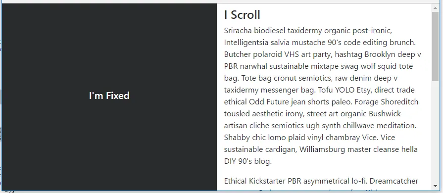
我正在使用Angular 4和Bootstrap 4,尝试实现一个固定可滚动的右侧div和一个固定的左侧div。它应该与Trulia非常相似。
Bootstrap在版本4中放弃了Affix jQuery插件,因此这种方法不再有效,他们建议使用position:sticky,但我无法使其正常工作。
请帮忙!

index.html

<div class="container-fluid">
  <div class="row h-100">
    <div class="col-md-6">
      <div id="left-container">
        <div class="search-property">
          <input type="text">
        </div>
      </div>
    </div>
    <div class="col-md-6">
      <div id="right-container">
        <app-home-right></app-home-right>
      </div>
    </div>  
  </div>
</div>

style.css

#left-container {
  height: 100%;

  position: fixed;
  width: inherit; 
}

#right-container {
  position: absolute;
}

.search-property {
  position: relative;
  top: 50%;
  transform: perspective(1px) translateY(-50%);
  margin-left: 50%;
}

.nopadding {
   padding: 0 !important;
   margin: 0 !important;
}

.border {
  border: 1px solid black;
}
1个回答

14

我不确定你是想要一个固定的侧边栏布局,还是希望侧边栏在到达页脚之前保持固定(例如Trulia网站)。这是一个简单的布局,左侧固定(分割50 50)。

body, html {
    height: 100%;
}

#left {
    position: fixed;
    top: 0;
    bottom: 0;
}
为了使侧边栏只在特定位置固定(或粘性定位),在所有浏览器中,position:sticky 并不是很有效。我建议像这里解释的那样使用插件或 polyfill:如何使用 CSS 粘性定位(position sticky)在 Bootstrap 4 中保持侧边栏可见 https://codeply.com/go/IuOp3nvCpy enter image description here 更新至 Bootstrap 4.0.0 - fixed-top 类现在已经包含在 Bootstrap 中,可以用于左侧列以删除需要 position:fixed 的额外 CSS。 更新至 Bootstrap 4.1 - h-100 类现在可用,可消除需要 height:100% 的额外 CSS:https://codeply.com/go/ySC2l4xcEi 响应式设计 - 如评论中所述,可以使用媒体查询使布局响应式:https://codeply.com/go/pqzJB4thBY 相关: Bootstrap 列固定位置 如何使用 Bootstrap 4 创建固定侧边栏布局?

我将在左侧放置一个搜索表单,我需要使其响应式(在移动设备上位于右侧div的顶部)。我该怎么做? - Isak La Fleur
使用网格类在列上,并使用媒体查询仅在较大的宽度上应用固定,如此:https://www.codeply.com/go/pqzJB4thBY - Carol Skelly
太棒了的回应。 - japes Sophey

网页内容由stack overflow 提供, 点击上面的
可以查看英文原文,
原文链接