Bootstrap4 - 2列:左侧滚动,右侧固定地图。

3
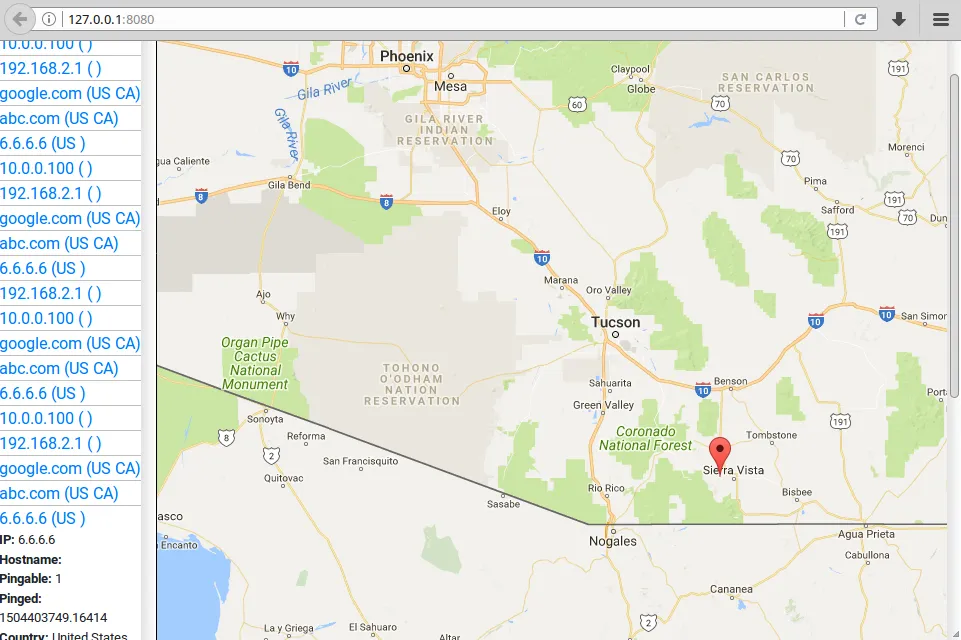
使用Bootstrap4创建双列布局,左列应该可以滚动(目前不能),右列不应该滚动(目前会有滚动条,如图所示)。地图应始终与窗口高度相同(在Bootstrap中称为“视口”,我想)。FYI,左列的内容随着时间增长而增加,因为服务器将更多主机推送到其中:

enter image description here

HTML:

<div id="app">
    <div class="container-fluid">
        <div class="row">
            <div class="col-md-2">list of hosts (should scroll)</div>
            <div class="col-md-10" id="map">google map (should NOT scroll)</div>
        </div>
    </div>
</div>

CSS:

.col-md-2 {
    border-right: 1px solid black;
    min-height: 100vh;
    overflow-y: scroll;
    padding: 0;
}

谢谢

2个回答

1
这是一个使用固定侧边栏的示例:https://jsfiddle.net/Lbn21js8/1/ 我为侧边栏添加了id选择器和背景颜色。
<div id="app">
  <div class="container-fluid">
    <div class="row">
      <div id="sidebar" class="col-md-2 bg-light ">list of hosts (should scroll)</div>
      <div class="col-md-10 ml-auto" id="map">google map (should NOT scroll)</div>
    </div>
  </div>
</div>

使用这个CSS:
#sidebar {
  border-right: 1px solid black;
  overflow-y: scroll;
  padding: 0;
  position: fixed;
  top: 0;
  left: 0;
  bottom: 0;
}

这个链接的 jsFiddle 应用程序每 1.5 秒向侧边栏添加一个新段落,因此如果您等待足够长的时间,您将看到侧边栏的滚动条变为活动/可滚动状态。
只要将地图部分限制在视口大小以下,您就不会看到页面的滚动条。

作为一个快速提示,偏移类应该会在下一个Beta版本中回归,所以你可以用我记得的offset-2替换ml-auto类。 - Tieson T.
谢谢,Tieson。除了你的代码之外,将#map添加min-height: 100vh;使其正常工作。ml-auto的作用是什么? - fire_water
ml-auto将左边距设置为自动。这是当前Beta版将内容推向右侧的方式,取代了Alpha使用的偏移类。 - Tieson T.

1

我使用了这个CSS,它对我起作用:

CSS:

#map {
    margin-left:20%;
    position:fixed;
}

这将允许左侧栏目 col-md-2 可以滚动,同时防止右侧栏目 col-md-10 滚动。通过添加 margin-left:20%;,右侧栏目不会重叠到左侧内容上。

网页内容由stack overflow 提供, 点击上面的
可以查看英文原文,
原文链接