我正在使用Matplotlib绘制相同类型的信息,但是针对不同的国家,使用多个子图。也就是说,我在一个3x3的网格上有九个图,所有图上都有相同的线条(当然,每条线的值不同)。
然而,我还没有找到如何在图上只放置一个图例(因为所有九个子图都有相同的线条)。
我该如何做到这一点?
然而,我还没有找到如何在图上只放置一个图例(因为所有九个子图都有相同的线条)。
我该如何做到这一点?
get_legend_handles_labels(),你可以在最后一个轴上调用它(如果你遍历它们),它会收集你从label=参数中所需要的一切。handles, labels = ax.get_legend_handles_labels()
fig.legend(handles, labels, loc='upper center')
pyplot接口而不是Axes接口,请使用以下代码:handles, labels = plt.gca().get_legend_handles_labels()
txinx图例,请参见使用twinx()添加到图例的次坐标轴。figlegend 可能是你正在寻找的: matplotlib.pyplot.figlegend
一个示例在这里:图例演示。
另一个示例:
plt.figlegend(lines, labels, loc = 'lower center', ncol=5, labelspacing=0.)
或者:
fig.legend(lines, labels, loc = (0.5, 0), ncol=5)
lines变量以放入legend参数中? - patapouf_ailines 是一个由 axes.plot() 返回的结果列表(即每个 axes.plot 或类似例程都返回一条“线”)。请参见链接的示例。 - user707650简而言之
lines_labels = [ax.get_legend_handles_labels() for ax in fig.axes]
lines, labels = [sum(lol, []) for lol in zip(*lines_labels)]
fig.legend(lines, labels)
我注意到其他答案中没有一个显示图片并在单个图例中引用不同子图中的多条曲线,所以我需要向您展示一张图片……来激发您的好奇心……

现在,如果我已经足够引起了您的兴趣,这就是代码:
from numpy import linspace
import matplotlib.pyplot as plt

# each Axes has a brand new prop_cycle, so to have differently
# colored curves in different Axes, we need our own prop_cycle
# Note: we CALL the axes.prop_cycle to get an itertoools.cycle
color_cycle = plt.rcParams['axes.prop_cycle']()

# I need some curves to plot
x = linspace(0, 1, 51)
functs = [x*(1-x), x**2*(1-x),
          0.25-x*(1-x), 0.25-x**2*(1-x)]
labels = ['$x-x²$', '$x²-x³$',
          '$\\frac{1}{4} - (x-x²)$', '$\\frac{1}{4} - (x²-x³)$']

# the plot,
fig, (a1,a2) = plt.subplots(2)
for ax, f, l, cc in zip((a1,a1,a2,a2), functs, labels, color_cycle):
    ax.plot(x, f, label=l, **cc)
    ax.set_aspect(2) # superfluos, but nice

# So far, nothing special except the managed prop_cycle. Now the trick:
lines_labels = [ax.get_legend_handles_labels() for ax in fig.axes]
lines, labels = [sum(lol, []) for lol in zip(*lines_labels)]

# Finally, the legend (that maybe you'll customize differently)
fig.legend(lines, labels, loc='upper center', ncol=4)
plt.show()
如果您想坚持使用官方的Matplotlib API,这是完美的选择,否则请参见下面的注释1(有一个私有方法...)
这两行...
lines_labels = [ax.get_legend_handles_labels() for ax in fig.axes]
lines, labels = [sum(lol, []) for lol in zip(*lines_labels)]
如需解释,请参见下方注释2。
我尝试了获得最高投票和被接受的答案所提出的方法,
 # fig.legend(lines, labels, loc='upper center', ncol=4)
 fig.legend(*a2.get_legend_handles_labels(),
            loc='upper center', ncol=4)
这就是我得到的东西

注意1
如果您不介意使用matplotlib.legend模块的私有方法...它真的更加容易。
from matplotlib.legend import _get_legend_handles_labels
...

fig.legend(*_get_legend_handles_and_labels(fig.axes), ...)
注意2
我已经将这两行棘手的代码封装在一个函数中,只需要四行代码,但有详细的注释
def fig_legend(fig, **kwdargs):

    # Generate a sequence of tuples, each contains
    #  - a list of handles (lohand) and
    #  - a list of labels (lolbl)
    tuples_lohand_lolbl = (ax.get_legend_handles_labels() for ax in fig.axes)
    # E.g., a figure with two axes, ax0 with two curves, ax1 with one curve
    # yields:   ([ax0h0, ax0h1], [ax0l0, ax0l1]) and ([ax1h0], [ax1l0])

    # The legend needs a list of handles and a list of labels,
    # so our first step is to transpose our data,
    # generating two tuples of lists of homogeneous stuff(tolohs), i.e.,
    # we yield ([ax0h0, ax0h1], [ax1h0]) and ([ax0l0, ax0l1], [ax1l0])
    tolohs = zip(*tuples_lohand_lolbl)

    # Finally, we need to concatenate the individual lists in the two
    # lists of lists: [ax0h0, ax0h1, ax1h0] and [ax0l0, ax0l1, ax1l0]
    # a possible solution is to sum the sublists - we use unpacking
    handles, labels = (sum(list_of_lists, []) for list_of_lists in tolohs)

    # Call fig.legend with the keyword arguments, return the legend object

    return fig.legend(handles, labels, **kwdargs)
sum(list_of_lists, [])是展平列表的一种非常低效的方法,但①我喜欢它的简洁性,②通常只有少量子图中有一些曲线,③Matplotlib和效率呢?;-)对于在具有许多轴的figure中自动定位单个图例(例如使用subplots()获得的图例),以下解决方案非常有效:
plt.legend(lines, labels, loc = 'lower center', bbox_to_anchor = (0, -0.1, 1, 1),
           bbox_transform = plt.gcf().transFigure)
使用 bbox_to_anchor 和 bbox_transform=plt.gcf().transFigure,您正在定义一个新的边界框,该边界框的大小为您的figure,以供loc参考。使用(0, -0.1, 1, 1)将此边界框向下移动一些,以防止图例放置在其他元素之上。
注意:在使用fig.set_size_inches()后使用此解决方案,并在使用fig.tight_layout()之前使用。
loc='upper center', bbox_to_anchor=(0.5, 0), bbox_transform=plt.gcf().transFigure,这样它肯定不会重叠。 - Davor Josipovic你只需要在循环外部请求图例一次。
例如,在此示例中,我有4个子图,具有相同的线条和单个图例。
from matplotlib.pyplot import *

ficheiros = ['120318.nc', '120319.nc', '120320.nc', '120321.nc']

fig = figure()
fig.suptitle('concentration profile analysis')

for a in range(len(ficheiros)):
    # dados is here defined
    level = dados.variables['level'][:]

    ax = fig.add_subplot(2,2,a+1)
    xticks(range(8), ['0h','3h','6h','9h','12h','15h','18h','21h'])
    ax.set_xlabel('time (hours)')
    ax.set_ylabel('CONC ($\mu g. m^{-3}$)')

    for index in range(len(level)):
        conc = dados.variables['CONC'][4:12,index] * 1e9
        ax.plot(conc,label=str(level[index])+'m')

    dados.close()

ax.legend(bbox_to_anchor=(1.05, 0), loc='lower left', borderaxespad=0.)
         # it will place the legend on the outer right-hand side of the last axes

show()
fig.legend() 的问题在于需要对所有的线条(绘图)进行标识... 因为对于每个子图,我都使用循环生成线条,而我想到的解决方法是在第二个循环之前创建一个空列表,然后随着线条的生成逐个将其添加进列表中... 然后我把这个列表作为 fig.legend() 函数的参数。 - carladados 是什么? - Shyamkkhadkadados是从netCDF4文件中获取的数据集(对于在列表ficheiros中定义的每个文件)。在每次循环中,都会读取不同的文件并将子图添加到图形中。 - carla在 gboffi 和 Ben Usman 的答案 基础上进行:
假设有多个子图,每个子图中有不同的线条,颜色和标签相同,可以按照以下方式操作:
labels_handles = {
  label: handle for ax in fig.axes for handle, label in zip(*ax.get_legend_handles_labels())
}

fig.legend(
  labels_handles.values(),
  labels_handles.keys(),
  loc = "upper center",
  bbox_to_anchor = (0.5, 0),
  bbox_transform = plt.gcf().transFigure,
)
如果您正在使用带有多个子图的条形图,并且每个条形图都有不同的颜色,则使用 mpatches 手动创建图例可能会更快。
假设您有四个具有不同颜色的条形图,颜色分别为 r、m、c 和 k,则可以按照以下方式设置图例:
import matplotlib.patches as mpatches
import matplotlib.pyplot as plt
labels = ['Red Bar', 'Magenta Bar', 'Cyan Bar', 'Black Bar']


#####################################
# Insert code for the subplots here #
#####################################


# Now, create an artist for each color
red_patch = mpatches.Patch(facecolor='r', edgecolor='#000000') # This will create a red bar with black borders, you can leave out edgecolor if you do not want the borders
black_patch = mpatches.Patch(facecolor='k', edgecolor='#000000')
magenta_patch = mpatches.Patch(facecolor='m', edgecolor='#000000')
cyan_patch = mpatches.Patch(facecolor='c', edgecolor='#000000')
fig.legend(handles = [red_patch, magenta_patch, cyan_patch, black_patch], labels=labels,
       loc="center right",
       borderaxespad=0.1)
plt.subplots_adjust(right=0.85) # Adjust the subplot to the right for the legend
plt.legend 中,以便为所有子图添加一个图例。 - Userhandles,_ = plt.gca().get_legend_handles_labels(),然后 fig.legend(handles, labels)。 - smcs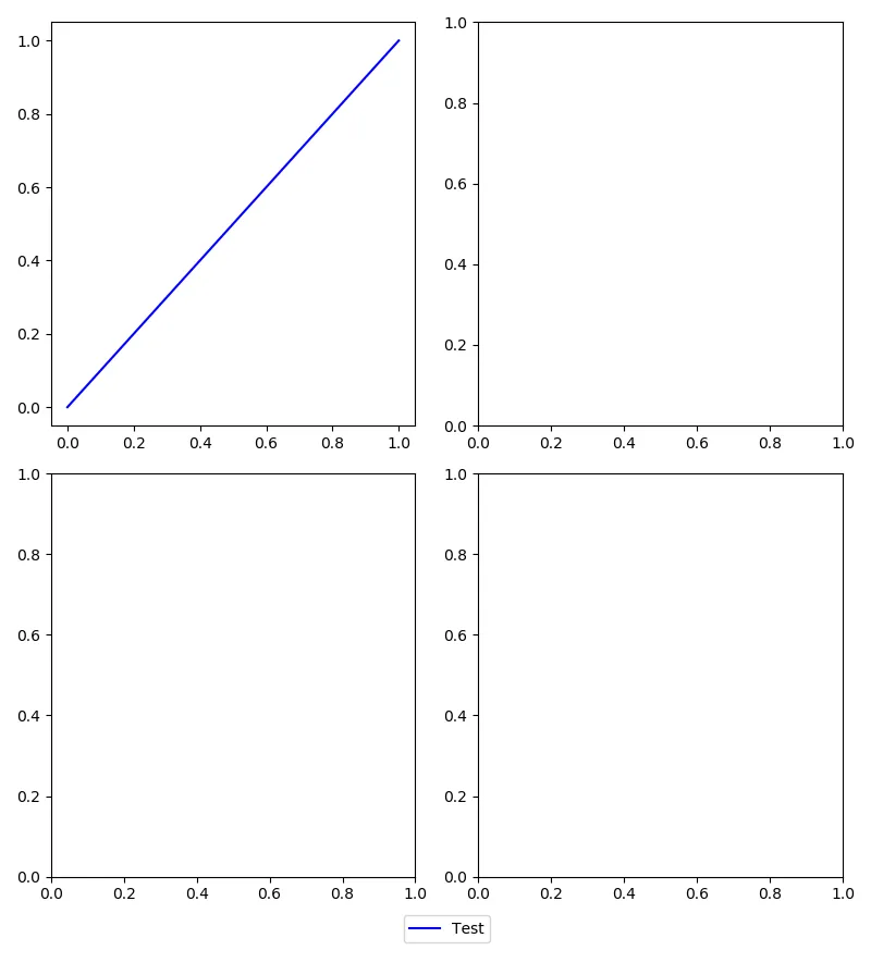
import matplotlib.pyplot as plt
import matplotlib.gridspec as gridspec

# Gridspec demo
fig = plt.figure()
fig.set_size_inches(8, 9)
fig.set_dpi(100)

rows   = 17 # The larger the number here, the smaller the spacing around the legend
start1 = 0
end1   = int((rows-1)/2)
start2 = end1
end2   = int(rows-1)

gspec = gridspec.GridSpec(ncols=4, nrows=rows)

axes = []
axes.append(fig.add_subplot(gspec[start1:end1, 0:2]))
axes.append(fig.add_subplot(gspec[start2:end2, 0:2]))
axes.append(fig.add_subplot(gspec[start1:end1, 2:4]))
axes.append(fig.add_subplot(gspec[start2:end2, 2:4]))
axes.append(fig.add_subplot(gspec[end2, 0:4]))

line, = axes[0].plot([0, 1], [0, 1], 'b')         # Add some data
axes[-1].legend((line,), ('Test',), loc='center') # Create legend on bottommost axis
axes[-1].set_axis_off()                           # Don't show the bottom-most axis

fig.tight_layout()
plt.show()
这篇答案是对user707650的解答关于图例位置的补充。
我对user707650的解决方案进行了第一次尝试,但因图例和子图标题的重叠而失败。
实际上,重叠是由fig.tight_layout()引起的,该方法更改子图的布局而不考虑图例。 但是,fig.tight_layout()是必要的。
为了避免重叠,我们可以通过fig.tight_layout(rect=(0,0,1,0.9))告诉fig.tight_layout()为图的图例留下空间。
所有之前的回答对我来说都太高深了,在我目前的编程旅程中,我只是添加了另一个称为patches的Matplotlib方面:
import matplotlib.patches as mpatches

first_leg = mpatches.Patch(color='red', label='1st plot')
second_leg = mpatches.Patch(color='blue', label='2nd plot')
thrid_leg = mpatches.Patch(color='green', label='3rd plot')
plt.legend(handles=[first_leg ,second_leg ,thrid_leg ])
补丁方面将我需要的所有数据放在了我的最终图中(它是一条线图,将三个不同的线图组合到了Jupyter Notebook的同一单元格中)。
(我更改了自己传说中命名的名称。)
handles, labels = [(a + b) for a, b in zip(ax1.get_legend_handles_labels(), ax2.get_legend_handles_labels())]- Billplt.gca().get_legend_handles_labels()对我有用。 - Stephen Witkowskilegend=0来隐藏子图中的图例。 - ShouravBR