我该如何制作一个带有斜线底部和边框的div?
我知道可以使用
clip-path,但这样就无法添加边框(例如:https://jsfiddle.net/s976/qopxf6mj/4/)
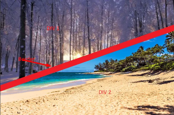
border 对于对角线容器的。clip-path,但这样就无法添加边框(例如:https://jsfiddle.net/s976/qopxf6mj/4/)
border 对于对角线容器的。.container {
width: 300px;
height: 200px;
background: url(https://picsum.photos/id/1002/800/800) center/cover;
overflow: hidden;
}
.box {
height: 70%;
border-bottom: 10px solid red;
transform: skewY(-15deg);
transform-origin: left;
position: relative;
overflow: hidden;
}
.box:before {
content: "";
position: absolute;
top: 0;
left: 0;
right: 0;
bottom: 0;
background: url(https://picsum.photos/id/12/800/800) center/cover;
transform: skewY(15deg);
transform-origin: left;
}<div class="container">
<div class="box">
</div>
</div>或使用类似下面的渐变效果与剪贴路径结合:
.container {
  width: 300px;
  height: 200px;
  background: url(https://picsum.photos/id/1002/800/800) center/cover;
}

.box {
  height: 70%;
  border-bottom: 10px solid red;
  background:
    linear-gradient(to bottom right,transparent 49.5%,red 50%) bottom/100% 80px no-repeat,
    url(https://picsum.photos/id/12/800/800) center/cover;
  clip-path:polygon(0 0,100% 0, 100% calc(100% - 80px),0 100%)
}<div class="container">
<div class="box">
</div>
</div>.container {
width: 300px;
height: 200px;
background: url(https://picsum.photos/id/1002/800/800) center/cover;
--angle:80px; /* Control the angle*/
--thickness:10px; /* Control the thickness of the line */
}
.container:before{
content:"";
display:block;
height: 70%;
border-bottom: var(--thickness) solid red;
background:
linear-gradient(to bottom right,transparent 49.2%,red 50%) bottom/100% var(--angle) no-repeat,
url(https://picsum.photos/id/12/800/800) center/cover;
clip-path:polygon(0 0,100% 0, 100% calc(100% - var(--angle)),0 100%)
}<div class="container">
</div>
<div class="container" style="--angle:40px;--thickness:5px">
</div>.right {
position: absolute;
left: 0;
top: 0;
-webkit-clip-path: polygon(0 0, 100% 0%, 100% 23%, 0 83%);
clip-path: polygon(0 0, 100% 0%, 100% 23%, 0 83%);
}
.left {
position: absolute;
left: 0;
top: 0;
-webkit-clip-path: polygon(0 75%, 100% 22%, 100% 100%, 0 100%);
clip-path: polygon(0 75%, 100% 22%, 100% 100%, 0 100%);
}
border {
position: absolute;
left: 0;
top: 0;
width: 400px;
height: 300px;
background-color: black;
-webkit-clip-path:polygon(0 75%, 100% 22%, 100% 28%, 0 83%);
clip-path: polygon(0 75%, 100% 22%, 100% 28%, 0 83%);
}<!DOCTYPE html>
<html>
<head>
<title>HTML, CSS and JavaScript demo</title>
</head>
<body>
<img class="left" src="https://picsum.photos/400/300?random">
<img class="right" src="https://picsum.photos/400/300">
<border />
</body>
</html>我有一个想法可以用skewY来实现:
<div class="div1"><div class="content"></div></div>
<div class="div2"><div class="content"></div></div>

div1 {
   transform: skewY(-10deg)
}

div2 {
   transform: skewY(-10deg)
}
接下来,您的内容也将倾斜-10度,因此您需要将其反向倾斜:
.content {
   transform: skewY(10deg)
}