将 div 的底部边框形状设为斜线。

4
我正在构建一个简单的网站,在其首页上需要两个背景。为此,我使用了两个div,一个在另一个上面。目前为止还不错。
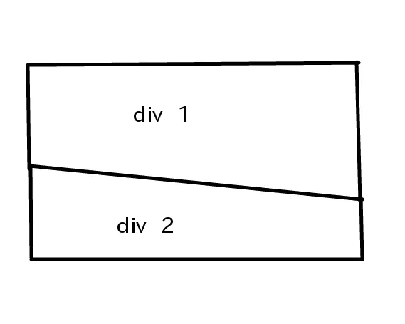
问题是,我想让第一个div的底部边界(或第二个div的顶部边界)成为倾斜的。这是我想要做的草图:

Sketch

Layout I need to follow

你有什么想法可以实现这个吗?

我找到了这篇文章,但它只适用于浮动元素,并且似乎不太稳定。

http://sarasoueidan.com/blog/css-shapes/

提前感谢!

html:

div class="main-container" id="main-container1">
    //all kinds of stuff
</div>

<div class="main-container" id="main-container2">
      //all kinds of stuff
</div>

CSS:

#main-container1{
    background: url(../img/background1.jpg);
    background-position:center;


}

#main-container2{
    background: url(../img/background2.jpg);
    background-position:center;


}

请提供您目前的代码。此外,CSS Shapes(您链接的文章)尚未实现。 - Zach Saucier
3
这段话的意思是:那些元素或它们的背景是否需要进行任何形式的滚动效果、动态大小或其他操作?换句话说,有什么阻止你使用“简单”的解决方案,即将“斜”边框直接作为第二个 div 的背景图像的一部分,并使它具有一个三角形透明部分...?请注意不要改变原文意思。 - CBroe
第二个背景应该是一个图案,所以我需要修改它来适应你的解决方案。但这只是一个想法。我还需要稍微修改一下div层次结构,对吧? - biip
为什么不能将两个背景图片合并成一个图片? - MilkyTech
2个回答

2

这不是最好的方法

.second {
    width:500px;
    height:300px;
    transform:skewY(20deg);
    background:orange;
    margin-top:-100px;
    border:2px solid green;
}

.holder{
    width:500px;
    height:800px;
    background:grey;
}

.second p{
    position:absolute;
    margin-top:200px;
    transform:skewY(-20deg);
}
<div class="holder">
    <div class="second"><p>Div 1</p></div>
</div>


0

在这里编辑

CSS:

.se-slope{
    background: #47650a;
    -webkit-transform: rotate(-5deg);
    -moz-transform: rotate(-5deg);
    -o-transform: rotate(-5deg);
    -ms-transform: rotate(-5deg);
    transform: rotate(-5deg);

}

.se-slope {
    margin: 0 -50px;
    -webkit-transform-origin: left center;
    -moz-transform-origin: left center;
    -o-transform-origin: left center;
    -ms-transform-origin: left center;
    transform-origin: left center;
}

.se-content {
    -webkit-transform: rotate(5deg);
    -moz-transform: rotate(5deg);
    -o-transform: rotate(5deg);
    -ms-transform: rotate(5deg);
    transform: rotate(5deg);
    color: #000;

   padding-top:120px;
   padding-bottom: 120px;
   margin-left: 10%;
   margin-right: 10%;

}

.above{
   background: #47650a;
   padding-bottom: 120px;
   width:100%;
}

.below
{
  background: gray;
  padding-bottom: 120px;
  margin-top: -110px;
}

HTML:

<div class="above">

 </div>
 <div class="se-slope">
        <article class="se-content">
          <p>You should use CSS TRANSFORM. That way you can do all kinds off neat stuff. Hav you tried skew allready? Or animations in JQuery build cool wepp apps. Be creative use arrows and circles...</p>
        </article>
</div>

 <div class="below">

 </div>

网页内容由stack overflow 提供, 点击上面的
可以查看英文原文,
原文链接