我有一个包含三个类别样本的数据集。
使用ggplot2可以获得良好的条形图表示。
然而,我还需要将每个类别的颜色更改为darkorange2、dodgerblue2和firebrick2等颜色。
我试图使用函数scale_fill_manual,但总是出现错误。
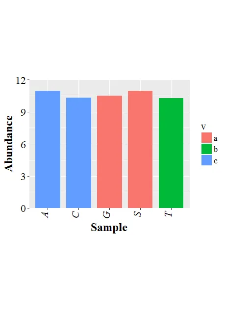
以下是我的当前绘图示例,没有更改颜色:
require(ggplot2)
d.f<-data.frame(v=c("a","a","b","c","c"),x=sample(LETTERS,5),y=10+runif(5))

pbar <- ggplot(data=d.f, aes(x=x, y=y,fill=v)) +
         geom_bar(stat="identity",width=0.8) +
         theme(text= element_text(size=16, family = "Times New Roman"),
               axis.text.x = element_text(angle = 90,hjust=1, vjust = 0, face="italic", colour="black"),
               axis.text.y = element_text(colour="black")) +
         coord_cartesian(ylim=c(0.0,12)) +
         scale_y_continuous(expand=c(0,0)) +
         theme(aspect.ratio = 0.8) +
         xlab("Sample")+ylab("Abundance")

pbar<-pbar+theme(axis.title=element_text(size=18, face="bold"))
pbar<-pbar+theme(axis.text=element_text(size=16))
pbar
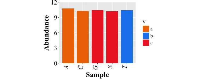
scale_fill_manual试过什么会有帮助,这样才能知道问题所在。 - m.evans