ggplot2:如何更改条形图堆栈的顺序

12

我想制作一个使用facet_wrap的堆积条形图,但是希望我的堆叠变量(“developed”)的顺序翻转。我已经重新排列了因子,并尝试了“order = descend()”,以及“scale_fill_manual”,但似乎都没有起作用。

以下是我的代码:

developed=rep(c("developed","available"),6)
agriculture=rep(c(rep("loi",2), rep("dryland",2), rep("agroforestry",2)),2)  
acres=c(7435,24254,10609,120500,10651,75606,6037,9910,4390,895,9747,46893)
islands=c(rep("All islands",6), rep("Oahu",6))
all_is2=data.frame(developed, agriculture, acres, islands)
head(all_is2)
  developed  agriculture  acres      island
1 developed          loi   7435 All islands
2 available          loi  24254 All islands
3 developed      dryland  10609 All islands
4 available      dryland 120500 All islands
5 developed agroforestry  10651 All islands
6 available agroforestry  75606 All islands

调整"农业"和"发达"两个因素的水平

all_is2$agriculture=factor(all_is2$agriculture,levels=c("loi","dryland","agroforestry"))
all_is2$developed=factor(all_is2$developed,levels=c("developed","available"))
levels(all_is2$developed)
[1] "developed" "available"

然后,绘制:

ggplot(all_is2,aes(x=agriculture,y=acres,fill=developed))+
     geom_bar(position="stack", stat="identity")+
     facet_wrap(~islands)+ scale_fill_grey(start=0.8, end=0.2, name="")+ xlab("")+ylab("Acres")+theme_bw()+ scale_y_continuous(labels=comma)

The Graph

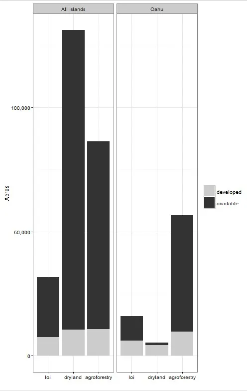
我希望将灰色的“developed”部分放在黑色的“available”部分之上,并且图例应该与条形图的顺序相匹配。

同时,是否可能将facet_wrap“全部岛屿”和“Oahu”从图的顶部移动到“loi”“dryland”和“agroforestry”的下方。谢谢您的帮助!


你需要反转你的因子顺序 (
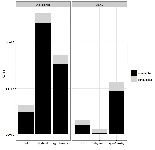
levels=c("available","developed"))。而且,如果你想要标签在图形下方,那么分面总是在图形的顶部或旁边,使用grid.arrange方法可能是一个好的选择。 - Heroka
我已经尝试过这样做,将因素保留在levels=c("available","developed"),但是我得到的结果是可用的以灰色叠放在顶部,而开发的则以黑色叠放在底部。(http://imgur.com/ne3iNhk) - Natalie K
几乎看起来像是一个 bug。 - Mike Wise
在facets上,感谢@Jota:您可以使用facet_wrap(〜islands,switch =“x”) - Heroka
我认为ggplot github上的这个问题是相关的。 - Henrik
谢谢大家,我非常感谢你们的帮助! - Natalie K
2个回答

11

这可能是一个解决方案。

我所做的是对数据集进行排序,以便我想要出现在x轴最近的值首先出现在数据集中。(我在这里使用了您的因子排序)。这修复了条形图的位置。

然后,我们必须更改图例的颜色和顺序。我无法理解scale_fill_grey,所以我将其改为了scale_fill_manual,同时设置了两个值和断点。

ggplot(all_is2[rev(order(all_is2$developed)),] ,aes(x=agriculture,y=acres,fill=developed))+
  geom_bar(position="stack", stat="identity")+theme_bw()+
  facet_wrap(~islands)+ 
  scale_fill_manual(values=c(developed="grey80",available="grey20"),name="",
                    breaks=c("developed","available"))+
 xlab("")+ylab("Acres")

输入图像描述

我不知道这是一个 bug 还是一个 feature,而且我认为在 ggplot 的以前版本中也发生了这种情况,但似乎使用 stat_identity 函数时,第一次观察到的值被绘制得最接近 x 轴,第二个值则在其上方。

演示:

set.seed(123)
testdat <- data.frame(x=1,y=sample(5))


p1 <- ggplot(testdat, aes(x=x,y=y,fill=factor(y))) +geom_bar(stat="identity")+labs(title="order in dataset")
p2 <- ggplot(testdat[order(testdat$y),],aes(x=x,y=y,fill=factor(y))) +
  geom_bar(stat="identity") + labs(title="ordered by y")
p3 <- ggplot(testdat[rev(order(testdat$y)),],aes(x=x,y=y,fill=factor(y))) +
  geom_bar(stat="identity") + labs(title="reverse ordered by y")

输入图片说明


2
哦,你打败了我!请查看 facet_wrap(~islands , switch = "x") 以将分面标签移动到下方。这是 ggplot2_2.0.0 的新功能。 - Jota
你必须通过对数据集进行排序来控制图形,这似乎有点奇怪。但我认为它内部使用了 dplyr ,所以可能和我的方式一样。 - Mike Wise
1
我使用了ggplot2.0;order美学已经被正式弃用,有人建议通过对数据进行排序来获得相同的效果。 - Heroka
你实际上让它变得比必要的更加复杂了;你只需要对数据进行排序就可以了。图例的顺序由因子水平的顺序控制;图的顺序由数据的顺序控制:http://ilari.scheinin.fi/ggplot-2-0-and-the-missing-order-aesthetic/ - Ilari Scheinin
谢谢大家!我很感激你们的帮助!@Heroka,它起作用了!谢谢! - Natalie K
不客气!如果它满足了您的需求,能否确认一下呢?这样可以避免其他人浪费时间。 - Heroka

1

值得一提的是,这里有一个使用dplyr的解决方案,并且它使用scale_fill_manual来明确颜色:

library(ggplot2)
library(dplyr)

developed=rep(c("developed","available"),6)
agriculture=rep(c(rep("loi",2), rep("dryland",2), rep("agroforestry",2)),2)  
acres=c(7435,24254,10609,120500,10651,75606,6037,9910,4390,895,9747,46893)
islands=c(rep("All islands",6), rep("Oahu",6))
all_is2=data.frame(developed, agriculture, acres, islands)

all_is2$agriculture=factor(all_is2$agriculture,levels=c("loi","dryland","agroforestry"))
#all_is2$developed=factor(all_is2$developed,levels=c("available","developed"))

all_is3 <- all_is2 %>% group_by(islands,agriculture,developed) %>% 
                       summarize(acres=sum(acres)) 

ggplot(all_is3,aes(x=agriculture,y=acres,fill=developed))+
  geom_bar(position="stack", stat="identity")+
  facet_wrap(~islands)+ 
  xlab("")+ylab("Acres")+theme_bw() +
  scale_fill_manual(name="",values=c("available"="black","developed"="light gray"))

enter image description here


欢迎,我一开始就认为这是一个好问题。我从中学到了一些东西。很高兴看到你得到了那么多赞(其中一个是我的),你现在已经很有名了。 - Mike Wise
是的,这是我的第一篇帖子,因为它非常令人恼火,我在网上找了好几天也找不到解决方案。但是通过发布帖子,我也学到了很多! - Natalie K
那里应该是早上吧,我这边要结束一天的工作了 :) - Mike Wise

网页内容由stack overflow 提供, 点击上面的
可以查看英文原文,
原文链接