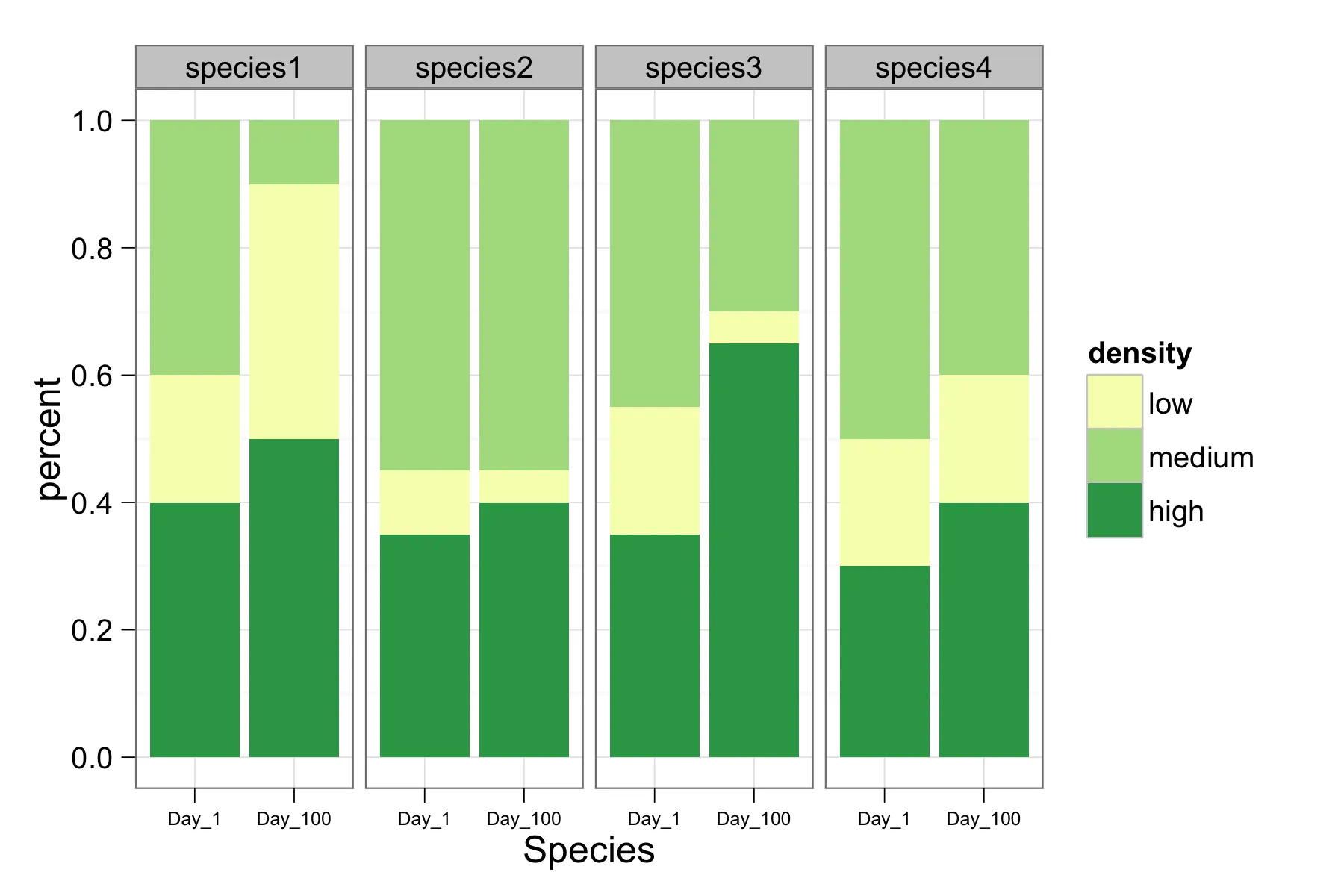
从以下数据框中工作:
    > foo
        species density day percent
    1  species1    high   1    0.40
    2  species1     low   1    0.20
    3  species1  medium   1    0.40
    4  species2    high   1    0.35
    5  species2     low   1    0.10
    6  species2  medium   1    0.55
    7  species3    high   1    0.35
    8  species3     low   1    0.20
    9  species3  medium   1    0.45
    10 species4    high   1    0.30
    11 species4     low   1    0.20
    12 species4  medium   1    0.50
    13 species1    high 100    0.50
    14 species1     low 100    0.40
    15 species1  medium 100    0.10
    16 species2    high 100    0.40
    17 species2     low 100    0.05
    18 species2  medium 100    0.55
    19 species3    high 100    0.65
    20 species3     low 100    0.05
    21 species3  medium 100    0.30
    22 species4    high 100    0.40
    23 species4     low 100    0.20
    24 species4  medium 100    0.40
我已经创建了以下的分面条形图:
require(ggplot2)

foo$density<-factor(foo$density,levels=c('low','medium','high'))

d <- ggplot(foo, aes(x=species, y=percent, fill=density)) +
    geom_bar(aes(width=.65), stat="identity") +
    facet_grid(. ~ day)
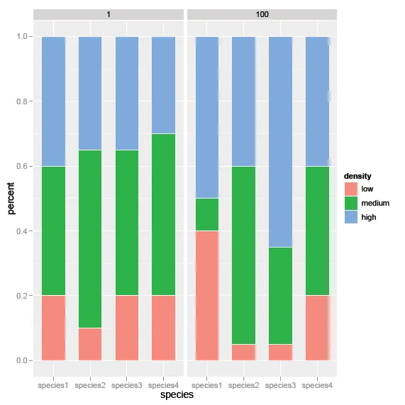
然而,我想将这些图表合并成一个双因素条形图。在x轴上,每一天-1和100-都将按物种分组。有没有什么建议如何创建这个图表呢?
非常感谢!
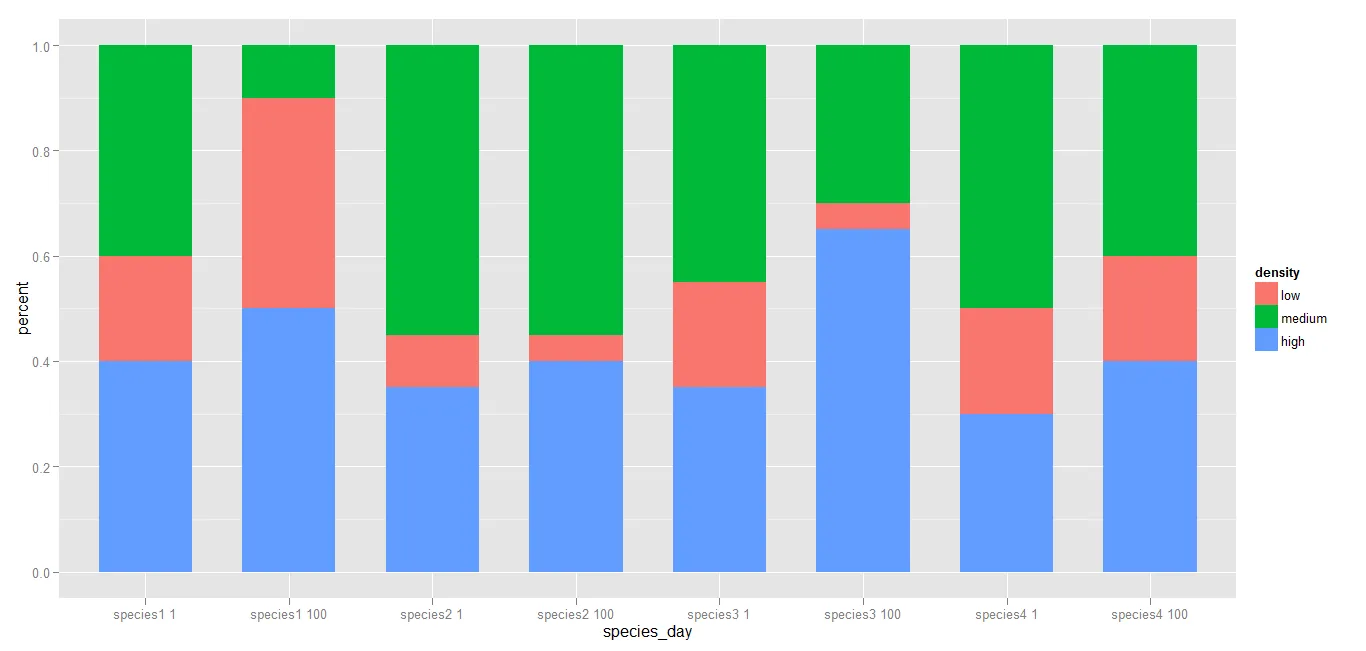 如果您愿意,您可以重新安排级别。