在R中的条形图中添加计数

3

我是一名R语言的初学者。在制作条形图时遇到了计数问题。

我的数据看起来像这样:

> head(worker)
  stateur statemb state age tenure    joblost
1     4.5     167    42  49     21      other
2    10.5     251    55  26      2 slack_work
3     7.2     260    21  40     19      other
4      NA     245    56  51     17 slack_work
5     6.5     125    58  33      1 slack_work
6     7.5     188    11  51      3      other
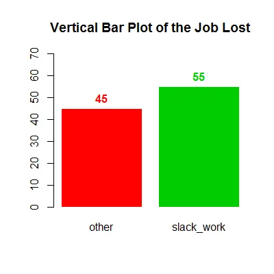
我用这段代码绘制了条形图。
table=table(worker$joblost)
barplot(table, main = "Vertical Bar Plot of the Job Lost")

但我想将每个失业类别的频率放在每个条形图的顶部。我该怎么做?
2个回答

3
使用text()barplot()有一个不可见的输出,可以用<-捕获并用于添加文本的x位置。对于y=,只需添加表格值加上一些好看的东西即可。
b <- barplot(tab, beside=TRUE, ylim=c(0, max(tab) + 15), 
             main="Vertical Bar Plot of the Job Lost", col=2:3, border=0)
text(b, tab + 5, tab, font=2, col=2:3)

enter image description here

请注意,如果您使用“table”作为对象名称,您将尝试覆盖“table()”函数!在使用之前,请始终检查名称是否空闲,输入“?table”。如果不是,请使用其他名称。

数据:

tab <- structure(c(other = 56L, slack_work = 44L), .Dim = 2L, .Dimnames = structure(list(
    c("other", "slack_work")), .Names = ""), class = "table")

1
谢谢您,先生!您的回答对像我这样的初学者非常有帮助。 - Izzah

2
您可以使用以下代码来实现此功能。
library(ggplot2)

  ggplot(worker,aes(x=factor(joblost)))+
  geom_bar(position="dodge")+ 
  labs(title="Vertical Bar Plot of the Job Lost", x="Job lost", y = "Frequency")+
  geom_text(aes(label=..count..),stat='count',position=position_dodge(0.9),vjust=-0.2)

enter image description here


1
鉴于Izzah对R不熟悉,您应明确指出您的解决方案涉及使用“ggplot2”,而不是基础R的绘图,并且需要从“library(ggplot2)”开始。 - Phil
1
非常感谢您,但是很遗憾我还不熟悉使用其他 R 包。稍后我会探索这个包并尝试使用您的方法。 - Izzah
@lzzah 在运行代码之前只需使用一次 install.packages("ggplot2") 即可。它将安装 ggplot2 包,下一次您只需通过 library(ggplot2) 调用该包即可。 - UseR10085

网页内容由stack overflow 提供, 点击上面的
可以查看英文原文,
原文链接