我正在使用基本滑块,已经知道如何更新我想要改变的滑块主题数据的部分,例如trackHeight,但不幸的是我不知道该如何更新“trackShape”字段。以下是我在主应用程序中更新track height的示例:
final SliderThemeData tweakedSliderTheme = Theme.of(context).sliderTheme.copyWith(
    trackHeight: 22.0,
     //trackShape: RectangularSliderTrackShape(),  // How do I update this??
);
我尝试在滑块小部件周围使用ClipRRect(),但没有效果。
这是一个简单的页面,只有一个滑块:
import 'package:flutter/material.dart';

class RoomControl extends StatefulWidget {
  @override
  _RoomControlState createState() => _RoomControlState();
}

class _RoomControlState extends State<RoomControl> {
  double _value = 0.0;
  void _setvalue(double value) => setState(() => _value = value);

  @override
  Widget build(BuildContext context) {
    return Scaffold(
      appBar: AppBar(
        title: Text('Name here'),
      ),
      //hit Ctrl+space in intellij to know what are the options you can use in flutter widgets
      body: Container(
        padding: EdgeInsets.all(32.0),
        child: Center(
          child: Column(
            children: <Widget>[
              Text('Value: ${(_value * 100).round()}'),
              ClipRRect(
                borderRadius: BorderRadius.circular(5.0),
              child:Slider(
                  value: _value,
                  onChanged: _setvalue,
                  divisions: 10,
              )
    )
            ],
          ),
        ),
      ),
    );
  }
}
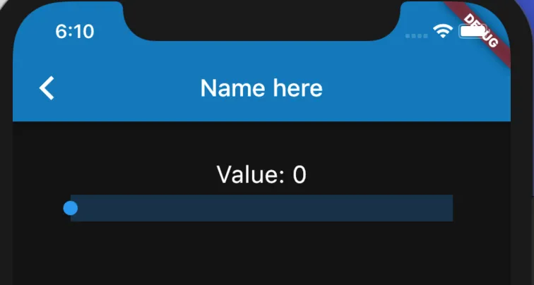
以下是滑块的外观:
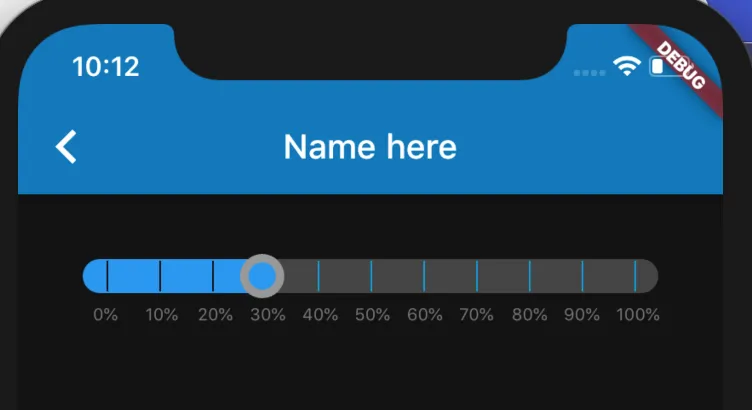
更新: 得到答案后,我可以通过更新刻度标记形状和拇指形状轻松创建类似于下面这样的内容:
final SliderThemeData tweakedSliderTheme = Theme.of(context).sliderTheme.copyWith(
  trackHeight: 20.0,
  thumbShape: MyRoundSliderThumbShape(enabledThumbRadius: 13.0, disabledThumbRadius: 13.0),
  trackShape: MyRoundSliderTrackShape(),  // TODO: this is hard coded right now for 20 track height
  inactiveTrackColor: lightGreySliderColor,
  activeTickMarkColor: Color(blackPrimaryValue),
  inactiveTickMarkColor: colorizedMenuColor,
  tickMarkShape: MyRectSliderTickMarkShape(tickMarkRadius: 4.0),
);
在打勾标记的形状上有一些技巧。如果它太大了,它就会跳过绘制!这可能是有道理的,但我不太了解绘画/渲染,所以花了一段时间才学会如何正确地显示打勾标记(Rect)。
 我将
我将