我正在尝试将一个普通的matplotlib.pyplot的plt.plot(x,y)和变量y作为变量x的函数与一个箱线图结合起来。然而,我只想在x的某些(可变)位置上绘制箱线图,但这似乎在matplotlib中不起作用?
将plt.plot(x,y)与plt.boxplot()结合使用
19
- ruben baetens
2个回答
29
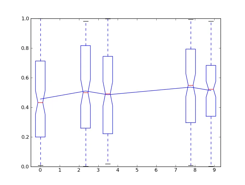
你是否想要类似这样的效果?boxplot函数中的positions参数可以让你将箱线图放置在任意位置。
import matplotlib.pyplot as plt
import numpy as np

# Generate some data...
data = np.random.random((100, 5))
y = data.mean(axis=0)
x = np.random.random(y.size) * 10
x -= x.min()
x.sort()

# Plot a line between the means of each dataset
plt.plot(x, y, 'b-')

# Save the default tick positions, so we can reset them...
locs, labels = plt.xticks()

plt.boxplot(data, positions=x, notch=True)

# Reset the xtick locations.
plt.xticks(locs)
plt.show()
- Joe Kington
4
0
以下是我所使用的方法:
- 绘制箱线图
- 获取箱线图X轴刻度位置
- 将箱线图X轴刻度位置用作线图的X轴数值
# Plot Box-plot
ax.boxplot(data, positions=x, notch=True)
# Get box-plot x-tick locations
locs=ax.get_xticks()

# Plot a line between the means of each dataset
# x-values = box-plot x-tick locations
# y-values = means
ax.plot(locs, y, 'b-')
- jumbofiatco
网页内容由stack overflow 提供, 点击上面的可以查看英文原文,
原文链接
原文链接
- 相关问题
- 29 拆包:[x,y],(x,y),x,y - 有什么区别?
- 5 查找Python字典中与(x,y)或(y,x)匹配的元组。
- 3 将Flask-Marshmallow与marshmallow-jsonapi结合使用
- 6 将JavaFX与Python结合使用
- 10 x += y 与 x = x + y 的执行时间差异
- 5 Numpy,为什么`x += y`与`x = x + y`产生不同的结果?
- 5 x,y = getPos() vs. (x, y) = getPos()
- 92 Python中的指数运算:x**y与math.pow(x, y)的区别
- 3 如何在Python中将逻辑门NOT与lst.count((x, not y))结合使用
- 24 将functools.lru_cache与multiprocessing.Pool结合使用
locs = ax.get_xticks()和ax.set_xticks(locs)。 - MrCyclophilax.set_xticklabels(locs)才能正确获取标签。 - MrCyclophil