我正在尝试使用mice软件包进行多重插补之后,使用ggplot2生成类似于lattice package的densityplot()函数。以下是可重现的示例:
require(mice)
dt <- nhanes
impute <- mice(dt, seed = 23109)
x11()
densityplot(impute)
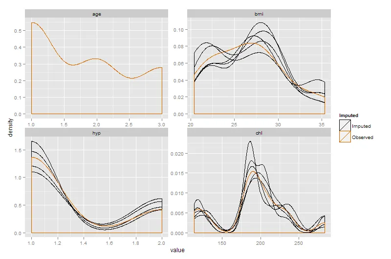
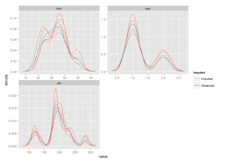
这将产生:
我希望能更好地控制输出(同时也将此作为ggplot的学习练习)。因此,对于bmi变量,我尝试了以下操作:
bar <- NULL
for (i in 1:impute$m) {
foo <- complete(impute,i)
foo$imp <- rep(i,nrow(foo))
foo$col <- rep("#000000",nrow(foo))
bar <- rbind(bar,foo)
}
imp <-rep(0,nrow(impute$data))
col <- rep("#D55E00", nrow(impute$data))
bar <- rbind(bar,cbind(impute$data,imp,col))
bar$imp <- as.factor(bar$imp)
x11()
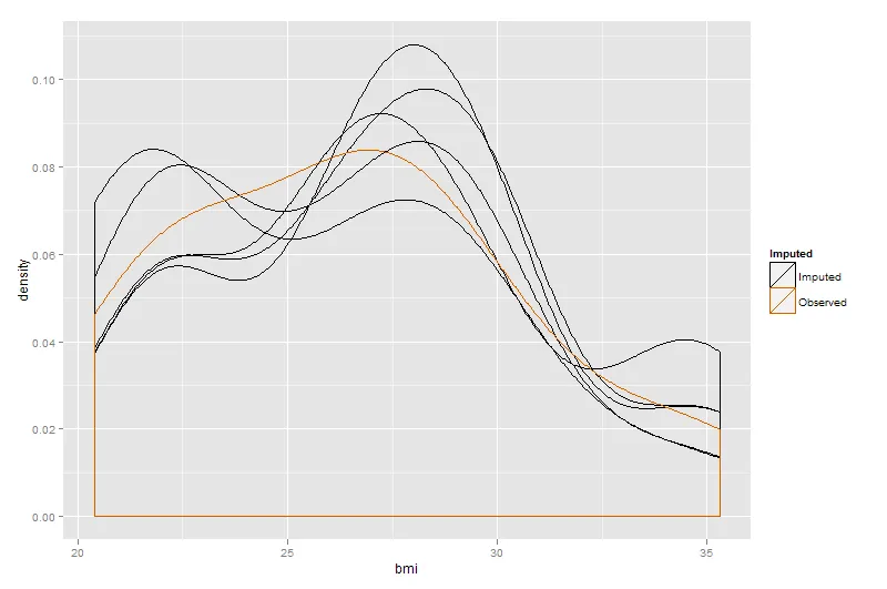
ggplot(bar, aes(x=bmi, group=imp, colour=col)) + geom_density()
+ scale_fill_manual(labels=c("Observed", "Imputed"))
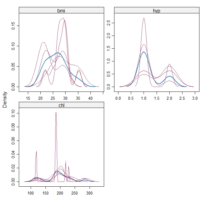
这会生成以下内容:
 因此,它存在几个问题:
1.颜色不正确。似乎我试图控制颜色的尝试完全是错误的/被忽略了。 2.有不必要的水平和垂直线条。 3.我想让图例显示Imputed和Observed,但我的代码会出现错误“一元运算符的参数无效”。 此外,似乎用`densityplot(impute)`一行就可以完成的工作需要做很多工作 - 所以我想知道是否完全走了弯路? 4.图的范围似乎不正确。
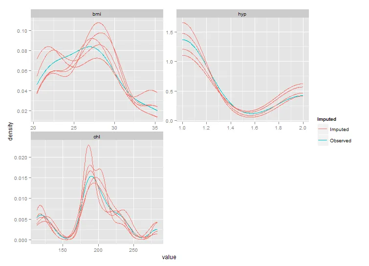
 您可以溶解fortify.mids的结果,将所有变量绘制在一个图表中。