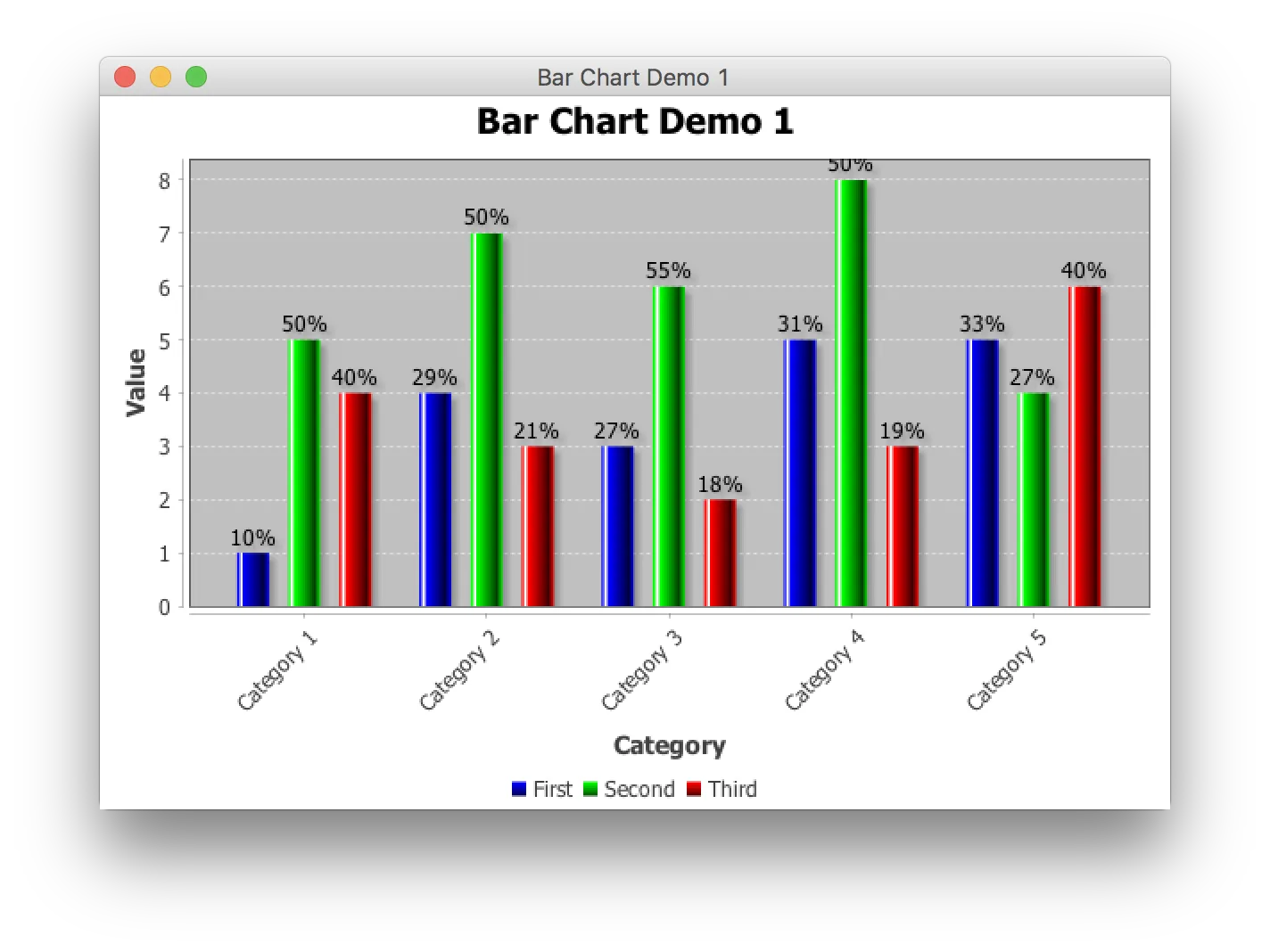
我正在使用JFreeChart,以下是我开发的图表截图和相关代码。
    private void getBarChart(List<Data> data) {
JFreeChart barChart = ChartFactory.createBarChart("", "", "", createDataset(data), PlotOrientation.VERTICAL, false, true, false);
        CategoryPlot plot = barChart.getCategoryPlot();
        plot.getRenderer().setSeriesPaint(0, new Color(7, 43, 97));

        barChart.getCategoryPlot().getRangeAxis().setLowerBound(0);
        barChart.getCategoryPlot().getRangeAxis().setUpperBound(1);
        NumberAxis xAxis2 = (NumberAxis) barChart.getCategoryPlot().getRangeAxis();
        xAxis2.setNumberFormatOverride(NumberFormat.getPercentInstance());

        plot.getRenderer().setSeriesItemLabelGenerator(0, new StandardCategoryItemLabelGenerator());
        plot.getRenderer().setSeriesItemLabelsVisible(1, true);
        plot.getRenderer().setBaseItemLabelsVisible(true);
        plot.getRenderer().setBaseSeriesVisible(true);
        barChart.getCategoryPlot().setRenderer(plot.getRenderer());


        BarRenderer.setDefaultBarPainter(new StandardBarPainter());
        ((BarRenderer) plot.getRenderer()).setBarPainter(new StandardBarPainter());

        BufferedImage image = new BufferedImage(650, 250, BufferedImage.TYPE_INT_ARGB);
        Graphics2D g2 = image.createGraphics();
        g2.setRenderingHint(JFreeChart.KEY_SUPPRESS_SHADOW_GENERATION, true);
        Rectangle r = new Rectangle(0, 0, 650, 250);
        barChart.draw(g2, r);
        BufferedImage chartImage = barChart.createBufferedImage(600, 400, null);
}
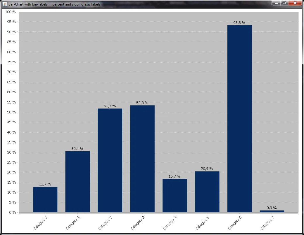
期望的图表应该类似于以下内容。
 问题1.) 如何按照期望的图表格式化x轴标签?(在barChart.getCategoryPlot().getDomainAxis()中使用CategoryLables或TickLabels)
问题2.) 在每个条形图的顶部显示的值(SeriesItemLabels)需要使用类似于y轴的百分比符号(%)进行格式化。(我认为,就像我在xAxis2.setNumberFormatOverride中所做的那样,这些值将自动乘以100%。目前它仅显示小数值)。如何实现这一点?
请帮帮我。谢谢。