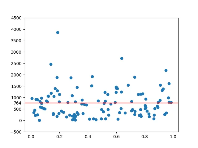
如何为下面的图表中显示的水平红线添加字符串标签?我想在红线旁边的y轴标签上添加类似于“k=305”的内容。蓝点只是一些其他数据,这些值并不重要。为了重新创建此问题,您可以绘制任何类型的数据。我的问题是关于红线的。
plt.plot((0,502),(305,305),'r-')
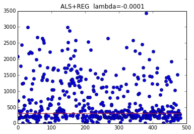
plt.title("ALS+REG")
plt.plot((0,502),(305,305),'r-')
plt.title("ALS+REG")
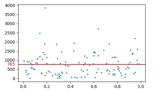
Axes.axhline(y)来绘制一条水平线。Axes.text()。棘手的问题在于决定放置文本的坐标。由于y坐标应该是绘制线条的数据坐标,但标签的x坐标应该与数据无关(例如允许不同的轴比例),因此我们可以使用混合变换,其中x变换是轴ylabel的变换,而y变换是数据坐标系。import matplotlib.pyplot as plt
import matplotlib.transforms as transforms
import numpy as np; np.random.seed(42)
N = 120
x = np.random.rand(N)
y = np.abs(np.random.normal(size=N))*1000
mean= np.mean(y)
fig, ax=plt.subplots()
ax.plot(x,y, ls="", marker="o", markersize=2)
ax.axhline(y=mean, color="red")
trans = transforms.blended_transform_factory(
ax.get_yticklabels()[0].get_transform(), ax.transData)
ax.text(0,mean, "{:.0f}".format(mean), color="red", transform=trans,
ha="right", va="center")
plt.show()
Axes.set_yticks 方法,您可以直接将新的刻度和相应的标签添加到现有的 yticks 列表中,而无需通过文本添加标签并自行定位。这避免了执行复杂操作以计算标签坐标的麻烦。import matplotlib.pyplot as plt
import matplotlib.transforms as transforms
import numpy as np; np.random.seed(42)
N = 120
x = np.random.rand(N)
y = np.abs(np.random.normal(size=N)) * 1000
mean = np.mean(y)
fig, ax = plt.subplots()
ax.plot(x, y, ls="", marker="o")
ax.axhline(y=mean, color="red")
# Here: add a new tick with the required value
yticks = [*ax.get_yticks(), mean]
yticklabels = [*ax.get_yticklabels(), int(mean)]
ax.set_yticks(yticks, labels=yticklabels)
plt.show()