Warren Weckesser的评论绝对有效,并且可以给您提供高分辨率图像。我在下面的示例中实现了他的想法。
关于使用contourf(),我不确定这是否是版本相关问题,但在最新版本中,
contourf()没有一个kwarg用于N。
正如您在文档中看到的那样,您要将N用作arg(在语法中:contourf(X,Y,Z,N))来指定要绘制的级别数量而不是RGB像素数。 contourf()绘制填充轮廓线,分辨率取决于要绘制的级别数。您的N=256不会起作用,contourf()将自动选择7个级别。
以下代码修改自官方示例,比较了不同N的分辨率。如果存在版本问题,则此代码将提供具有python 3.5.2; matplotlib 1.5.3的以下图形:
import numpy as np
import matplotlib.pyplot as plt
delta = 0.025
x = y = np.arange(-3.0, 3.01, delta)
X, Y = np.meshgrid(x, y)
Z1 = plt.mlab.bivariate_normal(X, Y, 1.0, 1.0, 0.0, 0.0)
Z2 = plt.mlab.bivariate_normal(X, Y, 1.5, 0.5, 1, 1)
Z = 10 * (Z1 - Z2)
fig, ((ax1, ax2), (ax3, ax4)) = plt.subplots(2, 2)
fig.set_size_inches(8, 6)
CS1 = ax1.contourf(X, Y, Z, cmap="viridis", N=256)
ax1.set_title('Your code sample')
ax1.set_xlabel('word length anomaly')
ax1.set_ylabel('sentence length anomaly')
cbar1 = fig.colorbar(CS1, ax=ax1)
N = 7
CS2 = ax2.contourf(X, Y, Z, N, cmap="viridis")
ax2.set_title('N=7')
ax2.set_xlabel('word length anomaly')
ax2.set_ylabel('sentence length anomaly')
cbar2 = fig.colorbar(CS2, ax=ax2)
N = 100
CS3 = ax3.contourf(X, Y, Z, N, cmap="viridis")
ax3.set_title('N=100')
ax3.set_xlabel('word length anomaly')
ax3.set_ylabel('sentence length anomaly')
cbar3 = fig.colorbar(CS3, ax=ax3)
IM = ax4.imshow(Z, cmap="viridis", origin='lower', extent=(-3, 3, -3, 3))
ax4.set_title("Warren Weckesser's idea")
ax4.set_xlabel('word length anomaly')
ax4.set_ylabel('sentence length anomaly')
cbar4 = fig.colorbar(IM, ax=ax4)
fig.tight_layout()
plt.show()
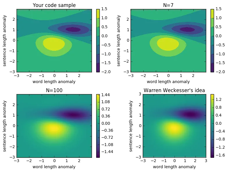
imshow而不是contourf。使用extent参数设置 x 和 y 轴范围。 - Warren Weckesser