我正在尝试在一个div上创建一个边框,其中左上和右下有两种不同的颜色。
无法找到解决方案,使用图像或直接在css上。
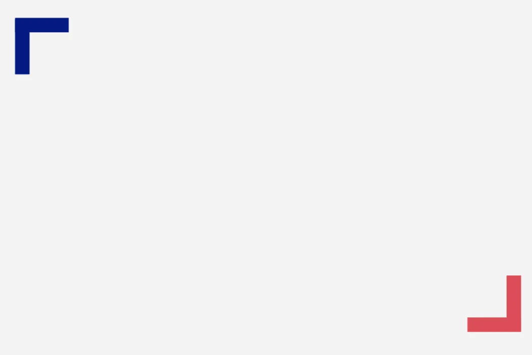
absolute的方法来定位两个红色部分,并且它们可以相对于具有位置设置为relative的类为box的div进行定位。
.box {
  background-color: gray;
  height: 400px;
  width: 400px;
  position: relative;
}

.top-left {
  position: absolute;
  top: 10px;
  left: 10px;
  border-left: 10px solid darkblue;
  border-top: 10px solid darkblue;
  height: 30px;
  width: 30px;
}

.bottom-right {
  position: absolute;
  bottom: 10px;
  right: 10px;
  border-bottom: 10px solid red;
  border-right: 10px solid red;
  height: 30px;
  width: 30px;
}<div class="box">
<div class="top-left"></div>
<div class="bottom-right"></div>
</div>:before和:after。
在CSS中,::before创建一个伪元素,它是所选元素的第一个子元素。通常用于为具有内容属性的元素添加装饰性内容。默认情况下它是内联的。
在CSS中,::after创建一个伪元素,它是所选元素的最后一个子元素。通常用于为具有内容属性的元素添加装饰性内容。默认情况下它是内联的。
div {
    position: relative;
    width: 100px;
    height: 100px;
    margin: 20px;
    background: grey;
}
div:before {
    display: block;
    content: "";
    width: 20px;
    height: 20px;
    position: absolute;
    top: 5px;
    left: 5px;
    border-top: 5px solid blue;
    border-left: 5px solid blue;
}
div:after {
    display: block;
    content: "";
    width: 20px;
    height: 20px;
    position: absolute;
    bottom: 5px;
    right: 5px;
    border-bottom: 5px solid red;
    border-right: 5px solid red;
}<div></div>无需额外元素或伪元素,您可以轻松使用多重背景实现:
.box {
  height: 200px;
  width: 400px;
  background:
   linear-gradient(red,red)   0 0,
   linear-gradient(red,red)   0 0,
   linear-gradient(blue,blue) 100% 100%,
   linear-gradient(blue,blue) 100% 100%,
  #ccc;
 padding:5px;
 background-size:80px 20px,20px 80px;
 background-origin:content-box;
 background-repeat:no-repeat;
}<div class="box">
</div>