有没有一种方法在CSS中创建交替颜色的虚线边框?
.twoColourBorder {
  border: 2px dashed red, blue;
}
编辑1
也许是堆叠的虚线边框(白,红,白,蓝)?(参考链接)
编辑2
最好不要;但是我需要考虑边框图片吗?
编辑3
倾向于使用渐变解决方案。仍在努力。
编辑4
Dylan指出stroke-dasharray或许可行。正在尝试。
有没有一种方法在CSS中创建交替颜色的虚线边框?
.twoColourBorder {
border: 2px dashed red, blue;
}
编辑1
也许是堆叠的虚线边框(白,红,白,蓝)?(参考链接)
编辑2
最好不要;但是我需要考虑边框图片吗?
编辑3
倾向于使用渐变解决方案。仍在努力。
编辑4
Dylan指出stroke-dasharray或许可行。正在尝试。
:root {
--border-size: 2px;
--box-width: 36em;
--box-height: 8em;
--dash-size: 1em;
}
.box,
.box::after {
height: var(--box-height);
width: var(--box-width);
border: solid;
}
.box {
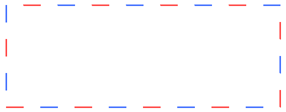
border-image: repeating-linear-gradient( to right, red 0, red var(--dash-size), transparent var(--dash-size), transparent calc(var(--dash-size) * 2), blue calc(var(--dash-size) * 2), blue calc(var(--dash-size) * 3), transparent calc(var(--dash-size) * 3), transparent calc(var(--dash-size) * 4));
border-image-slice: 16;
border-image-width: var(--border-size) 0;
}
.box::after {
content: "";
top: 0;
position: absolute;
border-image: repeating-linear-gradient( to bottom, blue 0, blue var(--dash-size), transparent var(--dash-size), transparent calc(var(--dash-size) * 2), red calc(var(--dash-size) * 2), red calc(var(--dash-size) * 3), transparent calc(var(--dash-size) * 3), transparent calc(var(--dash-size) * 4));
border-image-slice: 16;
border-image-width: 0 var(--border-size);
}<div class="box"></div>.boxborder-me {
box-shadow: 0 0 0 5px red;
outline: dashed 5px blue;
height: 100px;
}<div class="boxborder-me"></div>这应该对你有所帮助。
.box {
    padding: 1rem;
    border: 5px solid transparent;
    border-image: 16 repeating-linear-gradient(-45deg, red 0, red 1em, transparent 0, transparent 2em,
                  #58a 0, #58a 3em, transparent 0, transparent 4em);

    max-width: 20em;
    font: 100%/1.6 Baskerville, Palatino, serif;
}<div class="box" />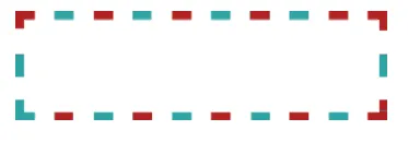
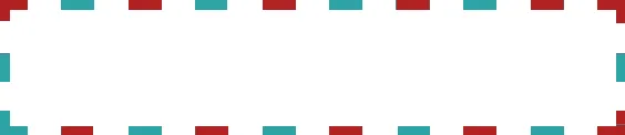
我知道这并不完美,肯定存在更好的答案!(我时间紧迫无法回答)把这个看作一个概念证明,你可以通过使用以下方法实现你想要的外观:
#multiColor {
 height: 100px;
 width: 340px;

 border: solid 5px;
 border-image: url('../../../assets/images/border.png') 10 / 10px round;
}
编辑
经过更多的研究,我开始研究svg stroke-dasharray,并想出了一些可能有助于我们达到最终解决方案的东西:
https://jsfiddle.net/wtcmpx98/52/
<svg viewbox="0 0 200 150" xmlns="http://www.w3.org/2000/svg" version="1.1">
  <rect class="red"/>
  <rect class="blue"/>
  <rect class="white"/>
  <!--<rect class="white-2"/>-->
</svg>


svg {
 top: 10px;
 left: 10px;

 fill: none;
 width: 500px;
 height: 500px;
}

.red,
.blue,
.white {
 x: 10px;
 y: 10px;

 height: 150px;
 width: 150px;
}

.red {
 stroke: red;
 stroke-width: 5;
 stroke-dasharray: 0,0,0;
}

.white {
 stroke: white;
 stroke-width: 6px;
 stroke-dasharray: 5,5,5;
}

.blue {
 stroke: blue;
 stroke-width: 5;
 stroke-dasharray: 10,10,10;
}

.white-2 {
 stroke: white;
 stroke-width: 6px;
 stroke-dasharray: 15,15,15;
}
<div>中使用background: linear-gradient(),共使用16个绝对定位的<div>。它还有些粗糙--当调整大小时,角落不是完美的。
拖动矩形的右下角以调整大小
* {
  padding: 0;
  margin: 0;
}

.box {
  position: relative;
  width: 30vw;
  height: 50vh;
  padding: 4px;
  margin: 25vh auto;
  resize: both;
  overflow: auto;
}

.box div {
  position: absolute;
}

.n {
  width: 25%;
  height: 4px;
  background: linear-gradient(to right, rgba(255, 0, 0, 1) 0%, rgba(255, 0, 0, 1)33%, rgba(255, 255, 255, 1) 33%, rgba(255, 255, 255, 1) 66%, rgba(0, 0, 255, 1) 66%, rgba(0, 0, 255, 1) 100%) repeat 10% 100%;
  top: 0;
}

.e {
  width: 4px;
  height: 25%;
  background: linear-gradient(to bottom, rgba(255, 0, 0, 1) 0%, rgba(255, 0, 0, 1)33%, rgba(255, 255, 255, 1) 33%, rgba(255, 255, 255, 1) 66%, rgba(0, 0, 255, 1) 66%, rgba(0, 0, 255, 1) 100%) repeat 100% 10%;
  right: 0;
}

.s {
  width: 25%;
  height: 4px;
  background: linear-gradient(to left, rgba(255, 0, 0, 1) 0%, rgba(255, 0, 0, 1)33%, rgba(255, 255, 255, 1) 33%, rgba(255, 255, 255, 1) 66%, rgba(0, 0, 255, 1) 66%, rgba(0, 0, 255, 1) 100%) repeat 10% 100%;
  bottom: 0;
}

.w {
  width: 4px;
  height: 25%;
  background: linear-gradient(to top, rgba(255, 0, 0, 1) 0%, rgba(255, 0, 0, 1)33%, rgba(255, 255, 255, 1) 33%, rgba(255, 255, 255, 1) 66%, rgba(0, 0, 255, 1) 66%, rgba(0, 0, 255, 1) 100%);
  left: 0;
}

.r1 {
  right: 0
}

.r2 {
  right: 25%
}

.r3 {
  right: 50%
}

.r4 {
  right: 75%
}

.b1 {
  bottom: 0
}

.b2 {
  bottom: 25%
}

.b3 {
  bottom: 50%
}

.b4 {
  bottom: 75%
}

.l1 {
  left: 0
}

.l2 {
  left: 25%
}

.l3 {
  left: 50%
}

.l4 {
  left: 75%
}

.t1 {
  top: 0
}

.t2 {
  top: 25%
}

.t3 {
  top: 50%
}

.t4 {
  top: 75%
}<div class='box'>
<div class='n r1'></div>
<div class='n r2'></div>
<div class='n r3'></div>
<div class='n r4'></div>
<div class='e b1'></div>
<div class='e b2'></div>
<div class='e b3'></div>
<div class='e b4'></div>
<div class='s l1'></div>
<div class='s l2'></div>
<div class='s l3'></div>
<div class='s l4'></div>
<div class='w t1'></div>
<div class='w t2'></div>
<div class='w t3'></div>
<div class='w t4'></div>
</div>