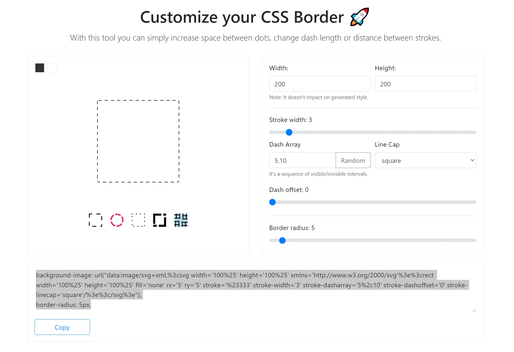
我在我的盒子中使用了虚线样式的边框,例如:
.box {
    width: 300px;
    height: 200px;
    border: dotted 1px #f00;
    float: left;
}
我想增加边框每个点之间的间距。
这个技巧适用于水平和垂直边框:
/*Horizontal*/
background-image: linear-gradient(to right, black 33%, rgba(255,255,255,0) 0%);
background-position: bottom;
background-size: 3px 1px;
background-repeat: repeat-x;

/*Vertical*/
background-image: linear-gradient(black 33%, rgba(255,255,255,0) 0%);
background-position: right;
background-size: 1px 3px;
background-repeat: repeat-y;
您可以使用background-size来调整大小,并使用线性渐变百分比来调整比例。在此示例中,我有一个由1像素点和2像素间距组成的虚线。
这样,您也可以使用多个背景来拥有多个虚线边框。
请在JSFiddle中尝试它,或查看代码片段示例:
div {
  padding: 10px 50px;
}
.dotted {
  border-top: 1px #333 dotted;
}
.dotted-gradient {
  background-image: linear-gradient(to right, #333 40%, rgba(255, 255, 255, 0) 20%);
  background-position: top;
  background-size: 3px 1px;
  background-repeat: repeat-x;
}
.dotted-spaced {
  background-image: linear-gradient(to right, #333 10%, rgba(255, 255, 255, 0) 0%);
  background-position: top;
  background-size: 10px 1px;
  background-repeat: repeat-x;
}
.left {
  float: left;
  padding: 40px 10px;
  background-color: #F0F0DA;
}
.left.dotted {
  border-left: 1px #333 dotted;
  border-top: none;
}
.left.dotted-gradient {
  background-image: linear-gradient(to bottom, #333 40%, rgba(255, 255, 255, 0) 20%);
  background-position: left;
  background-size: 1px 3px;
  background-repeat: repeat-y;
}
.left.dotted-spaced {
  background-image: linear-gradient(to bottom, #333 10%, rgba(255, 255, 255, 0) 0%);
  background-position: left;
  background-size: 1px 10px;
  background-repeat: repeat-y;
}<div>no
<br>border</div>
<div class='dotted'>dotted
<br>border</div>
<div class='dotted-gradient'>dotted
<br>with gradient</div>
<div class='dotted-spaced'>dotted
<br>spaced</div>
<div class='left'>no
<br>border</div>
<div class='dotted left'>dotted
<br>border</div>
<div class='dotted-gradient left'>dotted
<br>with gradient</div>
<div class='dotted-spaced left'>dotted
<br>spaced</div>我在最近的一个项目中使用了一个技巧,可以实现几乎任何我想要的水平边框。每次需要水平边框时,我使用 <hr/> 标签。添加水平边框的基本方法如下:
hr {border-bottom: 1px dotted #000;}
但是如果你想控制边框,例如增加点之间的间距,你可以尝试类似这样的方法:
hr {
height:14px; /* specify a height for this hr */
overflow:hidden;
}
而在接下来的内容中,您可以创建自己的边框(这里使用点的示例)
hr:after {
content:".......................................................................";
letter-spacing: 4px; /* Use letter-spacing to increase space between dots*/
}
这也意味着您可以向点、渐变等添加text-shadow。您想要的任何东西...
对于水平边框,它确实非常有效。如果您需要垂直边框,可以为另一个hr指定类,并使用CSS3 旋转属性。
这个例子使用了标准的CSS边框以及伪元素和overflow:hidden。在这个例子中,你可以得到三种不同的2像素虚线边框:正常,像5像素那样间隔,像10像素那样间隔。实际上只有10-8=2像素是可见的。
div.two{border:2px dashed #FF0000}

div.five:before {
  content: "";
  position: absolute;
  border: 5px dashed #FF0000;
  top: -3px;
  bottom: -3px;
  left: -3px;
  right: -3px;
}

div.ten:before {
  content: "";
  position: absolute;
  border: 10px dashed #FF0000;
  top: -8px;
  bottom: -8px;
  left: -8px;
  right: -8px;
}

div.odd:before {left:0;right:0;border-radius:60px}

div {
  overflow: hidden;
  position: relative;


  text-align:center;
  padding:10px;
  margin-bottom:20px;
}<div class="two">Kupo nuts here</div>
<div class="five">Kupo nuts<br/>here</div>
<div class="ten">Kupo<br/>nuts<br/>here</div>
<div class="ten odd">Kupo<br/>nuts<br/>here</div>应用于具有大圆角的小元素可能会产生一些有趣的效果。
      hovered
      ? ''
      : css`
        overflow: hidden;
        position: relative;
        ::before {
          content: '';
          position: absolute;
          border: 7px dashed ${Colors.primary50};
          top: -6px;
          bottom: -6px;
          left: -6px;
          right: -6px;
        }
    `}```
- halecommarachel所以从给出的答案开始,应用CSS3允许多个设置的事实——以下代码对于创建完整的框非常有用:
#border {
  width: 200px;
  height: 100px;
  background: yellow;
  text-align: center;
  line-height: 100px;

  background: linear-gradient(to right, orange 50%, transparent 0%) top repeat-x,
    linear-gradient(blue 50%, transparent 0%) right repeat-y,
    linear-gradient(to right, green 50%, transparent 0%) bottom repeat-x,
    linear-gradient(red 50%, transparent 0%) left repeat-y;
  background-size: 10px 1px, 1px 10px;
}<div id="border">
bordered area
</div>参见MDN文档,了解可用的border-style值:
- none:无边框,将宽度设置为0。 这是默认值。
除了这些选择之外,没有办法影响标准边框的样式。
如果上述内容不符合您的要求,您可以使用CSS3的border-image,但请注意,这在浏览器中的支持仍然有很多问题(编辑:浏览器支持情况截至2020年已经很好)。
radial-gradient。此外,使用Ukuser32的答案,可以轻松地将点属性重复应用于所有四个边框。只有角落不完美。
div {
    padding: 1em;
    background-image:
        radial-gradient(circle at 2.5px, #000 1.25px, rgba(255,255,255,0) 2.5px),
        radial-gradient(circle, #000 1.25px, rgba(255,255,255,0) 2.5px),
        radial-gradient(circle at 2.5px, #000 1.25px, rgba(255,255,255,0) 2.5px),
        radial-gradient(circle, #000 1.25px, rgba(255,255,255,0) 2.5px);
    background-position: top, right, bottom, left;
    background-size: 15px 5px, 5px 15px;
    background-repeat: repeat-x, repeat-y;
}<div>Some content with round, spaced dots as border</div>radial-gradient 期望:
在这里,我想要一个直径为5像素(2.5像素半径)的点,点之间距离是直径的2倍(10像素),总共15像素。 background-size 应该与此相匹配。
两个停止点的定义使得点变得平滑:半径的一半为纯黑色,然后渐变到完整半径。
使用 @Eagorajose 的简写语法基于其答案构建 4 边解决方案:
background: linear-gradient(to right, #000 33%, #fff 0%) top/10px 1px repeat-x, /* top */
linear-gradient(#000 33%, #fff 0%) right/1px 10px repeat-y, /* right */
linear-gradient(to right, #000 33%, #fff 0%) bottom/10px 1px repeat-x, /* bottom */
linear-gradient(#000 33%, #fff 0%) left/1px 10px repeat-y; /* left */
#page {
    background: linear-gradient(to right, #000 33%, #fff 0%) top/10px 1px repeat-x, /* top */
    linear-gradient(#000 33%, #fff 0%) right/1px 10px repeat-y, /* right */
    linear-gradient(to right, #000 33%, #fff 0%) bottom/10px 1px repeat-x, /* bottom */
    linear-gradient(#000 33%, #fff 0%) left/1px 10px repeat-y; /* left */

    width: 100px;
    height: 100px;
}<div id="page"></div>这是一个很老的问题,但在Google中排名很高,所以我将提供我的方法,这取决于您的需求。
在我的情况下,我想要一个具有最小间隔的粗虚线边框。 我使用了CSS图案生成器(比如这个:http://www.patternify.com/)来创建一个10像素宽,1像素高的图案。其中9像素是实线颜色,1像素是白色。
在我的CSS中,我将该图案作为背景图像,并使用background-size属性进行缩放。 我最终得到了一个20像素乘2像素的重复虚线,其中18像素是实线,2像素是白色。 您甚至可以将其缩放更大,以获得非常粗的虚线。
好处是,由于图像被编码为数据,因此您没有额外的HTTP请求,因此没有性能负担。 我将我的图像存储为SASS变量,以便在我的网站上重用它。
border:1px dashed black)只会使文件大小为40 kB。 - Marecky