如何创建具有渐变的虚线边框?

5

enter image description here

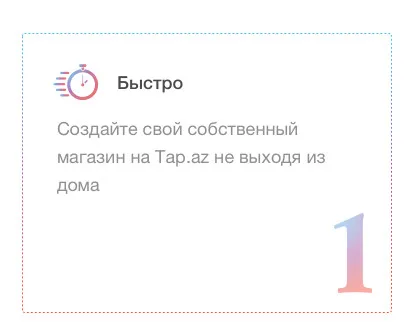
我需要创建一个像这张图片中的虚线边框渐变。以下是我的CSS代码。

.Rectangle-5 {
  margin: 51px 0px 0px 35px;
  display: inline-block;
  width: 370px;
  height: 280px;
  border-radius: 3px;
  border: 1px dashed;
  border-image-source: linear-gradient(to bottom, #4fc3f7, #ab5ca4 49%, #ff512f);
  border-image-slice: 1;
}
2个回答

9

新答案

这是一个改进版的初始答案,代码更少。思路是依赖于多个背景,并调整每个背景的background-clip

.container {
  display:inline-block;
  height: 200px;
  width: 200px;
  margin: 20px;
  border-radius:3px;
  border: 2px dotted #fff;
  background:
   linear-gradient(#fff 0 0) padding-box,
   linear-gradient(to bottom, #4fc3f7, #ab5ca4 49%, #ff512f) border-box; 
}
.alt {
  border: 2px dashed #fff;
}
<div class="container">

</div>

<div class="container alt">

</div>


旧答案

您可以将linear-gradient应用为外部容器的背景,然后在内部容器上使用点状虚线边框。根据您的需求,您必须使用白色作为边框的颜色,并且作为内容的背景,如下所示:

.container {
  display:inline-block;
  height: 200px;
  width: 200px;
  margin: 20px;
  background-image: linear-gradient(to bottom, #4fc3f7, #ab5ca4 49%, #ff512f);
}

.inner {
  border: 2px dotted #fff;
  height: calc(100% - 4px);
}
.inner-alt {
  border: 2px dashed #fff;
  height: calc(100% - 4px);
}

.content {
  background: #fff;
  height: 100%;
}
<div class="container">
  <div class="inner">
    <div class="content"></div>
  </div>
</div>

<div class="container">
  <div class="inner-alt">
    <div class="content"></div>
  </div>
</div>

您需要注意内部容器的高度。它应该是100%,但不要忘记边框在计算中,这就是为什么我使用了calc(100% - 4px)(上下边框各2像素)。

因此,如果您更改边框高度值,则还需要相应更新高度。


@DuuudeXX8 VXp 的本意是将边框的点状属性简单地改为虚线。这几乎是一样的,只是外观上有所不同。你可以试一试,就会看到区别了。 - Temani Afif
@TemaniAfif 如果我们使用内部类并设置边框:border: 1px dashed #fff,我们将得到与图片完全相同的结果。 - Randall
1
@DuuudeXX8 是的,正如我所评论的,两者都可以正确。这只取决于外观(顺便说一下,我更新了答案来说明这一点)。我只关注使用背景然后边框的技巧 ;) - Temani Afif

-1
请在您的CSS中添加以下规则。
.Rectangle-5{
  border: 2px dotted #fff;
  background: linear-gradient(#fff,#fff) padding-box,
   linear-gradient(92.35deg, #3370fe 1.28%, #00e599 98.95%) border-box;
}

1
目前你的回答不够清晰,请[编辑]以添加更多细节,帮助其他人理解它如何回答问题。你可以在帮助中心找到有关如何编写好答案的更多信息。 - Community

网页内容由stack overflow 提供, 点击上面的
可以查看英文原文,
原文链接