基于Thomas的评论和jbaums的答案,我提供以下解决方案。
- 我使用了jbaums的方法来绘制坐标轴,因为我不想要plotrix提供的未中断的圆形网格。
- 我没有使用jbaums的方法来绘制圆圈,因为那个圆圈有波浪线/颠簸的线条。
- 我两次调用
par(new = TRUE),因为jbaums的答案中的比例是真实比例的十分之一,而我无法弄清如何调整。
- 我手动放置了标签,但我对此并不满意。
- 还有很多多余的代码在里面,但我将其保留以便有人想使用它来开发自己的版本。
以下是代码:
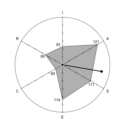
R <- 95
I <- 93
A <- 121
S <- 111
E <- 114
C <- 80
dimensions <- c("R", "I", "A", "S", "E", "C")
values <- c(R, I, A, S, E, C)
RIASEC <- data.frame(
"standard.values" = values,
"RIASEC" = dimensions
)
person.typ <- paste(
head(
RIASEC[
with(
RIASEC,
order(-standard.values)
),
]$RIASEC,
3
),
collapse = ""
)
vi1 <- 0
vi2 <- I
va1 <- 0.8660254 * A
va2 <- 0.5 * A
vs1 <- 0.8660254 * S
vs2 <- -0.5 * S
ve1 <- 0
ve2 <- -E
vc1 <- -0.8660254 * C
vc2 <- -0.5 * C
vr1 <- -0.8660254 * R
vr2 <- 0.5 * R
vek1 <- va1 + vi1 + vr1 + vc1 + ve1 + vs1
vek2 <- vr2 + vi2 + va2 + vs2 + ve2 + vc2
vektor <- sqrt(vek1^2 + vek2^2)
if (vek1 == 0) {tg <- 0} else {tg <- vek2 / vek1}
wink <- atan(tg) * 180 / pi
if (vek1 > 0) {
winkel <- 90 - wink
} else if (vek1 == 0) {
if (vek2 >= 0) {winkel <- 360}
else if (vek2 < 0) {winkel <- 180}
} else if (vek1 < 0) {
if (vek2 <= 0) {winkel <- 270 - wink}
else if (vek2 >= 0) {winkel <- 270 - wink}
}
library(plotrix)
axis.angle <- c(0, 60, 120, 180, 240, 300)
axis.rad <- axis.angle * pi / 180
value.length <- values - 70
dev.new(width = 5, height = 5)
radial.plot(value.length, axis.rad, labels = dimensions, start = pi-pi/6, clockwise=TRUE,
rp.type="p", poly.col = "grey", show.grid = TRUE, grid.col = "transparent", radial.lim = c(0,60))
radial.plot.labels(value.length + c(4, 2, -2, 1, 1, 4), axis.rad, radial.lim = c(0,60), start = pi-pi/6, clockwise = TRUE, labels = values, pos = c(1,2,3,1,2,1))
get.coords <- function(a, d, x0=0, y0=0) {
a <- ifelse(a <= 90, 90 - a, 450 - a)
data.frame(x = x0 + d * cos(a / 180 * pi), y = y0+ d * sin(a / 180 * pi) )
}
par(new = TRUE)
plot(NA, xlim = c(-6, 6), ylim=c(-6, 6), type='n', xlab='', ylab='', asp = 1,
axes=FALSE, new = FALSE, bg = "transparent")
circumf.pts <- get.coords(seq(60, 360, 60), 6)
segments(circumf.pts$x[1:3], circumf.pts$y[1:3],
circumf.pts$x[4:6], circumf.pts$y[4:6])
ticks.locs <- lapply(seq(60, 360, 60), get.coords, d=1:6)
ticks <- c(apply(do.call(rbind, ticks.locs[c(1, 4)]), 1, function(x)
get.coords(150, c(-0.1, 0.1), x[1], x[2])),
apply(do.call(rbind, ticks.locs[c(2, 5)]), 1, function(x)
get.coords(30, c(-0.1, 0.1), x[1], x[2])),
apply(do.call(rbind, ticks.locs[c(3, 6)]), 1, function(x)
get.coords(90, c(-0.1, 0.1), x[1], x[2])))
lapply(ticks, function(x) segments(x$x[1], x$y[1], x$x[2], x$y[2]))
par(new = TRUE)
plot(NA, xlim = c(-60, 60), ylim=c(-60, 60), type='n', xlab='', ylab='', asp = 1,
axes=FALSE, new = FALSE, bg = "transparent")
segments(0, 0, vek1, vek2, lwd=3)
points(vek1, vek2, pch=20, cex=2)
symbols(c(0, 0, 0), c(0, 0, 0), circles = c(60, 2, 1.3), inches = FALSE, add = TRUE, fg = c("black", "white", "black"), bg = c("transparent", "white", "black"))
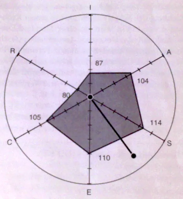
这里是图示:
radial.plot函数。 - Thomas