CSS同心圆与环绕“行星”的实现方法

3

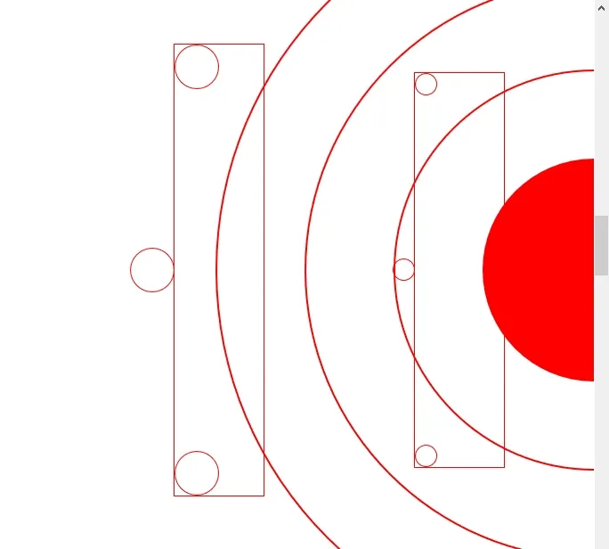
我正在尝试使用CSS渲染一个“太阳系”图表,使用CSS边框半径、边框和一些变换很容易绘制同心圆,但我正在尝试找到一种方法使小的“行星”固定在“轨道”或彩色边框上。一定有更精确的方法来实现这一点。

如果您查看这个图片,您会看到我想做什么:

enter image description here

目前的效果如下,对于内联样式感到抱歉...

enter image description here

<div style="width:100%; height:100vh; padding:0px; background-color:white; display:flex; flex-direction:column; position:relative; align-items:flex-end;">
        <div style="width:250px; height:250px; position:absolute; border-radius:50%; background-color:red; top:50%; transform:translateY(-50%) translateX(50%);  right:0px"></div>
        <div style="width:450px; height:450px; position:absolute; border-radius:50%; border:2px solid red; top:50%; transform:translateY(-50%) translateX(50%);  right:0px"></div>
        <div style="width:650px; height:650px; position:absolute; border-radius:50%; border:2px solid red; top:50%; transform:translateY(-50%) translateX(50%);  right:0px"></div>
        <div style="width:850px; height:850px; position:absolute; border-radius:50%; border:2px solid red; top:50%; transform:translateY(-50%) translateX(50%);  right:0px"></div>
        <div style="position:absolute; height:70%; width:100px; top:50%; transform:translateY(-50%); right:15%; outline:1px solid red;">
            <div style="width:25px; height:25px; border-radius:50%; border:1px solid red; position:absolute; top:0px; left:0px;"></div>
            <div style="width:25px; height:25px; border-radius:50%; border:1px solid red; position:absolute; transform:translateY(-50%); top:50%; right:100%;"></div>
            <div style="width:25px; height:25px; border-radius:50%; border:1px solid red; position:absolute; bottom:0px; left:0px;"></div>
        </div>
        <div style="position:absolute; height:80%; width:100px; top:50%; transform:translateY(-50%); right:55%; outline:1px solid red;">
            <div style="width:50px; height:50px; border-radius:50%; border:1px solid red; position:absolute; top:0px; left:0px;"></div>
            <div style="width:50px; height:50px; border-radius:50%; border:1px solid red; position:absolute; transform:translateY(-50%); top:50%; right:100%;"></div>
            <div style="width:50px; height:50px; border-radius:50%; border:1px solid red; position:absolute; bottom:0px; left:0px;"></div>
        </div>
    </div>


1
如果你的轨道行星半径为r,轨道圆的直径为d,则制作一个宽度和高度均为(d + r/2)的盒子。将你的行星放置在盒子内,位置为x:50%,y:0,然后旋转外部盒子。盒子应该居中于圆圈上。 - Liftoff
1
以下是与我的上一条评论相关的示例代码:https://jsfiddle.net/tyLg48sx/ - Liftoff
2个回答

4

由于涉及到圆形,您可以依靠旋转,只需要知道距离中心的距离(半径)。您还可以通过使用更少的元素来优化同心圆。

以下是一个示例,我将使用CSS变量轻松控制每个元素。请注意,变换的顺序很重要(我们使用平移进行居中,然后旋转,再次平移)

.orbit{
  width:150px;
  height:150px;
  padding:30px;
  border-radius:50%;
  background:red content-box;
  border:1px solid red; /*1st orbit at 105px (30px + 150px/2) */
  margin:auto;
  position:relative;
}
/* 2nd at 135px  */
.orbit:before,
.orbit:after{
   content:"";
   position:absolute;
   top: var(--o,-30px);
   bottom: var(--o,-30px);
   left: var(--o,-30px);
   right: var(--o,-30px);
   border:inherit;
   border-radius:inherit
}
/* 3rd orbit at 165px*/
.orbit:after {
  --o:-60px;
}
.orbit span {
  position:absolute;
  z-index:1;
  height:20px;
  width:20px;
  background:blue;
  border-radius:inherit;
  top:50%;
  left:50%;
  transform:translate(-50%,-50%) rotate(var(--r,0deg)) translateX(var(--d,0px));
}
body {
  margin:0;
  height:100vh;
  display:flex;
}
<div class="orbit">
    <span style="--d:105px;--r:80deg"></span>
    <span style="--d:105px;--r:120deg"></span>
    <span style="--d:105px;--r:-80deg"></span>
    <span style="--d:135px;--r:80deg;height:30px;width:30px;background:green"></span>
    <span style="--d:135px;--r:-90deg;height:30px;width:30px;background:green"></span>
    <span style="--d:165px;--r:-45deg"></span>
    <span style="--d:165px;--r:200deg;height:50px;width:50px;background:purple"></span>
</div>

另一种更优化的无透明度代码:

.orbit{
  width:150px;
  height:150px;
  padding:30px;
  border-radius:50%;
  background:red content-box;
  border:1px solid red;
  box-shadow:
    0 0 0 29px #fff,
    0 0 0 30px red,
    0 0 0 59px #fff,
    0 0 0 60px red;
  margin:auto;
  position:relative;
}

.orbit span {
  position:absolute;
  height:20px;
  width:20px;
  background:blue;
  border-radius:inherit;
  top:50%;
  left:50%;
  transform:translate(-50%,-50%) rotate(var(--r,0deg)) translateX(var(--d,0px));
}
body {
  margin:0;
  height:100vh;
  display:flex;
}
<div class="orbit">
    <span style="--d:105px;--r:80deg"></span>
    <span style="--d:105px;--r:120deg"></span>
    <span style="--d:105px;--r:-80deg"></span>
    <span style="--d:135px;--r:80deg;height:30px;width:30px;background:green"></span>
    <span style="--d:135px;--r:-90deg;height:30px;width:30px;background:green"></span>
    <span style="--d:165px;--r:-45deg"></span>
    <span style="--d:165px;--r:200deg;height:50px;width:50px;background:purple"></span>
</div>


0

你也可以从阴影中绘制圆形,并将元素从一个远端旋转,因此你只需要考虑它的宽度:

例如:

html {
  display: flex;
  min-height: 100vh;
}
body {
  margin: auto;
}
ul,
li,
span {
  margin: 0;
  padding: 0;
}
li {
  position: absolute;
  color: gray;
  list-style-position: inside;
  font-size: 2.5vw;
  top: 0.2em;
  right:0.0em;
  line-height: 0;
  height:0;
  white-space: nowrap;
  transform-origin: center right;
  margin: -0.4vw 0;
}
span {
  position: absolute;
  color: black;
  transform: translate(-70%, 1.5em) rotate(0);
  font-size: 0.5em;
  color: tomato;
}

body {
  position: relative;
  width:0.4em;
  height:0.4em;
  border-radius: 50%;
  background:orange;
  box-shadow: 
  inset 0 0 0 5px orange,
    0 0 0 3vw     orange, 
    0 0 1vw 3vw   orange, 
    0 0 0 3vw     #333,
    0 0 0 6vw     #444, 
    0 0 0 6vw     blue, 
    0 0 0 6.2vw   blue,
    
    0 0 0 6.2vw   #333,
    0 0 0 7.5vw   #333, 
    0 0 0 7.5vw   blue, 
    0 0 0 7.7vw   blue, 
    
    0 0 0 7.75vw  #333,
    0 0 0 8.7vw   #222, 
    0 0 0 9.5vw   #222, 
    0 0 0 9.55vw  green, 
    0 0 0 9.7vw   green,
    
    0 0 0 9.75vw  #222, 
    0 0 0 11.5vw  #111,
    0 0 0 11.5vw  blue,
    0 0 0 11.7vw  blue,
    
    0 0 0 11.75vw  #222, 
    0 0 0 15.2vw  #111,
    0 0 0 15.2vw  blue,
    0 0 0 15.4vw  blue,
    
    0 0 0 15.45vw #222, 
    0 0 0 17.4vw  #111,
    0 0 0 17.4vw  blue,
    0 0 0 17.6vw  blue,
    
    0 0 0 17.65vw #222, 
    0 0 0 19.3vw  #111,
    0 0 0 19.3vw  blue,
    0 0 0 19.5vw  blue,
    
    0 0 0 19.55vw #222, 
    0 0 0 22.3vw  #111,
    0 0 0 22.3vw  blue,
    0 0 0 22.5vw  blue,
    
    0 0 0 100vw ;
}
li:nth-child(1) {
  width: 6.9vw;
  animation: rotate 1s -1s linear infinite ;
}
li:nth-child(1) span {
  animation: rotateName 1s -1s linear infinite ;
}
li:nth-child(2) {
  color:brown;
  width: 8.4vw;
  animation: rotate 1.5s -1.5s linear infinite ;
}
li:nth-child(2) span {
  animation: rotateName  1.5s -1.5s  linear infinite ;
}

li:nth-child(3) {
  color:rgb(0, 120, 212);
  width: 10.6vw;
  animation: rotate 2s 1s linear infinite ;
}
li:nth-child(3) span {
  animation: rotateName 2s  1s linear infinite ;
}

li:nth-child(4) {
  color:red;
  width: 12.5vw;
  animation: rotate 2.5s -2.5s linear infinite ;
}
li:nth-child(4) span {
  animation: rotateName  2.5s -2.5s  linear infinite ;
}
li:nth-child(5) {
  color:gold;
  width: 15.5vw;
  animation: rotate 3s -3s linear infinite ;
}
li:nth-child(5) span {
  animation: rotateName  3s -3s  linear infinite ;
}
li:nth-child(6) {
  color:turquoise;
  width: 17.5vw;
  animation: rotate 3.5s -3.5s linear infinite ;
}
li:nth-child(6) span {
  animation: rotateName  3.5s -3.5s  linear infinite ;
}
li:nth-child(7) {
  color:darkgreen;
  width: 19.5vw;
  animation: rotate 4s -4s linear infinite ;
}
li:nth-child(7) span {
  animation: rotateName  4s -4s  linear infinite ;
}
li:nth-child(8) {
  color:cyan;
  width: 22.5vw;
  animation: rotate 4.5s -4.5s linear infinite ;
}
li:nth-child(8) span {
  animation: rotateName  4.5s -4.5s  linear infinite ;
}

body:before {
  content:'SUN';
  position:absolute;
  font-size:1.5vw;
  transform:translate(-50%,-0.5em);
  color:red;text-shadow: 0 0 0.2em gold,0 0 0.2em gold,0 0 0.2em gold,0 0 0.2em gold,0 0 0.2em gold,0 0 0.2em gold,0 0 0.2em gold,0 0 0.2em gold,0 0 0.2em gold,0 0 0.2em gold,0 0 0.2em gold,0 0 0.2em gold,0 0 0.2em gold ;
}

 
@keyframes rotate {
  100% {transform:rotate(360deg)}
}
@keyframes rotateName {
   100%{transform: translate(-70%, 1.5em) rotate(-360deg)}
}
<ul>
  <li><span>Mercury</span></li>
  <li><span>Venus</span></li>
  <li><span>Earth</span></li>
  <li><span>Mars</span></li>
  <li><span>Jupiter</span></li>
  <li><span>Saturne</span></li>
  <li><span>Uranus</span></li>
  <li><span>Neptune</span></li>
</ul>

受到如何设置动画使元素在圆周上移动?的启发,第三个片段直观地展示了它的工作原理。

网页内容由stack overflow 提供, 点击上面的
可以查看英文原文,
原文链接