使用CSS实现行星环绕效果

4

我正在尝试制作一个像这张照片一样有环的行星

图片描述

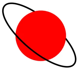
目前我是用一种看起来非常不干净的方法来实现。环 (椭圆) 是一个没有背景和黑色边框旋转的 div,我通过在顶部添加另外半个红色圆圈来实现环绕星球的效果。

下面是JSFiddle链接,以及演示代码:

.elipse {
  width: 300px;
  height: 105px;
  background: none;
  border-radius: 50%;
  -ms-transform: rotate(40deg);  /* IE 9 */
  -webkit-transform: rotate(40deg);  /* Safari */
  transform: rotate(40deg);
  position: absolute;
  left: 45px;
  top: 45px;
  border: 5px solid black;
}
.full-planet {
  height: 170px;
  width: 170px;
  border-radius: 170px 170px 170px 170px;
  -moz-border-radius: 170px 170px 170px 170px;
  -webkit-border-radius: 170px 170px 170px 170px;
  position: absolute;
  left: 120px;
  top: 20px;
  background: red;
}
.half-planet {
  height: 85px;
  width: 170px;
  border-radius: 170px 170px 0 0;
  -moz-border-radius: 170px 170px 0 0;
  -webkit-border-radius: 170px 170px 0 0;
  -ms-transform: rotate(40deg);  /* IE 9 */
  -webkit-transform: rotate(40deg);  /* Safari */
  transform: rotate(40deg);
  position: absolute;
  left: 147px;
  top: 30px;
  background: red;
}
.cont {
  padding-left: 100px;
  padding-top: 100px;
  position: relative;
  width: 0;
  height: 0;
}
<div class='container'>
  <div class="full-planet"></div>
  <div class='elipse'></div>
  <div class="half-planet"></div>
</div>

调整参数以获得良好的对齐效果非常麻烦。如果我需要更改一个参数,例如,我几乎必须更改其他所有参数才能保持对齐。有没有一种方法可以使这个过程更简单,不需要根据我的视觉不断调整参数?

我感觉有一种更简洁的方法。

2个回答

5

使用SVG:

对于这种效果/形状,我通常建议使用SVG,因为使用SVG绘制弧形要容易得多。SVG元素的z-index取决于它们在DOM中出现的顺序。所以更容易控制它们的顺序。SVG本质上也是响应式的。

您可以在此页面中找到有关如何使用SVG绘制椭圆弧的更多信息。

svg {
  width: 200px;
  height: 200px;
  margin: 20px;
}
<svg viewBox='0 0 130 130'>
  <path d='M0,78 a65,25 0 1 1 102.5,45' stroke='black' stroke-width='2' fill='transparent' transform='rotate(45,100,100)' />
  <circle cx='65' cy='65' r='45' fill='red' />
  <path d='M0,78 a65,25 0 1 0 102.5,45' stroke='black' stroke-width='2' fill='transparent' transform='rotate(45,100,100)' />
</svg>


使用CSS:

通过CSS创建这种效果会比较困难,很可能需要额外的元素才能实现。在你的代码中,你添加了一个额外的半圆形在上面使得部分环形在后面,而在我下面的代码片段中,我使用了一个低z-index的额外元素来实现环形的一部分。但是,几乎所有设置都使用了百分比,因此在更改时不需要修改太多参数。正如你可以看到代码输出的片段(悬停在形状上),它也相当灵敏。

.wrapper {
  position: relative;
  height: 200px;
  width: 200px;
}
.ring { /* produces the front part of the ring */
  position: absolute;
  height: 100%;
  width: 45%;
  left: 27.5%; /* half of 100% - width (to position in center) */
  border: 2px solid;
  border-color: black transparent black black;
  border-radius: 50%;
  transform: rotate(-45deg);
  z-index: 2; /* brings it forward */
}
.ring-behind { /* produces the part that goes behind */
  position: absolute;
  height: 100%;
  width: 45%;
  left: 27.5%; /* half of 100% - width (to position in center) */
  border: 2px solid;
  border-color: transparent black transparent transparent;
  border-radius: 50%;
  transform: rotate(-45deg);
  z-index: -1; /* sends it behind */
}
.planet {
  position: absolute;
  height: 75%;
  width: 75%;
  top: 12.5%; /* half of 100% - height (to position in middle) */
  left: 12.5%; /* half of 100% - width (to position in center) */
  border-radius: 50%;
  background: red;
  z-index: 1; /* above the back part of the ring but below the front */
}

/* just for demo */

.wrapper {
  transition: all 1s;
}
.wrapper:hover {
  height: 300px;
  width: 300px;
}
<div class='wrapper'>
  <div class='ring'></div>
  <div class='ring-behind'></div>
  <div class='planet'></div>
</div>


5

有一天事情会变得更容易...

CSS解决方案,应该是这样的(一个div用于行星,一个用于环,响应式标记等等...但只在Webkit中起作用)

.planet {
  width: 330px;
  height: 330px;
  background-color: lightgreen;
  border-radius: 50%;
  margin: 100px;
  position: relative;
  perspective: 1000px;
  transform-style: preserve-3d;
  box-shadow: inset green -20px -20px 70px;
}

.ring {
  width: 150%;
  height: 150%;
  border: solid 10px red;
  border-radius: 50%;
  top: -25%; 
  left: -25%; 
  position: absolute;
  transform: rotate3d(0.8, 0.2, 0, 75deg); 
  box-sizing: border-box;
}
<div class="planet">
<div class="ring"></div>
</div>


网页内容由stack overflow 提供, 点击上面的
可以查看英文原文,
原文链接