我尝试了一些在线解决方案,试图改变我的弹出框箭头的颜色。这是我的CSS代码,它在一个自己创建的popover.css文件中(其中的其他CSS都可以正常工作)。
popover.bottom .arrow::after {
    border-bottom-color: black !important;
}
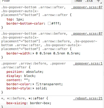
以下是DOM中应用的样式:
 最初的回答。
我尝试了一些在线解决方案,试图改变我的弹出框箭头的颜色。这是我的CSS代码,它在一个自己创建的popover.css文件中(其中的其他CSS都可以正常工作)。
popover.bottom .arrow::after {
border-bottom-color: black !important;
}
对于Bootstrap 5,请使用以下内容:
.popover .popover-arrow::before, .popover .popover-arrow::after {
    border-color: #FFA500 !important;  /* this example changes the arrow to orange color... You can always replace with any color you choose. */
    border-top-color: transparent !important;
    border-bottom-color: transparent !important;
}
不确定您使用的是哪个版本的bootstrap,但看起来您的选择器有些问题。在我的4.0版本中可以使用此方法(基于此例子:https://getbootstrap.com/docs/4.0/components/popovers/):
.arrow::after, .bs-popover-bottom .arrow::after {
    border-bottom-color: black !important;
}
    <style type="text/css">
        .popover {
            background: blue;
        }

        .popover.bs-popover-top .popover-arrow:after {
            border-top-color: blue;
        }

        .popover.bs-popover-end .popover-arrow:after {
            border-right-color: blue;
        }

        .popover.bs-popover-bottom .popover-arrow:after {
            border-bottom-color: blue;
        }

        .popover.bs-popover-start .popover-arrow:after {
            border-left-color: blue;
        }
    </style>
v5.1.1是有效的。请注意,根据您的环境,您可能需要清除浏览器缓存才能看到更改。 - undefined