更改Bootstrap弹出框的背景颜色

16

我想修改 Bootstrap 弹出框的 CSS 样式。我希望改变整个弹出框的背景色,而不仅仅是文本。

有什么建议吗?

http://bootply.com/110002

$(document).ready(function() {
  $("[rel='android']").popover({
    html: 'true', 
    content: '<div id="popOverBox">Coming March 2014</div>'
   });
});

CSS

(层叠样式表)
 #popOverBox {
     background: tomato;
     font-family: serif;
 }
7个回答

35

#popOverBox 不同,你应该将焦点放在 .popover 元素上。

这里有例子

.popover {
    background: tomato;
}

如果要更改箭头的背景(伪元素),您可以使用以下代码:

.popover.bottom .arrow:after {
    border-bottom-color: tomato;
}

1
上面的解决方案对我没有用,但是下面这个可以:.tooltip-inner { background-color: #D13127; color: #fff; } .tooltip.top .tooltip-arrow { border-top-color: #D13127; } - MCGRAW
2
尝试使用箭头,请使用.popover.top > .arrow:after { border-top-color: #111; } - ymakux
1
最好使用浏览器中的开发工具来检查元素,以查看箭头类别的使用情况。根据选项和弹出窗口的位置来确定所使用的类别。对于我来说,我使用了以下代码:.arrow::after, .bs-popover-top .arrow::after { bottom: 1px; border-top-color: #450909; } - Kyle Coots
这是一个不安全的网站示例。 - Lucas

4

在Bootstrap-4中改变弹出框背景和文本颜色

如果你使用sass-bootstrap-4,你可以很容易地通过改变一些变量的值来实现。

以下是_variables.scss文件中的变量:

$popover-inner-padding: 1px !default;
$popover-bg: #fff !default;
$popover-max-width: 276px !default;
$popover-border-width: $border-width !default;
$popover-border-color: rgba(0, 0, 0, .2) !default;
$popover-box-shadow: 0 5px 10px rgba(0, 0, 0, .2) !default;

$popover-title-bg: darken($popover-bg, 3%) !default;
$popover-title-padding-x: 14px !default;
$popover-title-padding-y: 8px !default;

$popover-content-padding-x: 14px !default;
$popover-content-padding-y: 9px !default;

$popover-arrow-width: 10px !default;
$popover-arrow-color: $popover-bg !default;

$popover-arrow-outer-width: ($popover-arrow-width + 1px) !default;
$popover-arrow-outer-color: fade-in($popover-border-color, .05) !default;

我使用$brand-info变量将它们更改为浅蓝色:
注意:最好将这些变量复制到您自己的custom.scss文件中,然后再进行更改。

$popover-inner-padding: 1px !default;
$popover-bg: #fff !default;
$popover-max-width: 276px !default;
$popover-border-width: $border-width !default;
$popover-border-color: $brand-info;
$popover-box-shadow: 0 5px 10px rgba(0, 0, 0, .2) !default;

$popover-title-bg: $brand-info;
$popover-title-padding-x: 14px !default;
$popover-title-padding-y: 8px !default;

$popover-content-padding-x: 14px !default;
$popover-content-padding-y: 9px !default;

$popover-arrow-width: 10px !default;
$popover-arrow-color: $popover-bg !default;

$popover-arrow-outer-width: ($popover-arrow-width + 1px) !default;
$popover-arrow-outer-color:$brand-info;
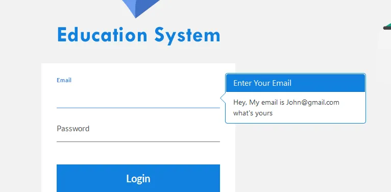
更改变量后的输出结果如下:

enter image description here。这与HTML标签保持一致。

3

.popover {background-color: tomato;}
.popover.bottom .arrow::after {border-bottom-color: tomato; }
.popover-content {background-color: tomato;}

3

时间总会过去的,我想报告一下我的个人解决方案,在LESS中(确实符合我的需求,但我认为对这里的一些人可能也有用)。将一个类添加到class="popover",比如class="popover popover-warning",然后在less中执行以下操作:

.popover-warning {
  background-color: #f0ad4e !important;
  & .arrow, .arrow:after {
    border-left-color: #f0ad4e !important;
    border-left-color: rgba(0, 0, 0, 0.25);
  }
  & .popover-content, .popover-title {
    background-color: #f0ad4e !important;
  }
}

希望这能帮到您。

0
请注意,如果您正在使用less或sass文件,则也可以执行以下操作:
@popover-bg: tomato;

这样就不用担心箭头在哪一边了。


0
自从Bootstrap 5.2.0版本以来,弹出框可以通过CSS变量进行自定义。另一个例子,请参阅文档中的自定义弹出框部分

new bootstrap.Popover(document.querySelector('[data-bs-toggle=popover]'));
<link href="https://cdn.jsdelivr.net/npm/bootstrap@5.3.0/dist/css/bootstrap.min.css" rel="stylesheet" integrity="sha384-9ndCyUaIbzAi2FUVXJi0CjmCapSmO7SnpJef0486qhLnuZ2cdeRhO02iuK6FUUVM" crossorigin="anonymous">
<script src="https://cdn.jsdelivr.net/npm/bootstrap@5.3.0/dist/js/bootstrap.bundle.min.js" integrity="sha384-geWF76RCwLtnZ8qwWowPQNguL3RmwHVBC9FhGdlKrxdiJJigb/j/68SIy3Te4Bkz" crossorigin="anonymous"></script>
<style>
.my-popover {
  --bs-popover-bg: dodgerblue;
  --bs-popover-body-color: #e7fc03;
  --bs-popover-header-bg: #fff;
}
</style>
<button class="btn btn-primary" 
  data-bs-toggle="popover" data-bs-custom-class="my-popover"
  data-bs-title="Popover Title"
  data-bs-content="This is the popover content.">
   Click for Popover
</button>


0

您可以更改弹出窗口的默认模板:

//Setup popover
node_el.popover(
    { title: 'Error',
        content: err_msg,
        trigger: 'focus',

        placement: 'top',
        template: '<div class="popover err" role="tooltip"><div class="arrow"></div><h3 class="popover-header text-danger"></h3><div class="popover-body text-danger"></div></div>'
    });

node_el.popover('show');

上面的示例中添加了CSS类'err'和'text-danger'。也可以添加用于背景颜色的CSS类...

网页内容由stack overflow 提供, 点击上面的
可以查看英文原文,
原文链接