我无法找到相关信息,但是我很难接受它是不可行的。
如何自定义弹出框的箭头?我已经尝试修改类.arrow等,但弹出框位置会被搞乱。
那么,正确的方法是什么?我找不到任何文档。
以下是我一直使用的类,但箭头看起来都是错的:
箭头应该指向红色正方形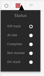
谢谢。
如何自定义弹出框的箭头?我已经尝试修改类.arrow等,但弹出框位置会被搞乱。
那么,正确的方法是什么?我找不到任何文档。
以下是我一直使用的类,但箭头看起来都是错的:
.popover {
    position: absolute;
    top: 0;
    left: 0;
    z-index: 1010;
    display: none;
    padding: 5px;
}

    .popover.top {
        margin-top: -5px;
    }

    .popover.right {
        margin-left: 5px;
    }

    .popover.bottom {
        margin-top: 5px;
    }

    .popover.left {
        margin-left: -5px;
    }

    .popover.top .arrow {
        bottom: 0;
        left: 50%;
        margin-left: -5px;
        border-left: 5px solid transparent;
        border-right: 5px solid transparent;
        border-top: 5px solid #000000;
    }

    .popover.right .arrow {
        top: 50%;
        left: 0;
        margin-top: -5px;
        border-top: 5px solid transparent;
        border-bottom: 5px solid transparent;
        border-right: 5px solid #000000;
    }

    .popover.bottom .arrow {
        top: 0px;
        left: 50%;
        margin-left: -5px;
        border-left: 9px solid transparent;
        border-right: 9px solid transparent;
        border-bottom: 19px solid #000000;
    }

    .popover.left .arrow {
        top: 50%;
        right: 0;
        margin-top: -5px;
        border-top: 5px solid transparent;
        border-bottom: 5px solid transparent;
        border-left: 5px solid #000000;
    }

    .popover .arrow {
        position: absolute;
        width: 0;
        height: 0;
    }

.popover-inner {
    padding: 3px;
    width: auto;
    overflow: hidden;
    background: #000000;
    background: rgba(0, 0, 0, 0.8);
    -webkit-box-shadow: 0 3px 7px rgba(0, 0, 0, 0.3);
    -moz-box-shadow: 0 3px 7px rgba(0, 0, 0, 0.3);
    box-shadow: 0 3px 7px rgba(0, 0, 0, 0.3);
}

.popover-title {
    padding: 9px 15px;
    line-height: 1;
    background-color: #252525;
    -webkit-border-radius: 3px 3px 0 0;
    -moz-border-radius: 3px 3px 0 0;
    border-radius: 3px 3px 0 0;
    background-color: rgba(37, 37, 37, 0.7);
    font-size: 14px;
    color: #7e7e7e;
}

.popover-content {
    padding: 14px;
    background-color: #252525;
    -webkit-border-radius: 0 0 3px 3px;
    -moz-border-radius: 0 0 3px 3px;
    border-radius: 0 0 3px 3px;
    -webkit-background-clip: padding-box;
    -moz-background-clip: padding-box;
    background-clip: padding-box;
    background-color: rgba(37, 37, 37, 0.7);
}

    .popover-content p, .popover-content ul, .popover-content ol {
        margin-bottom: 0;
    }

    .popover-content table {
        background: transparent;
    }

        .popover-content table td {
            border: 0px;
            background: transparent;
            color: #7e7e7e;
        }
箭头应该指向红色正方形
谢谢。
.popover和.arrow样式相关的CSS类来设置它们的样式。由于您没有提供您尝试的内容以及出现了什么问题,因此这就是我们能够提供的最好建议。 - Marc.popover.bottom .arrow不是你需要修改的样式吗?” - Marc