这是你想要的吗?
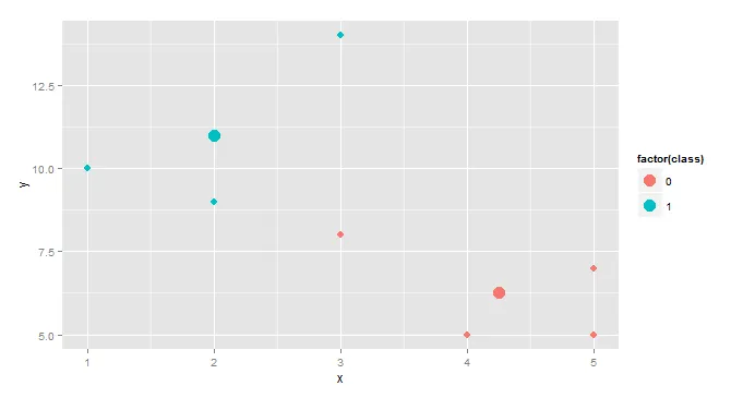
centroids <- aggregate(cbind(x,y)~class,df,mean)
ggplot(df,aes(x,y,color=factor(class))) +
  geom_point(size=3)+ geom_point(data=centroids,size=5)
这将创建一个名为centroids的单独数据框,它具有x、y和class列,其中x和y是按类别计算的均值。接着我们使用centroid作为数据集添加第二个点几何层。
这是一个略微有趣的版本,适用于聚类分析。
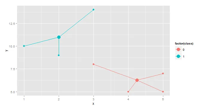
gg <- merge(df,aggregate(cbind(mean.x=x,mean.y=y)~class,df,mean),by="class")
ggplot(gg, aes(x,y,color=factor(class)))+geom_point(size=3)+
  geom_point(aes(x=mean.x,y=mean.y),size=5)+
  geom_segment(aes(x=mean.x, y=mean.y, xend=x, yend=y))
编辑 回应原帖评论。
可以使用geom_errorbar(...)和geom_errorbarh(...)添加垂直和水平误差线。
centroids <- aggregate(cbind(x,y)~class,df,mean)
f <- function(z)sd(z)/sqrt(length(z))
se <- aggregate(cbind(se.x=x,se.y=y)~class,df,f)
centroids <- merge(centroids,se, by="class")
ggplot(gg, aes(x,y,color=factor(class)))+
geom_point(size=3)+
geom_point(data=centroids, size=5)+
geom_errorbar(data=centroids,aes(ymin=y-se.y,ymax=y+se.y),width=0.1)+
geom_errorbarh(data=centroids,aes(xmin=x-se.x,xmax=x+se.x),height=0.1)
如果您想计算95%置信度而不是标准误差,请将
</p> 替换为:
f <- function(z)sd(z)/sqrt(length(z)) # function to calculate std.err
随着
f <- function(z) qt(0.025,df=length(z)-1, lower.tail=F)* sd(z)/sqrt(length(z))