在ggplotly散点图中添加自定义数据标签

5

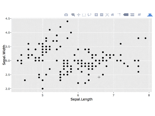
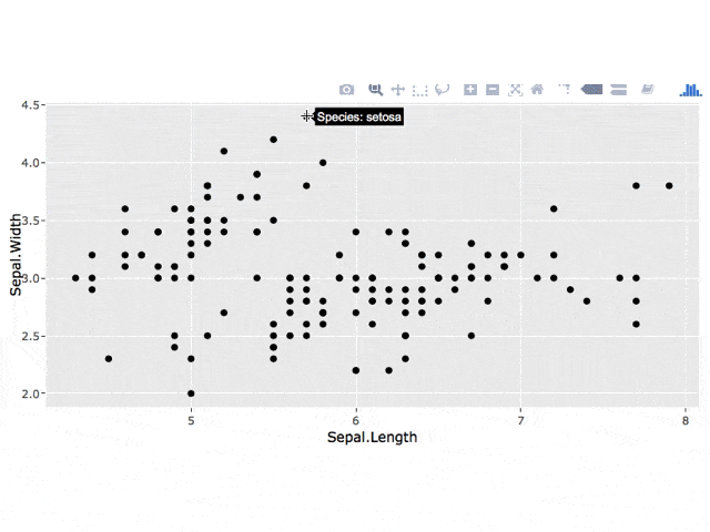
当光标悬停在数据点上时,我希望显示每个数据点的物种而不是x和y值。我使用鸢尾花数据集。此外,如果可能的话,我希望能够单击数据点使标签持久化,并且在选择绘图中的新位置时不会消失。基本上是标签问题,持久性问题是一个加分项。这是我的应用程序:

## Note: extrafont is a bit finnicky on Windows, 
## so be sure to execute the code in the order 
## provided, or else ggplot won't find the font

# Use this to acquire additional fonts not found in R
install.packages("extrafont");library(extrafont)
# Warning: if not specified in font_import, it will 
# take a bit of time to get all fonts
font_import(pattern = "calibri")
loadfonts(device = "win")

#ui.r
library(shiny)
library(ggplot2)
library(plotly)
library(extrafont)
library(ggrepel)
fluidPage(

  # App title ----
  titlePanel(div("CROSS CORRELATION",style = "color:blue")),

  # Sidebar layout with input and output definitions ----
  sidebarLayout(

    # Sidebar panel for inputs ----
    sidebarPanel(

      # Input: Select a file ----
      fileInput("file1", "Input CSV-File",
                multiple = TRUE,
                accept = c("text/csv",
                           "text/comma-separated-values,text/plain",
                           ".csv")),

      # Horizontal line ----
      tags$hr(),

      # Input: Checkbox if file has header ----
      checkboxInput("header", "Header", TRUE),

      # Input: Select separator ----
      radioButtons("sep", "Separator",
                   choices = c(Comma = ",",
                               Semicolon = ";",
                               Tab = "\t"),
                   selected = ","),


      # Horizontal line ----
      tags$hr(),

      # Input: Select number of rows to display ----
      radioButtons("disp", "Display",
                   choices = c(Head = "head",
                               All = "all"),
                   selected = "head")


    ),
    # Main panel for displaying outputs ----
    mainPanel(

      tabsetPanel(type = "tabs",
                  tabPanel("Table",
                           shiny::dataTableOutput("contents")),
                  tabPanel("Correlation Plot",
                           tags$style(type="text/css", "
           #loadmessage {
                                      position: fixed;
                                      top: 0px;
                                      left: 0px;
                                      width: 100%;
                                      padding: 5px 0px 5px 0px;
                                      text-align: center;
                                      font-weight: bold;
                                      font-size: 100%;
                                      color: #000000;
                                      background-color: #CCFF66;
                                      z-index: 105;
                                      }
                                      "),conditionalPanel(condition="$('html').hasClass('shiny-busy')",
                                                          tags$div("Loading...",id="loadmessage")
                                      ),
                           fluidRow(
                             column(3, uiOutput("lx1")),
                           column(3,uiOutput("lx2"))),
                           hr(),
                           fluidRow(
                             tags$style(type="text/css",
                                        ".shiny-output-error { visibility: hidden; }",
                                        ".shiny-output-error:before { visibility: hidden; }"
                             ),
                           column(3,uiOutput("td")),
                           column(3,uiOutput("an"))),
                           fluidRow(
                           plotlyOutput("sc"))
      ))
  )))
#server.r
function(input, output) {


  output$contents <- shiny::renderDataTable({

    iris
  })


  output$lx1<-renderUI({
    selectInput("lx1", label = h4("Select 1st Expression Profile"), 
                choices = colnames(iris[,1:4]), 
                selected = "Lex1")
  })
  output$lx2<-renderUI({
    selectInput("lx2", label = h4("Select 2nd Expression Profile"), 
                choices = colnames(iris[,1:4]), 
                selected = "Lex2")
  })

  output$td<-renderUI({
    radioButtons("td", label = h4("Trendline"),
                 choices = list("Add Trendline" = "lm", "Remove Trendline" = ""), 
                 selected = "")
  })

  output$an<-renderUI({

    radioButtons("an", label = h4("Correlation Coefficient"),
                 choices = list("Add Cor.Coef" = cor(subset(iris, select=c(input$lx1)),subset(iris, select=c(input$lx2))), "Remove Cor.Coef" = ""), 
                 selected = "")
  })  


 output$sc<-renderPlotly({

   p1 <- ggplot(iris, aes_string(x = input$lx1, y = input$lx2))+

     # Change the point options in geom_point
     geom_point(color = "darkblue") +
     # Change the title of the plot (can change axis titles
     # in this option as well and add subtitle)
     labs(title = "Cross Correlation") +
     # Change where the tick marks are
     scale_x_continuous(breaks = seq(0, 2.5, 30)) +
     scale_y_continuous(breaks = seq(0, 2.5, 30)) +
     # Change how the text looks for each element
     theme(title = element_text(family = "Calibri", 
                                size = 10, 
                                face = "bold"), 
           axis.title = element_text(family = "Calibri Light", 
                                     size = 16, 
                                     face = "bold", 
                                     color = "darkgrey"), 
           axis.text = element_text(family = "Calibri", 
                                    size = 11))+
     theme_bw()+
     geom_smooth(method = input$td)+
     annotate("text", x = 10, y = 10, label = as.character(input$an))
   ggplotly(p1) %>%
     layout(hoverlabel = list(bgcolor = "white", 
                              font = list(family = "Calibri", 
                                          size = 9, 
                                          color = "black")))

 }) 


}
1个回答

12

1. 工具提示

您可以按照此处所述的方法以多种方式更改工具提示。要在工具提示中仅显示物种,可以使用以下代码:

library(ggplot2)
library(plotly)
p1 <- ggplot(iris, aes_string(x = "Sepal.Length", 
                                y = "Sepal.Width",
                                key = "Species")) +
      geom_point()
ggplotly(p1, source = "select", tooltip = c("key"))

2. 持久标签

我不确定如何在单击时将 plotly 工具提示留在点上,但是您可以使用 plotly 单击事件 获取单击的点,然后向您的 ggplot 添加一个 geom_text 图层。

3. 最小示例

我已经修改了您的代码,以创建一个更简单的示例。通常,如果您创建一个 最小示例 并删除不需要重新创建问题的应用程序部分(例如更改字体),这将很有帮助。

library(shiny)
library(plotly)
library(ggplot2)

ui <- fluidPage(
  plotlyOutput("iris")
)

server <- function(input, output, session) {
  output$iris <- renderPlotly({
      # set up plot
      p1 <- ggplot(iris, aes_string(x = "Sepal.Length", 
                                    y = "Sepal.Width",
                                    key = "Species")) +
          geom_point()

      # get clicked point
      click_data <- event_data("plotly_click", source = "select")
      # if a point has been clicked, add a label to the plot
      if(!is.null(click_data)) {
          label_data <- data.frame(x = click_data[["x"]],
                                   y = click_data[["y"]],
                                   label = click_data[["key"]],
                                   stringsAsFactors = FALSE)
         p1 <- p1 + 
             geom_text(data = label_data,
                       aes(x = x, y = y, label = label),
                       inherit.aes = FALSE, nudge_x = 0.25)
      }
      # return the plot
      ggplotly(p1, source = "select", tooltip = c("key"))
  })
  }

shinyApp(ui, server)

enter image description here

编辑:保留所有标签

您可以使用reactiveValues将每个点击存储在反应式数据框中,并将此数据框用于您的geom_text图层。

library(shiny)
library(plotly)
library(ggplot2)

ui <- fluidPage(
    plotlyOutput("iris")
)

server <- function(input, output, session) {
    # 1. create reactive values
    vals <- reactiveValues()
    # 2. create df to store clicks
    vals$click_all <- data.frame(x = numeric(),
                                y = numeric(),
                                label = character())
    # 3. add points upon plot click
    observe({
        # get clicked point
        click_data <- event_data("plotly_click", source = "select")
        # get data for current point
        label_data <- data.frame(x = click_data[["x"]],
                                 y = click_data[["y"]],
                                 label = click_data[["key"]],
                                 stringsAsFactors = FALSE)
        # add current point to df of all clicks
        vals$click_all <- merge(vals$click_all,
                                label_data, 
                                all = TRUE)
    })
    output$iris <- renderPlotly({
        # set up plot
        p1 <- ggplot(iris, aes_string(x = "Sepal.Length", 
                                      y = "Sepal.Width",
                                      key = "Species")) +
            geom_point() + 
            # 4. add labels for clicked points
            geom_text(data = vals$click_all,
                      aes(x = x, y = y, label = label),
                      inherit.aes = FALSE, nudge_x = 0.25)
        # return the plot
        ggplotly(p1, source = "select", tooltip = c("key"))
    })
}

shinyApp(ui, server)

enter image description here


1
这是一个非常有帮助的杰出答案。是否可能在单击后保留所显示的值,而不是在选择另一个位置时消失?我将编辑我的初始帖子,以便清楚表达,因为我理解我描述的方式可能会引起困惑。 - firmo23
@firmo23 很高兴能帮忙!我已经更新了我的答案并提供了一个选项。如果它对你有用,请告诉我。 - Hallie Swan
您的代码似乎在这个数据集上运行正常,但是当我尝试将其应用于我的实际数据集时,出现了奇怪的错误。具体来说,我无法生成geom_smooth。而最近之前我是可以的。我在谈论我的实际数据集,因为我可以使用鸢尾花数据集生成。我想知道是否可以私下联系您。再次感谢。 - firmo23
我创建了一个新的问题,可能有助于解决 https://stackoverflow.com/questions/49502917/trendline-cannot-be-displayed-after-putting-observer-in-my-shiny-app - firmo23
另一个问题是,当地图最初被创建时,我会得到用线连接的点,但在更新后,线会消失。 - firmo23

网页内容由stack overflow 提供, 点击上面的
可以查看英文原文,
原文链接