增加R iGraph中顶点之间的间距

4
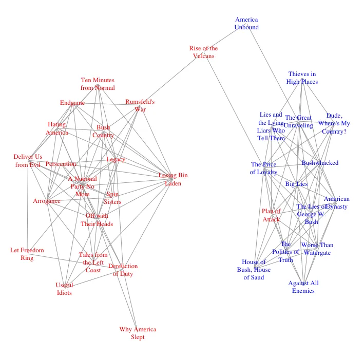
我正在使用R和igraph可视化亚马逊上一些政治书籍的购买情况。我已经得到了一个网络图,显示了某些书籍的位置,表明它们不仅被与相同政治观点的其他书籍一起购买。下面是这张图:

我的问题是,由于一些紧密的聚类中有太多书籍,标签很难辨认。我希望能够扩大这些聚类,同时不遮挡连接聚类的少数标题的中间位置。 有人有任何关于如何完成这个任务的想法吗? 为了生成这个图,我读入了这份数据作为一个gml文件,然后进行了以下操作:
g<-read.graph("data/polbooks/polbooks.gml", format=c("gml"))
V(g)$degree <- degree(g, mode="all")
cut.off <- mean(V(g)$degree)
sub <- induced_subgraph(g, which(V(g)$degree>cut.off))
plot(sub, vertex.shape="none", vertex.size=1,     
     vertex.label.color=ifelse(V(sub)$value=="l", "blue", "red"),   
     layout=layout_with_fr)

我尝试了几种内置布局,但没有一种能真正产生所需的效果。


当我运行你的代码时,出现了一个错误 Error in text.default(x, y, labels = labels, col = label.color, family = label.family, : zero-length 'labels' specified。我不确定问题是在我的端还是你的代码中有些东西丢失了。如果你启动一个干净的会话,你发布的代码是否能在你的系统上无误地运行? - eipi10
您IP地址为143.198.54.68,由于运营成本限制,当前对于免费用户的使用频率限制为每个IP每72小时10次对话,如需解除限制,请点击左下角设置图标按钮(手机用户先点击左上角菜单按钮)。 - fraxture
数据位置不是问题。如果我想到了解决方法,我会告诉你的。 - eipi10
谢谢,也许我们可以一起聊聊这个问题?很想知道你会采取什么方法。 - fraxture
1个回答

10
以下是我为了提高图表的可读性所做的尝试:
  1. 将过长的书名折行。

  2. 缩小字体大小。

  3. 设置种子,使布局可重现,允许您保留喜欢的“随机”布局。

  4. 使用来自另一个SO答案的图形布局代码以增加节点间距。

以下是实现方式:
## Function to wrap long strings
# Source: https://dev59.com/_2s05IYBdhLWcg3wPPaB#7367534
wrap_strings <- function(vector_of_strings,width){
  as.character(sapply(vector_of_strings, FUN=function(x){
                        paste(strwrap(x, width=width), collapse="\n")
                        }))
  }

# Apply the function to wrap the node labels
V(sub)$label = wrap_strings(V(sub)$label, 12)

## Shrink font
V(sub)$label.cex = 0.8

# Function to increase node separation (for explanatory details, see the link below)
# Source: https://dev59.com/rV4b5IYBdhLWcg3wxEGm#28722680
layout.by.attr <- function(graph, wc, cluster.strength=1,layout=layout.auto) {  
  g <- graph.edgelist(get.edgelist(graph)) # create a lightweight copy of graph w/o the attributes.
  E(g)$weight <- 1

  attr <- cbind(id=1:vcount(g), val=wc)
  g <- g + vertices(unique(attr[,2])) + igraph::edges(unlist(t(attr)), weight=cluster.strength)

  l <- layout(g, weights=E(g)$weight)[1:vcount(graph),]
  return(l)
}

## Make layout reproducible. Different values will produce different layouts,
##  but setting a seed will allow you to reproduce a layout if you like it.
set.seed(3)

现在让我们绘制图表:
plot(sub, vertex.shape="none", vertex.size=1,     
     vertex.label.color=ifelse(V(sub)$value=="l", "blue", "red"),
     layout=layout.by.attr(sub, wc=1))

enter image description here


非常好的回答。谢谢! - fraxture

网页内容由stack overflow 提供, 点击上面的
可以查看英文原文,
原文链接