很遗憾,我不知道如何使用默认工具完成它,但我用另一种方法来完成它,也许对你有帮助。
- 在您的小部件中创建
FocusNode和边框颜色的变量:
// Use it to change color for border when textFiled in focus
FocusNode _focusNode = FocusNode()
// Color for border
Color _borderColor = Colors.grey
- 在
initState内为textField创建监听器,如果textField处于焦点状态,将边框颜色更改为橙色,否则更改为灰色:
@override
void initState() {
super.initState();
_focusNode.addListener(() {
setState(() {
_borderColor = _focusNode.hasFocus ? Colors.orange : Colors.grey;
});
});
}
- 为
textField 创建带有边框的 Container,添加 focusNode 并设置装饰到 textField:
Container(
  decoration: BoxDecoration(
    border: Border.all(color: _borderColor),
    borderRadius: BorderRadius.circular(4),
  ),
  child: TextField(
    focusNode: _focusNode,
    style: TextStyle(color: Colors.grey),
    keyboardType: TextInputType.number,
    decoration: InputDecoration(
      contentPadding: EdgeInsets.zero,
      border: InputBorder.none,
      labelText: "Amount",
      prefixIconConstraints: BoxConstraints(minWidth: 0, minHeight: 0),
      prefixIcon: Padding(
        padding: EdgeInsets.symmetric(vertical: 18, horizontal: 8),
        child: Text("₦", style: TextStyle(fontSize: 16, color: Colors.grey)),
      ),
    ),
  ),
),
- 不要忘记为
focusNode调用dispose:
@override
void dispose() {
  _focusNode.dispose();
  super.dispose();
}
完整代码:
class TextFieldDesignPage extends StatefulWidget {
TextFieldDesignPage({Key? key}) : super(key: key);
@override
_TextFieldDesignPageState createState() => _TextFieldDesignPageState();
}
class _TextFieldDesignPageState extends State<TextFieldDesignPage> {
FocusNode _focusNode = FocusNode();
Color _borderColor = Colors.grey;
@override
void initState() {
super.initState();
_focusNode.addListener(() {
setState(() {
_borderColor = _focusNode.hasFocus ? Colors.orange : Colors.grey;
});
});
}
@override
void dispose() {
_focusNode.dispose();
super.dispose();
}
@override
Widget build(BuildContext context) {
return Scaffold(
body: Center(
child: Container(
margin: EdgeInsets.all(8),
decoration: BoxDecoration(
border: Border.all(color: _borderColor),
borderRadius: BorderRadius.circular(4),
),
child: TextField(
focusNode: _focusNode,
style: TextStyle(color: Colors.grey),
keyboardType: TextInputType.number,
decoration: InputDecoration(
contentPadding: EdgeInsets.zero,
border: InputBorder.none,
labelText: "Amount",
prefixIconConstraints: BoxConstraints(minWidth: 0, minHeight: 0),
prefixIcon: Padding(
padding: EdgeInsets.symmetric(vertical: 18, horizontal: 8),
child: Text("₦", style: TextStyle(fontSize: 16, color: Colors.grey)),
),
),
),
),
),
);
}
}
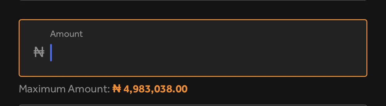
结果:

 这个
这个