经过一些研究,我想出了两种不同的解决方案。
必需:数据文件分割
这两种解决方案都需要将数据文件按列分类拆分成多个文件。因此,我创建了一个简短的ruby脚本,可以在此gist中找到:
https://gist.github.com/fiedl/6294424
使用此脚本的方法是:要将数据文件data.csv拆分为data.Category1.csv 和 data.Category2.csv,请运行以下命令:
# bash
ruby categorize_csv.rb --column 2 data.csv

# data.csv
# year   category   num_of_events_for_A   num_of_events_for_B
"2011";"Category1";"213";"30"
"2011";"Category2";"240";"28"
"2012";"Category1";"222";"13"
"2012";"Category2";"238";"42"
...

# data.Category1.csv
# year   category   num_of_events_for_A   num_of_events_for_B
"2011";"Category1";"213";"30"
"2012";"Category1";"222";"13"
...

# data.Category2.csv
# year   category   num_of_events_for_A   num_of_events_for_B
"2011";"Category2";"240";"28"
"2012";"Category2";"238";"42"
...
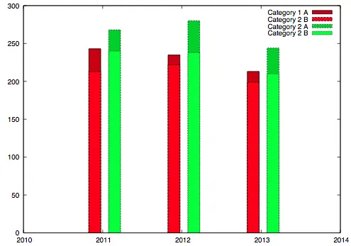
解决方案1:堆叠箱形图
策略:每个类别一个数据文件。每个堆栈一个列。通过使用 gnuplot 的 "with boxes" 参数手动绘制直方图的条形。
优点:完全灵活,可以自由调整条形大小、帽子、颜色等。
缺点:必须手动放置条形。
# solution1.gnuplot
reset
set terminal postscript eps enhanced 14

set datafile separator ";"

set output 'stacked_boxes.eps'

set auto x
set yrange [0:300]
set xtics 1

set style fill solid border -1

num_of_categories=2
set boxwidth 0.3/num_of_categories
dx=0.5/num_of_categories
offset=-0.1

plot 'data.Category1.csv' using ($1+offset):($3+$4) title "Category 1 A" linecolor rgb "#cc0000" with boxes, \
     ''                   using ($1+offset):3 title "Category 2 B" linecolor rgb "#ff0000" with boxes, \
     'data.Category2.csv' using ($1+offset+dx):($3+$4) title "Category 2 A" linecolor rgb "#00cc00" with boxes, \
     ''                   using ($1+offset+dx):3 title "Category 2 B" linecolor rgb "#00ff00" with boxes
结果看起来像这样:
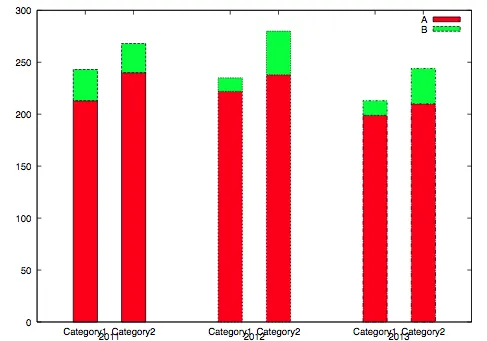
方案二:本机 Gnuplot 直方图
策略:每年一个数据文件。每个堆栈一列。使用 gnuplot 的常规直方图机制生成直方图。
优点:更易于使用,因为不需要手动定位。
缺点:由于所有类别都在一个文件中,每个类别的颜色都相同。
reset
set terminal postscript eps enhanced 14
set datafile separator ";"
set output 'histo.eps'
set yrange [0:300]
set style data histogram
set style histogram rowstack gap 1
set style fill solid border -1
set boxwidth 0.5 relative
plot newhistogram "2011", \
'data.2011.csv' using 3:xticlabels(2) title "A" linecolor rgb "red", \
'' using 4:xticlabels(2) title "B" linecolor rgb "green", \
newhistogram "2012", \
'data.2012.csv' using 3:xticlabels(2) title "" linecolor rgb "red", \
'' using 4:xticlabels(2) title "" linecolor rgb "green", \
newhistogram "2013", \
'data.2013.csv' using 3:xticlabels(2) title "" linecolor rgb "red", \
'' using 4:xticlabels(2) title "" linecolor rgb "green"
结果看起来像这样:
参考资料