TL;DR
使用渐变时,图像的大小就是元素的大小。 border-image-width 将定义我们放置切片的 9 个区域(如果未定义,则使用 border-width)。border-image-slice 将考虑初始图像以创建切片。无单位值被视为像素值,百分比值针对元素的大小进行解析。
为了获得完美的结果,我们应该让切片等于区域,为此,当不使用单位时,我们需要将 border-image-slice 设为 border-image-width(或 border-width)。使用百分比时,计算出的值应该相同。
在您的情况下,切片中的 80 表示 80px,并且您有一个边框为 5em,即 5x16px = 80px。
让我们来看一个简单的例子。
div {
  width: 100px;
  height: 100px;
  display: inline-block;
  border: 10px solid transparent;
}

div.box {
  background: repeating-linear-gradient(45deg, #000, #000 5px, transparent 5px, transparent 10px) border-box, red;
}

div.border {
  border-image: repeating-linear-gradient(45deg, #000, #000 5px, transparent 5px, transparent 10px) 50 fill;
  border-image-width: 50px;
  background: red;
}
<div class="box"></div>

<div class="border"></div>
在上面的例子中,我尝试使用不同的技术(背景和边框)创建具有相同输出的两个 div。请注意,在第二个示例中,我使用了关键字
fill并指定了一个与边框宽度不同的边框图像宽度,并使用了与该边框宽度相等的切片。
请注意,在切片中的
50在这里被视为像素,因为我们正在处理非矢量图像(渐变)。
引用:
数字代表图像中的像素(如果图像是光栅图像)或向量坐标(如果图像是矢量图像)。
ref
让我们删除
fill关键字:
div {
  width: 100px;
  height: 100px;
  display: inline-block;
  border: 10px solid transparent;
}

div.box {
  background: repeating-linear-gradient(45deg, #000, #000 5px, transparent 5px, transparent 10px) border-box, red;
}

div.border {
  border-image: repeating-linear-gradient(45deg, #000, #000 5px, transparent 5px, transparent 10px) 50;
  border-image-width: 50px;
  background: red;
}
<div class="box"></div>

<div class="border"></div>
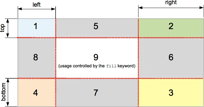
如果存在fill关键字,则导致border-image的中间部分被保留。(默认情况下,它会被丢弃,即视为空。)ref
默认情况下,边框图像不会在中间绘制,而只会在边框上绘制。从示例中我们可以清楚地看到,每个侧面都有50px,我们的自定义边框也由border-image-width定义。
如果我们没有指定border-image-width,则默认值为1,这意味着:
数字表示相应计算的border-width的倍数。
因此,我们要么明确指定border-image-width,要么简单地使用border-width作为参考。在大多数情况下,只需要border-width,因为在大多数情况下,我们只想覆盖边框区域,而不是更多。
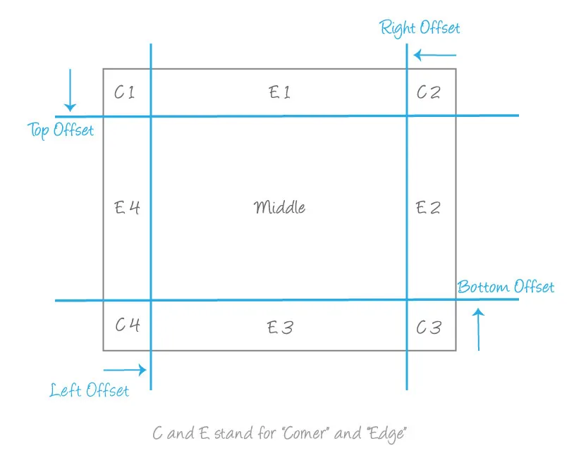
现在,切片将图像分成9个部分:
这个属性指定了图像顶部、右侧、底部和左侧边缘的内部偏移量,将其分为九个区域:
四个角落、
四条边缘和一个
中心。
 ref
ref
以下是更好地展示我们示例操作的步骤:
div {
  width: 100px;
  height: 100px;
  border: solid 10px transparent;
  display: inline-block;
  position: relative;
}

div:before {
  content: "";
  position: absolute;
  top: -10px;
  left: -10px;
  right: -10px;
  bottom: -10px;
  background:
    linear-gradient(green,green) left 0 top    50px/100% 1px no-repeat,
    linear-gradient(green,green) left 0 bottom 50px/100% 1px no-repeat,
    linear-gradient(green,green) top 0 left  50px/1px 100% no-repeat,
    linear-gradient(green,green) top 0 right 50px/1px 100% no-repeat;
}

div.box {
  background: repeating-linear-gradient(45deg, #000, #000 5px, transparent 5px, transparent 10px) border-box, red;
}

div.border {
  border-image: repeating-linear-gradient(45deg, #000, #000 5px, transparent 5px, transparent 10px) 50;
  border-image-width: 50px;
  background: red;
}
<div class="box"></div>

<div class="border"></div>
左侧图像是我们分成九个部分的原始图像,然后我们将每个部分放置在右侧九个区域中。中间的那个是空的,因为我们没有使用
fill。在这个例子中,我们不会注意到任何问题,因为切片适合区域。
现在让我们将切片减少到
25:
div {
  width: 100px;
  height: 100px;
  border: solid 10px transparent;
  display: inline-block;
  position: relative;
}

div.box:before {
  content: "";
  position: absolute;
  top: -10px;
  left: -10px;
  right: -10px;
  bottom: -10px;
  background:
    linear-gradient(blue,blue) left 0 top    25px/100% 1px no-repeat,
    linear-gradient(blue,blue) left 0 bottom 25px/100% 1px no-repeat,
    linear-gradient(blue,blue) top 0 left  25px/1px 100% no-repeat,
    linear-gradient(blue,blue) top 0 right 25px/1px 100% no-repeat;
}

div.border:before {
  content: "";
  position: absolute;
  top: -10px;
  left: -10px;
  right: -10px;
  bottom: -10px;
  background:
    linear-gradient(green, green) left 0 top 50px/100% 1px no-repeat,
    linear-gradient(green, green) left 0 bottom 50px/100% 1px no-repeat,
    linear-gradient(green, green) top 0 left 50px/1px 100% no-repeat,
    linear-gradient(green, green) top 0 right 50px/1px 100% no-repeat;
}

div.box {
  background: repeating-linear-gradient(45deg, #000, #000 5px, transparent 5px, transparent 10px) border-box, red;
}

div.border {
  border-image: repeating-linear-gradient(45deg, #000, #000 5px, transparent 5px, transparent 10px) 25;
  border-image-width: 50px;
  background: red;
}
<div class="box"></div>

<div class="border"></div>
这有点棘手,但逻辑相同。从左边的图像中,我们从每个侧面削减
25px,以获得我们将放置在右侧图像中的 9 个部分,其中边框宽度仍为相同的 (
50px)。您可以清晰地看到角落中的部分是如何简单缩放和边缘变形的。
在每个角落中,我们使用一个
25px 25px 的图像放在一个
50px 50px 的区域内,例如在顶部边缘中,我们使用一个
60px 25px 的图像放在一个
10px 50px 的区域内。
您还可以定义每个侧面的不同值,以获得以下效果:
div {
  width: 100px;
  height: 100px;
  border: solid 10px transparent;
  display: inline-block;
  position: relative;
}

div.box:before {
  content: "";
  position: absolute;
  top: -10px;
  left: -10px;
  right: -10px;
  bottom: -10px;
  background:
    linear-gradient(blue, blue) left 0 top 20px/100% 1px no-repeat,
    linear-gradient(blue, blue) left 0 bottom 30px/100% 1px no-repeat,
    linear-gradient(blue, blue) top 0 left 20px/1px 100% no-repeat,
    linear-gradient(blue, blue) top 0 right 60px/1px 100% no-repeat;
}

div.border:before {
  content: "";
  position: absolute;
  top: -10px;
  left: -10px;
  right: -10px;
  bottom: -10px;
  background:
    linear-gradient(green, green) left 0 top 50px/100% 1px no-repeat,
    linear-gradient(green, green) left 0 bottom 50px/100% 1px no-repeat,
    linear-gradient(green, green) top 0 left 50px/1px 100% no-repeat,
    linear-gradient(green, green) top 0 right 50px/1px 100% no-repeat;
}

div.box {
  background: repeating-linear-gradient(45deg, #000, #000 5px, transparent 5px, transparent 10px) border-box, red;
}

div.border {
  border-image: repeating-linear-gradient(45deg, #000, #000 5px, transparent 5px, transparent 10px);
  border-image-slice: 20 60 20 30;
  border-image-width: 50px;
  background: red;
}
<div class="box"></div>

<div class="border"></div>
现在我们更清楚地知道如何切割图像,然后通过缩放和拉伸将它们放入不同的区域。显然,最好的值是将所有边上的切片大小都等于边框宽度
border-width,这在你的示例中是成立的,因为
5em等于
5x16px = 80px,因此切片大小为
80。
从规范中我们还可以读到:
边框图像切片值给出的区域可能会重叠。但是,如果右侧和左侧宽度之和等于或大于图像的宽度,则顶部和底部边缘以及中间部分的图像为空,这与为这些部分指定非空透明图像具有相同的效果。对于上下值也是类似的。
如果您指定的左右切片大于图像宽度,那么逻辑上您将无法放置在顶部/底部/中间部分的任何内容:
div {
  width: 100px;
  height: 100px;
  border: solid 10px transparent;
  display: inline-block;
  position: relative;
}

div.box:before {
  content: "";
  position: absolute;
  top: -10px;
  left: -10px;
  right: -10px;
  bottom: -10px;
  background:
    linear-gradient(blue, blue) left 0 top 20px/100% 1px no-repeat,
    linear-gradient(blue, blue) left 0 bottom 30px/100% 1px no-repeat,
    linear-gradient(blue, blue) top 0 left 60px/1px 100% no-repeat,
    linear-gradient(blue, blue) top 0 right 60px/1px 100% no-repeat;
}

div.border:before {
  content: "";
  position: absolute;
  top: -10px;
  left: -10px;
  right: -10px;
  bottom: -10px;
  background:
    linear-gradient(green, green) left 0 top 50px/100% 1px no-repeat,
    linear-gradient(green, green) left 0 bottom 50px/100% 1px no-repeat,
    linear-gradient(green, green) top 0 left 50px/1px 100% no-repeat,
    linear-gradient(green, green) top 0 right 50px/1px 100% no-repeat;
}

div.box {
  background: repeating-linear-gradient(45deg, #000, #000 5px, transparent 5px, transparent 10px) border-box, red;
}

div.border {
  border-image: repeating-linear-gradient(45deg, #000, #000 5px, transparent 5px, transparent 10px);
  border-image-slice: 20 60 20 60;
  border-image-width: 50px;
  background: red;
}
<div class="box"></div>

<div class="border"></div>
同样的逻辑也适用于顶部/底部。
以下是一个例子,我们只会有角落:
div {
  width: 100px;
  height: 100px;
  border: solid 10px transparent;
  display: inline-block;
  position: relative;
}

div.box:before {
  content: "";
  position: absolute;
  top: -10px;
  left: -10px;
  right: -10px;
  bottom: -10px;
  background:
    linear-gradient(blue, blue) left 0 top 20px/100% 1px no-repeat,
    linear-gradient(blue, blue) left 0 bottom 100px/100% 1px no-repeat,
    linear-gradient(blue, blue) top 0 left 60px/1px 100% no-repeat,
    linear-gradient(blue, blue) top 0 right 60px/1px 100% no-repeat;
}

div.border:before {
  content: "";
  position: absolute;
  top: -10px;
  left: -10px;
  right: -10px;
  bottom: -10px;
  background:
    linear-gradient(green, green) left 0 top 50px/100% 1px no-repeat,
    linear-gradient(green, green) left 0 bottom 50px/100% 1px no-repeat,
    linear-gradient(green, green) top 0 left 50px/1px 100% no-repeat,
    linear-gradient(green, green) top 0 right 50px/1px 100% no-repeat;
}

div.box {
  background: repeating-linear-gradient(45deg, #000, #000 5px, transparent 5px, transparent 10px) border-box, red;
}

div.border {
  border-image: repeating-linear-gradient(45deg, #000, #000 5px, transparent 5px, transparent 10px);
  border-image-slice: 20 60 100 60;
  border-image-width: 50px;
  background: red;
}
<div class="box"></div>

<div class="border"></div>
使用百分比值也会得到相同的结果。我们只需要找到参考点,由于我们正在处理渐变,因此渐变的大小就是元素的大小。在我们的示例中,
50的一部分等于
41.666%,因为宽度/高度等于
100px 2 * 10px = 120px。
div {
  width: 100px;
  height: 100px;
  border: solid 10px transparent;
  display: inline-block;
  position: relative;
}

div:before {
  content: "";
  position: absolute;
  top: -10px;
  left: -10px;
  right: -10px;
  bottom: -10px;
  background:
    linear-gradient(blue, blue) left 0 top 50px/100% 1px no-repeat,
    linear-gradient(blue, blue) left 0 bottom 50px/100% 1px no-repeat,
    linear-gradient(blue, blue) top 0 left 50px/1px 100% no-repeat,
    linear-gradient(blue, blue) top 0 right 50px/1px 100% no-repeat;
}


div.box {
  background: repeating-linear-gradient(45deg, #000, #000 5px, transparent 5px, transparent 10px) border-box, red;
}

div.border {
  border-image: repeating-linear-gradient(45deg, #000, #000 5px, transparent 5px, transparent 10px) 41.666%;
  border-image-width: 50px;
  background: red;
}
<div class="box"></div>

<div class="border"></div>