如何使用border-image和linear-gradient设置多彩边框?

3

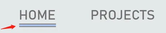
尝试制作如下图所示的多色底部边框,但失败了。

multi color bottom border

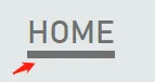
尝试使用 border-image: linear-gradient(),但没有成功。它只得到一个颜色:#707070

only got one color bottom border

a {
  color: #707070 !important;
  font-size: 20px;
  text-decoration: none;
  margin-right: 50px;
  border-bottom: 5px solid;
  border-image: linear-gradient(to bottom, #707070 20%, #a4c0e9 20%, #a4c0e9 80%, #707070 80%) 5;
}
<div id="nav">
  <a href="/">HOME</a>
  <a href="/projects">PROJECTS</a>
  <a href="/resume">RESUME</a>
</div>

2个回答

3
问题在于百分比相对于元素而不是边框,这会使20%5px大。
您需要考虑像素值。 您还需要从底部开始,因为顶部参考点也是元素的顶部:

a {
  color: #707070 !important;
  font-size: 20px;
  text-decoration: none;
  margin-right: 50px;
  border-bottom: 5px solid;
  border-image: 
    linear-gradient(to top, #707070 1px, #a4c0e9 1px, #a4c0e9 4px, #707070 4px) 5;
}
<a>A link element</a>

或者将其用作背景,这样更容易处理:

a {
  color: #707070 !important;
  font-size: 20px;
  text-decoration: none;
  margin-right: 50px;
  border-bottom: 5px solid transparent;
  background: 
    linear-gradient(to bottom, #707070 20%, #a4c0e9 20%, #a4c0e9 80%, #707070 80%) bottom/100% 5px border-box no-repeat;
}
<a>A link element</a>

相关内容:渐变边框图片的边框图像切片


以下是一个示例,更好地说明了你所遇到的问题:

.box {
  width:100px;
  height:100px;
  display:inline-block;
  border-bottom:10px solid rgba(0,0,0,0.2);

}
<div class="box" style="background:linear-gradient(to bottom, #707070 20%, #a4c0e9 20%, #a4c0e9 80%, #707070 80%) border-box">
</div>

<div class="box" style="border-image:linear-gradient(to bottom, #707070 20%, #a4c0e9 20%, #a4c0e9 80%, #707070 80%) 10 fill">
</div>

<div class="box" style="border-image:linear-gradient(to bottom, #707070 20%, #a4c0e9 20%, #a4c0e9 80%, #707070 80%) 10 ">
</div>

在这个例子中,第一个框显示我们将要使用的渐变。在第二个框中,我们使用fill将其应用到边框上,同时也着色了中间区域,在最后一个框中,我们只着色了border-bottom

0

将您的代码或jsfiddle或codepen的链接发布出来总是很好的。您可以参考帮助部分如何提问?

在您的情况下,您展示的设计似乎不是渐变。我有一个实心颜色和边框。渐变可以用于边框上,您可以在这里看到:here

为了达到您展示的效果,我会使用 :after 和以下样式:

 a{
      position: relative;
      padding-bottom: 20px;

    &:after{
      position: absolute;
      content: '';
      height: 10px;
      width: 100%;
      left: 0;
      bottom: 0;
      background: #a4c0e9;
      border-top: 1px solid #707070;
      border-bottom: 1px solid #707070;
    }
    }

非常感谢,你的方法可能有效。但是我认为上面的border-image也可以工作,考虑到一个类似的情况:https://dev59.com/-lkT5IYBdhLWcg3wRNUR - Hai Na Zheng
在这些示例中,背景颜色(在您的情况下为#a4c0e9)来自单独的元素,并且它们仅在边框上应用渐变。 - Sebastian Devassy

网页内容由stack overflow 提供, 点击上面的
可以查看英文原文,
原文链接