如何同时使用text-shadow和linear-gradient来渲染文本?

4
我尝试同时使用它们,但失败了。

h1 {
  font-size: 72px;
  background: linear-gradient(to top, black 50%, orange 50%);
  -webkit-background-clip: text;
  -webkit-text-fill-color: transparent;
  text-shadow: -1px 0 black, 0 1px black, 1px 0 black, 0 -1px black;
}
<h1>Heading 1</h1>

仅使用linear-gradient而不用text-shadow: enter image description here

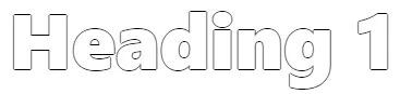
仅使用text-shadow而不用linear-gradient:
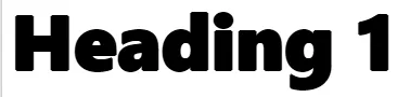
 enter image description here

同时使用两者: enter image description here


第二个,只有text-shadow的这个,会有阴影吗?我看只有1px,但是我不确定。如果你按F12并使用“选择元素”工具来选择它,它是否显示正在应用你尝试应用的CSS? - Jay
1
是否是这个的副本:https://dev59.com/W1QI5IYBdhLWcg3w7QHJ#55001610? - Temani Afif
鉴于您使用text-shadow的目的似乎是为了在文本周围实现描边/轮廓,您是否考虑过直接使用text-stroke?不过,它的浏览器支持确实较少:https://caniuse.com/#search=text-stroke - Robert
@Robert 我宁愿使用text-shadow和linear-gradient的组合。这是可能的吗? - Tal Rofe
2个回答

0

基于之前的答案,这里有一个需要复制文本的想法:

h1 {
  font-family:sans-serif;
  font-size:60px;
  font-weight: bold;
  position:relative;
  margin:20px;
}
h1::before,
h1::after {
  content:attr(data-text);
}
h1::after {
  color:#fff; /*use white*/
  /*create the stroke around text*/
  text-shadow:
    1px 0  0px #000,
    0 1px 0px #000,
    1px 1px 0px #000,
    -1px 0 0px #000,
    0 -1px 0px #000,
    -1px -1px 0px #000,
    -1px 1px 0px #000,
    1px -1px 0px #000;
  mix-blend-mode: darken; /*everything is more dark than white so we always see the background */
}
h1::before {
  position:absolute;
  top:0;
  left:0;
  background:linear-gradient(to bottom,yellow 50%, red 51%);
  -webkit-background-clip: text;
  background-clip: text;
  -webkit-text-fill-color: transparent;
  color:transparent;
}
<h1 data-text="Heading 1"></h1>


一个类似的解决方案也依赖于 content,但只有一个元素:https://www.viget.com/articles/background-clip-text-shadow-gradients/ - Robert
@Robert 我也在使用单个元素 ;) 我只是忘记从之前的答案中删除我拿走的额外包装(已编辑) - Temani Afif

-1

在你的代码中,如果有 background: linear-gradient(to top, black 50%, orange 50%);,你应该将其替换为 bottom,
而如果有 1px 0 black,你应该去掉 black

<style>   
h1 {
  font-size: 72px;
  background: -webkit-linear-gradient(bottom, black 50%, orange 50%);
  -webkit-background-clip: text;
  -webkit-text-fill-color: transparent;
  text-shadow: -1px 0, 0 1px, 1px 0, 0 -1px
}
</style>
<h1>Heading 1</h1>

变更:

background: -webkit-linear-gradient(bottom,black 50%, orange 50%); text-shadow: -1px 0black, 0 1pxblack, 1px 0black, 0 -1pxblack`;


网页内容由stack overflow 提供, 点击上面的
可以查看英文原文,
原文链接