修改 WPF Toolkit DropDownButton 样式

6

我想修改WpfToolkit的DropDownButton样式,以便能够设置背景颜色。

以下是DropDownButton的默认样式:

<ResourceDictionary xmlns="http://schemas.microsoft.com/winfx/2006/xaml/presentation"
                    xmlns:x="http://schemas.microsoft.com/winfx/2006/xaml"
                    xmlns:chrome="clr-namespace:Xceed.Wpf.Toolkit.Chromes"
                    xmlns:conv="clr-namespace:Xceed.Wpf.Toolkit.Core.Converters"
                    xmlns:local="clr-namespace:Xceed.Wpf.Toolkit">

   <conv:InverseBoolConverter x:Key="InverseBoolConverter" />

   <LinearGradientBrush x:Key="PopupDarkBorderBrush" EndPoint="0.5,1" StartPoint="0.5,0">
      <GradientStop Color="#FFA3AEB9" Offset="0" />
      <GradientStop Color="#FF8399A9" Offset="0.375" />
      <GradientStop Color="#FF718597" Offset="0.375" />
      <GradientStop Color="#FF617584" Offset="1" />
   </LinearGradientBrush>

   <LinearGradientBrush x:Key="PopupBackgroundBrush" StartPoint="0,0" EndPoint="0,1">
      <LinearGradientBrush.GradientStops>
         <GradientStopCollection>
            <GradientStop Offset="0" Color="#FFffffff" />
            <GradientStop Offset="1" Color="#FFE8EBED" />
         </GradientStopCollection>
      </LinearGradientBrush.GradientStops>
   </LinearGradientBrush>

   <Style TargetType="{x:Type local:DropDownButton}">
      <Setter Property="BorderThickness" Value="1" />
      <Setter Property="IsTabStop" Value="False" />
      <Setter Property="HorizontalContentAlignment" Value="Center" />
      <Setter Property="VerticalContentAlignment" Value="Center" />
      <Setter Property="Padding" Value="3" />
      <Setter Property="Template">
         <Setter.Value>
            <ControlTemplate TargetType="{x:Type local:DropDownButton}">
               <Grid x:Name="MainGrid" SnapsToDevicePixels="True">
                  <ToggleButton x:Name="PART_DropDownButton"
                                Grid.Column="1"
                                IsChecked="{Binding IsOpen, RelativeSource={RelativeSource TemplatedParent}, Mode=TwoWay}"
                                IsHitTestVisible="{Binding IsOpen, RelativeSource={RelativeSource TemplatedParent}, Converter={StaticResource InverseBoolConverter}}">
                     <ToggleButton.Template>
                        <ControlTemplate TargetType="ToggleButton">
                           <ContentPresenter />
                        </ControlTemplate>
                     </ToggleButton.Template>
                     <Grid>
                        <chrome:ButtonChrome x:Name="ToggleButtonChrome"
                                             CornerRadius="2.75"
                                             RenderChecked="{TemplateBinding IsOpen}"
                                             RenderEnabled="{TemplateBinding IsEnabled}"
                                                        RenderMouseOver="{Binding IsMouseOver, ElementName=PART_DropDownButton}"
                                                        RenderPressed="{Binding IsPressed, ElementName=PART_DropDownButton}">
                           <Grid>
                              <Grid.ColumnDefinitions>
                                 <ColumnDefinition Width="*" />
                                 <ColumnDefinition Width="Auto" />
                              </Grid.ColumnDefinitions>
                              <ContentPresenter Margin="{TemplateBinding Padding}" Content="{TemplateBinding Content}" ContentTemplate="{TemplateBinding ContentTemplate}" VerticalAlignment="{TemplateBinding VerticalContentAlignment}" HorizontalAlignment="{TemplateBinding HorizontalContentAlignment}" RecognizesAccessKey="true" />
                              <Grid x:Name="arrowGlyph" IsHitTestVisible="False" Margin="4,3,4,3" Grid.Column="1">
                                 <Path x:Name="Arrow"  Width="7" Height="4" Data="M 0,1 C0,1 0,0 0,0 0,0 3,0 3,0 3,0 3,1 3,1 3,1 4,1 4,1 4,1 4,0 4,0 4,0 7,0 7,0 7,0 7,1 7,1 7,1 6,1 6,1 6,1 6,2 6,2 6,2 5,2 5,2 5,2 5,3 5,3 5,3 4,3 4,3 4,3 4,4 4,4 4,4 3,4 3,4 3,4 3,3 3,3 3,3 2,3 2,3 2,3 2,2 2,2 2,2 1,2 1,2 1,2 1,1 1,1 1,1 0,1 0,1 z" Fill="#FF000000" />
                              </Grid>
                           </Grid>
                        </chrome:ButtonChrome>
                     </Grid>
                  </ToggleButton>

                  <Popup x:Name="PART_Popup" 
                         HorizontalOffset="1"
                         VerticalOffset="1"
                         AllowsTransparency="True"
                         StaysOpen="False"
                         Placement="Bottom"
                         Focusable="False"
                         IsOpen="{Binding IsChecked, ElementName=PART_DropDownButton}">
                     <Border BorderThickness="1" Background="{StaticResource PopupBackgroundBrush}" BorderBrush="{StaticResource PopupDarkBorderBrush}">
                        <ContentPresenter x:Name="PART_ContentPresenter" Content="{TemplateBinding DropDownContent}" />
                     </Border>
                  </Popup>

               </Grid>
                <ControlTemplate.Triggers>
                    <Trigger Property="IsEnabled" Value="False">
                        <Setter Property="Fill" TargetName="Arrow" Value="#AFAFAF" />
                    </Trigger>
                </ControlTemplate.Triggers>
            </ControlTemplate>
         </Setter.Value>
      </Setter>
   </Style>
</ResourceDictionary>

我正在创建下拉按钮,代码如下:
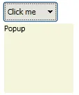
<extToolkit:DropDownButton VerticalAlignment="Center" Background="Red">
            <extToolkit:DropDownButton.Content>
                <TextBlock>Click me</TextBlock>
            </extToolkit:DropDownButton.Content>
            <extToolkit:DropDownButton.DropDownContent>
                <TextBlock>Popup</TextBlock>
            </extToolkit:DropDownButton.DropDownContent>
        </extToolkit:DropDownButton>

我将背景设置为红色,但没有任何影响。所以我尝试将DropDownButton的样式背景绑定到我设置的背景:

<Grid Background="{TemplateBinding Background}">
                                            <Grid.ColumnDefinitions>
                                                <ColumnDefinition Width="*" />
                                                <ColumnDefinition Width="Auto" />
                                            </Grid.ColumnDefinitions>
                                            <ContentPresenter Margin="{TemplateBinding Padding}" Content="{TemplateBinding Content}" ContentTemplate="{TemplateBinding ContentTemplate}" VerticalAlignment="{TemplateBinding VerticalContentAlignment}" HorizontalAlignment="{TemplateBinding HorizontalContentAlignment}" RecognizesAccessKey="true" />
                                            <Grid x:Name="arrowGlyph" IsHitTestVisible="False" Margin="4,3,4,3" Grid.Column="1">
                                                <Path x:Name="Arrow"  Width="7" Height="4" Data="M 0,1 C0,1 0,0 0,0 0,0 3,0 3,0 3,0 3,1 3,1 3,1 4,1 4,1 4,1 4,0 4,0 4,0 7,0 7,0 7,0 7,1 7,1 7,1 6,1 6,1 6,1 6,2 6,2 6,2 5,2 5,2 5,2 5,3 5,3 5,3 4,3 4,3 4,3 4,4 4,4 4,4 3,4 3,4 3,4 3,3 3,3 3,3 2,3 2,3 2,3 2,2 2,2 2,2 1,2 1,2 1,2 1,1 1,1 1,1 0,1 0,1 z" Fill="#FF000000" />
                                            </Grid>
                                        </Grid>

但是,无论我在控件中设置什么,都不能改变背景颜色。如果我直接在样式中设置背景颜色(没有绑定),那么颜色就会生效,但由于某种原因,在ButtonChrome上定义的CornerRadius消失了,按钮恢复为矩形。

有什么建议吗?我只想在定义控件时能够设置下拉按钮和PART_Popup的背景。

1个回答

2

似乎ButtonChrome无法设置任意背景颜色而不丢失CornerRadius属性。如果您不喜欢这种情况,那么您需要寻找替代方案,作为替代方案,我使用了ToggleButton来实现这一点:

<ToggleButton x:Name="ToggleButtonChrome"
              Background="{TemplateBinding Background}"
              IsEnabled="{TemplateBinding IsEnabled}"
              IsChecked="{Binding IsOpen, ElementName=PART_Popup}">

但是我有一个图标按钮位于中间,没有方法可以去除它,所以我通过在Content属性中添加空格来进行补偿:

Content=" Click me         " 

为了设置弹出窗口的背景,我创建了一个名为 Background 的“附加”依赖属性,并将其放置在 PropertyExtension 命名空间中。
public static class Popup
{
    #region Popup Background Property

    public static readonly DependencyProperty BackgroundProperty;

    public static void SetBackground(DependencyObject DepObject, Brush value)
    {
        DepObject.SetValue(BackgroundProperty, value);
    }

    public static Brush GetBackground(DependencyObject DepObject)
    {
        return (Brush)DepObject.GetValue(BackgroundProperty);
    }

    #endregion

    static Popup()
    {
        #region Popup Background Registration

        PropertyMetadata BrushPropertyMetadata = new PropertyMetadata(Brushes.Transparent);

        BackgroundProperty = DependencyProperty.RegisterAttached("Background",
                                                         typeof(Brush),
                                                         typeof(Popup),
                                                         BrushPropertyMetadata);

        #endregion
    }
}

并在ControlTemplate中设置如下:

<Popup x:Name="PART_Popup"
       IsOpen="{Binding IsChecked, ElementName=PART_DropDownButton}"
       ...>                                
    <Border BorderThickness="1"
            Background="{TemplateBinding PropertyExtension:Popup.Background}"> <!-- Here -->

        <ContentPresenter x:Name="PART_ContentPresenter" 
                          Content="{TemplateBinding DropDownContent}" />
    </Border>
</Popup>

使用示例:

<Grid>
    <wpfx:DropDownButton PropertyExtension:Popup.Background="{StaticResource PopupBackground}"
                         Content=" Click me         " 
                         HorizontalContentAlignment="Left"
                         Background="CadetBlue"
                         Width="80" 
                         Height="30" >

        <wpfx:DropDownButton.DropDownContent>
            <TextBlock Width="100" 
                       Height="100"
                       Text="Popup" />
        </wpfx:DropDownButton.DropDownContent>
    </wpfx:DropDownButton>
</Grid>

初始状态:

enter image description here

最终状态:

enter image description here

整个项目可以在此链接上获得。

下面是一个完整的示例:

<Window.Resources>
    <wpfx:InverseBoolConverter x:Key="InverseBoolConverter" />
    <SolidColorBrush x:Key="PopupBackground" Color="Beige" />

    <Style TargetType="{x:Type wpfx:DropDownButton}">
        <Setter Property="BorderThickness" Value="1" />
        <Setter Property="IsTabStop" Value="False" />

        <Setter Property="Template">
            <Setter.Value>
                <ControlTemplate TargetType="{x:Type wpfx:DropDownButton}">
                    <Grid x:Name="MainGrid"                                              
                          SnapsToDevicePixels="True">

                        <ToggleButton x:Name="PART_DropDownButton"
                                      Grid.Column="1"
                                      IsChecked="{Binding IsOpen, RelativeSource={RelativeSource TemplatedParent}, Mode=TwoWay}"
                                      IsHitTestVisible="{Binding IsOpen, RelativeSource={RelativeSource TemplatedParent}, Converter={StaticResource InverseBoolConverter}}">

                            <ToggleButton.Template>
                                <ControlTemplate TargetType="ToggleButton">
                                    <ContentPresenter />
                                </ControlTemplate>
                            </ToggleButton.Template>

                            <Grid>
                                <ToggleButton x:Name="ToggleButtonChrome"
                                              Background="{TemplateBinding Background}"
                                              IsEnabled="{TemplateBinding IsEnabled}"
                                              IsChecked="{Binding IsOpen, ElementName=PART_Popup}">

                                    <Grid>
                                        <Grid.ColumnDefinitions>
                                            <ColumnDefinition Width="*" />
                                            <ColumnDefinition Width="Auto" />
                                        </Grid.ColumnDefinitions>

                                        <ContentPresenter Content="{TemplateBinding Content}" 
                                                          ContentTemplate="{TemplateBinding ContentTemplate}"  
                                                          HorizontalAlignment="{TemplateBinding HorizontalContentAlignment}"
                                                          VerticalAlignment="{TemplateBinding VerticalContentAlignment}"
                                                          RecognizesAccessKey="True" />

                                        <Grid x:Name="arrowGlyph" 
                                              IsHitTestVisible="False" 
                                              Margin="4,3,4,3"                                                  
                                              Grid.Column="1">

                                            <Path x:Name="Arrow"
                                                  Width="7" 
                                                  Height="4"
                                                  Data="M 0,1 C0,1 0,0 0,0 0,0 3,0 3,0 3,0 3,1 3,1 3,1 4,1 4,1 4,1 4,0 4,0 4,0 7,0 7,0 7,0 7,1 7,1 7,1 6,1 6,1 6,1 6,2 6,2 6,2 5,2 5,2 5,2 5,3 5,3 5,3 4,3 4,3 4,3 4,4 4,4 4,4 3,4 3,4 3,4 3,3 3,3 3,3 2,3 2,3 2,3 2,2 2,2 2,2 1,2 1,2 1,2 1,1 1,1 1,1 0,1 0,1 z" 
                                                  Fill="#FF000000" />
                                        </Grid>
                                    </Grid>
                                </ToggleButton>
                            </Grid>
                        </ToggleButton>

                        <Popup x:Name="PART_Popup"
                               IsOpen="{Binding IsChecked, ElementName=PART_DropDownButton}"
                               HorizontalOffset="1"
                               VerticalOffset="1"
                               AllowsTransparency="True"
                               StaysOpen="False"
                               Placement="Bottom"
                               Focusable="False">

                            <Border BorderThickness="1"
                                    Background="{TemplateBinding PropertyExtension:Popup.Background}">

                                <ContentPresenter x:Name="PART_ContentPresenter" 
                                                  Content="{TemplateBinding DropDownContent}" />
                            </Border>
                        </Popup>
                    </Grid>

                    <ControlTemplate.Triggers>
                        <Trigger Property="IsEnabled" Value="False">
                            <Setter Property="Fill" TargetName="Arrow" Value="#AFAFAF" />
                        </Trigger>                            
                    </ControlTemplate.Triggers>
                </ControlTemplate>
            </Setter.Value>
        </Setter>
    </Style>
</Window.Resources>

<Grid>
    <wpfx:DropDownButton PropertyExtension:Popup.Background="{StaticResource PopupBackground}"
                         Content=" Click me         " 
                         HorizontalContentAlignment="Left"
                         Background="CadetBlue"
                         Width="80" 
                         Height="30" >

        <wpfx:DropDownButton.DropDownContent>
            <TextBlock Width="100" 
                       Height="100"
                       Text="Popup" />
        </wpfx:DropDownButton.DropDownContent>
    </wpfx:DropDownButton>
</Grid>

网页内容由stack overflow 提供, 点击上面的
可以查看英文原文,
原文链接