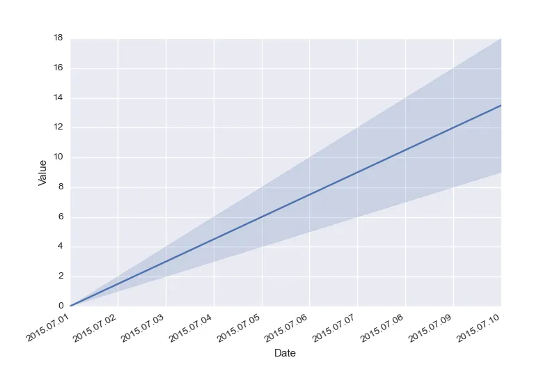
Seaborn tsplot在x轴上显示日期时间不好

13

下面是一个能创建简单时间序列图的脚本:

%matplotlib inline
import datetime
import pandas as pd
import seaborn as sns
import matplotlib.pyplot as plt

fig, ax = plt.subplots()

df = []
start_date = datetime.datetime(2015, 7, 1)
for i in range(10):
    for j in [1,2]:
        unit = 'Ones' if j == 1 else 'Twos'
        date = start_date + datetime.timedelta(days=i)
        
        df.append({
                'Date': date.strftime('%Y%m%d'),
                'Value': i * j,
                'Unit': unit
            })
    
df = pd.DataFrame(df)

sns.tsplot(df, time='Date', value='Value', unit='Unit', ax=ax)
fig.autofmt_xdate()

结果如下:

enter image description here

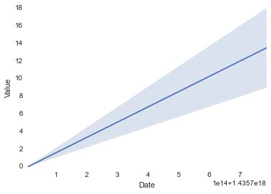
您可以看到,x轴上的日期时间使用了奇怪的数字表示,而不是像matplotlib和其他绘图工具一样的“好看”表示。我尝试了很多方法,重新格式化数据,但它从未清晰地显示出来。有人知道解决方法吗?

4个回答

15

Matplotlib将日期表示为浮点数(以天为单位),因此除非你(或pandas或seaborn)告诉它你的值代表日期,否则它将不会将刻度格式化为日期。我不是seaborn专家,但看起来它(或pandas)确实将 datetime 对象转换为matplotlib日期,但是没有为轴分配适当的定位器和格式化程序。这就是为什么您会得到这些奇怪的数字,实际上只是从0001.01.01以来的天数。因此,您必须手动处理刻度(在大多数情况下更好,因为它可以让您获得更多控制权)。

因此,您需要指定日期定位器,它决定放置刻度的位置,以及日期格式化程序,然后将字符串格式化为刻度标签。

import datetime
import pandas as pd
import seaborn as sns
import matplotlib.pyplot as plt
import matplotlib.dates as mdates

# build up the data
df = []
start_date = datetime.datetime(2015, 7, 1)
for i in range(10):
    for j in [1,2]:
        unit = 'Ones' if j == 1 else 'Twos'
        date = start_date + datetime.timedelta(days=i)

        # I believe it makes more sense to directly convert the datetime to a
        # "matplotlib"-date (float), instead of creating strings and then let
        # pandas parse the string again
        df.append({
                'Date': mdates.date2num(date),
                'Value': i * j,
                'Unit': unit
            })
df = pd.DataFrame(df)

# build the figure
fig, ax = plt.subplots()
sns.tsplot(df, time='Date', value='Value', unit='Unit', ax=ax)

# assign locator and formatter for the xaxis ticks.
ax.xaxis.set_major_locator(mdates.AutoDateLocator())
ax.xaxis.set_major_formatter(mdates.DateFormatter('%Y.%m.%d'))

# put the labels at 45deg since they tend to be too long
fig.autofmt_xdate()
plt.show()

结果:

在此输入图片描述


5
我遇到了这个错误:OverflowError:Python整数过大,无法转换为C长整型。 - kurious
在我的电脑上可以运行。你使用了我的确切示例吗?也许你需要更新你的发行版。 - hitzg
6
我遇到了类似的问题:在使用Python 2.7在Linux上安装matplotlib后,当调用_from_ordinalf(x, tz)函数时,在matplotlib/dates.pyc文件的第214行会抛出OverflowError: signed integer is greater than maximum异常。 - Bryan P

12

对我而言,@hitzg的回答在DateFormatter中会导致“OverflowError: signed integer is greater than maximum”。

看着我的数据框,我的索引是datetime64类型,而不是datetime类型。不过Pandas可以很好地进行转换。以下方法对我非常有效:

import matplotlib as mpl

def myFormatter(x, pos):
    return pd.to_datetime(x)

[ . . . ]

ax.xaxis.set_major_formatter(mpl.ticker.FuncFormatter(myFormatter))

1
然后我们该如何进行格式化呢? ax.xaxis.set_major_formatter(mdates.DateFormatter('%Y.%m.%d')) 无效。 - MERose

2
这里有一个可能不太优雅的解决方案,但这是我唯一拥有的...希望它能帮到你!
    g = sns.pointplot(x, y, data=df, ci=False);

    unique_dates = sorted(list(df['Date'].drop_duplicates()))
    date_ticks = range(0, len(unique_dates), 5)

    g.set_xticks(date_ticks);
    g.set_xticklabels([unique_dates[i].strftime('%d %b') for i in date_ticks], rotation='vertical');
    g.set_xlabel('Date');

如果您发现任何问题,请告诉我!


我很好奇,for i in <tons of spaces> date_ticks 这么写有什么原因吗? - CertainPerformance
这对我来说有点奇怪...事实证明,unique_dates是一个日期时间对象列表。也就是说,list没有strftime方法,因此我们需要从列表中取出第i个项目并应用该方法。 - ltjds

0
def myFormatter(x, pos):
       return pd.to_datetime(x).strftime('%Y%m%d')
ax.xaxis.set_major_formatter(mpl.ticker.FuncFormatter(myFormatter))

网页内容由stack overflow 提供, 点击上面的
可以查看英文原文,
原文链接