将ggplot2图表的x轴放置在顶部

86

我觉得这应该很明显......我要做的就是将 x 轴从图底部移除并添加到顶部。

这里有一个可复制的示例。数据加上制作以下图形所需的代码:

library(reshape2)
library(ggplot2)

data(mtcars)
dat <- with(mtcars, data.frame(mpg, cyl, disp, hp, wt, gear))
cor.matrix <- round(cor(dat, use = "pairwise.complete.obs", method = "spearman"), digits = 2)
diag(cor.matrix)<-NA

cor.dat <- melt(cor.matrix)
cor.dat <- data.frame(cor.dat)
cor.dat <- cor.dat[complete.cases(cor.dat),]


ggplot(cor.dat, aes(Var2, Var1, fill = value)) + 
  geom_tile(colour="gray90", size=1.5, stat="identity") + 
  geom_text(data=cor.dat, aes(Var2, Var1, label = value), color="black", size=rel(4.5)) +
  scale_fill_gradient(low = "white", high = "dodgerblue", space = "Lab", na.value = "gray90", guide = "colourbar") +
  scale_x_discrete(expand = c(0, 0)) +
  scale_y_discrete(expand = c(0, 0)) +
  xlab("") + 
  ylab("") +
  theme(panel.grid.major = element_blank(),
        panel.grid.minor = element_blank(),
        panel.border = element_rect(fill=NA,color="gray90", size=0.5, linetype="solid"),
        axis.line = element_blank(),
        axis.ticks = element_blank(),
        panel.background = element_rect(fill="gray90"),
        plot.background = element_rect(fill="gray90"),
        legend.position = "none", 
        axis.text = element_text(color="black", size=14) )

输入图像描述

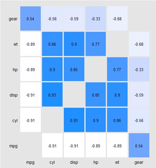
但我想要生成的是- 这似乎很显然(例如,在基本R中非常容易实现),但我在ggplot2中没有找到我要寻找的内容。

输入图像描述


ggplot中的轴线不如基础R灵活。对于您的示例,除了标签之外,您没有使用任何轴线组件。我建议您最好不要绘制轴线,只需使用
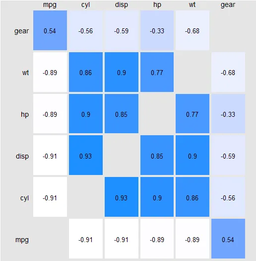
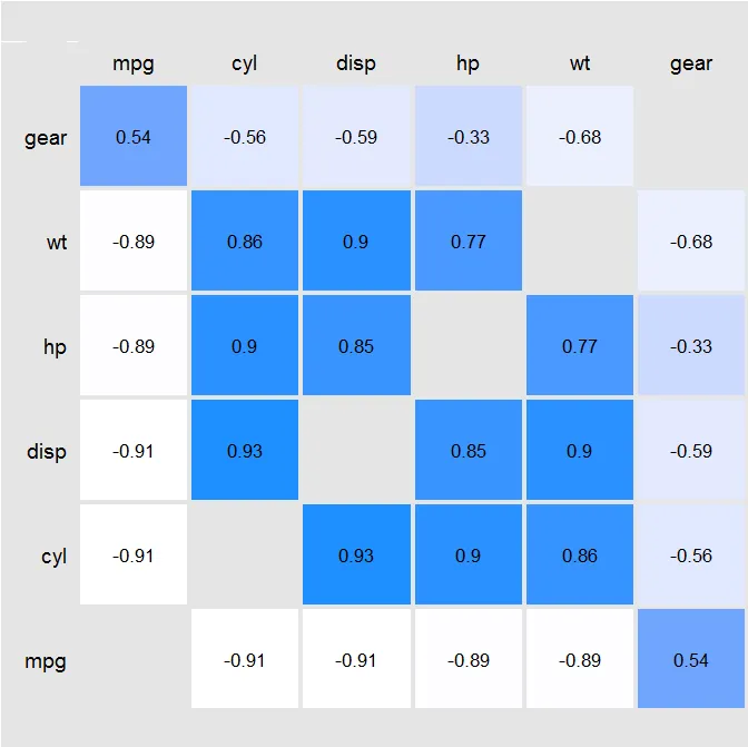
geom_text将标签放在所需位置即可。 - Gregor Thomas
2
移动x轴很困难,但是可以使用ggplot_gtable和ggplot_build函数来实现。这些函数会“绘制”ggplot,但不是在屏幕上,而是创建所谓的“grob”对象,表示可视元素(框、线、网格等),但在不同于ggplot对象(比例尺、主题、美学等)的级别上。您可以根据需要操作grob,交换它们、调整大小等。 - MrGumble
除非您正在自动化此过程,否则您可能只想在事后编辑图形。在Illustrator或Inkscape中移动轴需要几秒钟的时间。 - Minnow
我发现了这个页面,因为我正在开发一个Shiny应用程序;inkscape或Illustrator都不可行! - tumultous_rooster
6个回答

174
您可以通过添加 axis x line=top 将x轴标签移动到顶部。
scale_x_discrete(position = "top") 

请注意,如果您在代码中使用coord_flip(),则此解决方案可能无法按预期工作。我认为这是ggplot2中的一个较大问题,其中某些函数的“x”和“y”参数(如scale...labs)继续按照aes()调用中定义的方式表示“x”和“y”,而其他函数(如'facet_wrap')在翻转坐标时会切换它们的含义。您可以通过在aes()调用中手动翻转x和y变量来轻松解决此问题。 - ESELIA

6

我使用了这个解决方法。复制了绘图的x轴并将其粘贴在一起,然后进行裁剪。我没有清理过的代码,但下面是一个示例。

p.bot   <-  
ggplot(cor.dat, aes(Var2, Var1, fill = value)) + 
  geom_tile(colour="gray90", size=1.5, stat="identity") + 
  geom_text(data=cor.dat, aes(Var2, Var1, label = value), color="black", size=rel(4.5)) +
  scale_fill_gradient(low = "white", high = "dodgerblue", space = "Lab", na.value = "gray90", guide = "colourbar") +
  scale_x_discrete(expand = c(0, 0)) +
  scale_y_discrete(expand = c(0, 0)) +
  xlab("") + 
  ylab("") +
  theme(panel.grid.major = element_blank(),
        panel.grid.minor = element_blank(),
        panel.border = element_rect(fill=NA,color="gray90", size=0.5, linetype="solid"),
        axis.line = element_blank(),
        axis.ticks = element_blank(),
        panel.background = element_rect(fill="gray90"),
        plot.background = element_rect(fill="gray90"),
        legend.position = "none", 
        axis.text.x = element_blank(),
        plot.margin = unit(c(1,0,0,0), "cm"),
        axis.text.y = element_text(color="black", size=14) )

p.top   <-  p.bot + theme(
    axis.text.x = element_text(color="black", size=14),
    axis.text.y = element_text(color="gray90", size=14)
    )  + coord_cartesian(ylim = c(0,0))


require(gtable)
#Extract Grobs
g1<-ggplotGrob(p.top)
g2<-ggplotGrob(p.bot)
#Bind the tables
g<-gtable:::rbind_gtable(g1, g2, "first")
#Remove a row between the plots
g <- gtable_add_rows(g, unit(-1.25,"cm"), pos=nrow(g1))
#draw
panels <- g$layout$t[grep("panel", g$layout$name)]
g$heights[panels] <- lapply(c(0,2), unit, "null")

grid.newpage()
grid.draw(g)

enter image description here


5

查看cowplot包

ggdraw(switch_axis_position(p + axis = 'x'))

在当前版本的cowplot下,我需要将加号替换为逗号:ggdraw(switch_axis_position(p, axis = 'x'))。 - Jessica Beyer

3

现在,您可以通过在scale_x_discrete中添加"position='top'"来实现此目的。

代码:

library(reshape2)
library(ggplot2)

data(mtcars)
dat <- with(mtcars, data.frame(mpg, cyl, disp, hp, wt, gear))
cor.matrix <- round(cor(dat, use = "pairwise.complete.obs", method = "spearman"), digits = 2)
diag(cor.matrix)<-NA

cor.dat <- melt(cor.matrix)
cor.dat <- data.frame(cor.dat)
cor.dat <- cor.dat[complete.cases(cor.dat),]


ggplot(cor.dat, aes(Var2, Var1, fill = value)) + 
  geom_tile(colour="gray90", size=1.5, stat="identity") + 
  geom_text(data=cor.dat, aes(Var2, Var1, label = value), color="black", size=rel(4.5)) +
  scale_fill_gradient(low = "white", high = "dodgerblue", space = "Lab", na.value = "gray90", guide = "colourbar") +
  scale_x_discrete(expand = c(0, 0),position = 'top') +
  scale_y_discrete(expand = c(0, 0),position = 'left') +
  xlab("") + 
  ylab("") +
  theme(panel.grid.major = element_blank(),
        panel.grid.minor = element_blank(),
        panel.border = element_rect(fill=NA,color="gray90", size=0.5, linetype="solid"),
        axis.line = element_blank(),
        axis.ticks = element_blank(),
        panel.background = element_rect(fill="gray90"),
        plot.background = element_rect(fill="gray90"),
        legend.position = "none", 
        axis.text = element_text(color="black", size=14) )

这个答案和被接受的那个是一样的。 - ESELIA

1

2
考虑扩展您的回答,解释代码的作用/为什么它解决了OP的问题,并总结在您分享的链接中提供的详细信息。 - Joey Harwood
1
虽然这段代码片段可能是解决方案,但包括解释真的有助于提高您的帖子质量。请记住,您正在回答未来读者的问题,而这些人可能不知道您提出代码建议的原因。 - Rahul Gupta

-1

如果它是一个连续的刻度,请使用

scale_x_continuous(position = "top") +

如果它是离散的刻度,请使用。
scale_x_discrete(position = "top") +

2
这个答案与其他一些答案有什么不同?此外,这里使用 + 运算符有点令人困惑。我要么提供完整的代码块,要么省略它。例如,如果您在 ggplot 对象的末尾使用此函数,它将导致错误。 - Shawn Hemelstrand

网页内容由stack overflow 提供, 点击上面的
可以查看英文原文,
原文链接