如何清洗我的数据并使用ggplot2创建图表?

3

我想使用维基百科上的数据创建一个图表,我从找到的表格中创建了一个数据框。它包含两列 - 啤酒的风格和苦味值范围(IBU),如“20-50”。这两个都是字符型的,所以我不能从中制作出有意义的图表。我设法将IBU列更改为两个分开的数字列(最小值和最大值),但它在我的第一个数据框中创建了第二个数据框,尝试寻找类似的案例,但我找不到,现在我陷入了困境,不知道下一步该怎么做 :(对于粘贴这么多代码,请谅解,我只是想让别人读取数据并查看其结构。

library(xml2)
library(rvest)
library(ggplot2)
library(tidyr)

file_html <- read_html(
  "https://pl.wikipedia.org/wiki/International_Bittering_Units",
   encoding = "UTF-8")
table_html <- html_node(file_html, "#mw-content-text > div > table")
table_IBU <- html_table(table_html, fill = TRUE)


table_IBU$IBU2 <- str_replace(table_IBU$`Stopień IBU`, "\\+", "")
table_IBU$IBU3 <- tidyr::separate(table_IBU, IBU2, into = c("min", "max"), sep = " – ")
table_IBU <- subset(table_IBU, select = -c(IBU2,
                                          `Stopień IBU`,
                                          `Gatunek piwa`))

table_IBU$IBU3$min2 <- as.numeric(table_IBU$IBU3$min)
table_IBU$IBU3$max2 <- as.numeric(table_IBU$IBU3$max)

#graph that I can come up with on my own

IBUgraph <- ggplot(table_IBU$IBU3, aes(reorder(`Gatunek piwa`, + max2), 
                                 max2)) + 
  geom_point(width = 0.5, color = "darkolivegreen",
           fill = "darkseagreen4") + 
  theme(text=element_text(size = 9)) 
IBUgraph = IBUgraph +
  labs(y = "Międzynarodowe Jednostki Goryczy (IBU)",
       x = "Gatunek",
       title = "Skala IBU - International Bitterness Units, 
       czyli międzynarodowe jednostki goryczy")
IBUgraph <- IBUgraph + theme(axis.text.x=element_text(angle=45, hjust=1.1))

IBUgraph

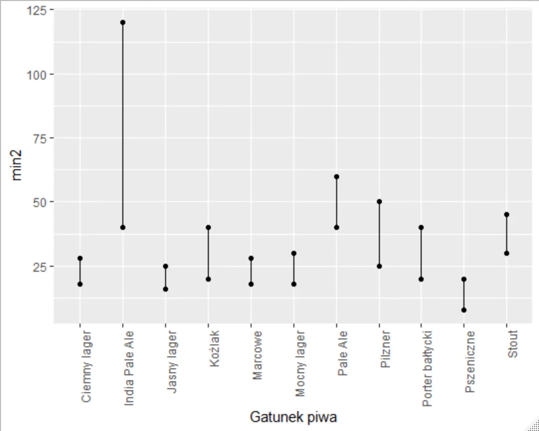
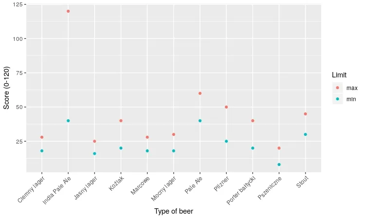
最终我想使用ggplot()创建一个图表,其中x轴为啤酒的类型,每种类型都展示最小值和最大值两个点。

你需要一个图例吗? - StupidWolf
2
欢迎来到SO。你已经写了哪些ggplot代码?你遇到了哪些问题? - wibeasley
"两者都是字符,所以我不能制作一个有意义的图形。" IBU范围实际上由两个单独的数字列组成,例如 "20-50",您可以使用separate()函数将其解析为IBU3$min,max,但您不喜欢它作为子数据框架/命名列表的输出格式。这是tidyr::separate(),还是其他软件包?" - smci
@smci,是的,tidyr - Edyficjum
1
@StupidWolf 谢谢,我知道这很奇怪,我一直在努力解决它,我只知道 R 的基础知识,这是我第一次创建图表,所以有点困惑。 - Edyficjum
显示剩余3条评论
2个回答

7
你可以用哑铃图表来展示,例如这样。
ggplot(table_IBU$IBU3,aes(x=`Gatunek piwa`)) + 
      geom_point(aes(y=min2)) + # add point for min
      geom_point(aes(y=max2)) + # add point for max
      geom_segment(aes(xend=`Gatunek piwa`,y=min2,yend=max2)) + # create segment between min and max
      theme(axis.text.x = element_text(angle = 90, hjust = 1)) # rotate x axis

enter image description here


5

那么,您正在寻找类似于这样的东西吗?

library(dplyr)
library(stringr)
library(tidyr)
library(ggplot2)
library(rvest)

#Acquire table
table_IBU <- read_html("https://pl.wikipedia.org/wiki/International_Bittering_Units", encoding = "UTF-8") %>%
  html_node(., "#mw-content-text > div > table") %>%
  html_table(., fill = TRUE)

#Extract scores into min and max values
table_IBU$IBU2 <- str_replace(table_IBU$`Stopień IBU`, "\\+", "")
table_IBU %<>% separate(., IBU2, into = c("min", "max"), sep = " – ") %>% select(-c(`Stopień IBU`))
table_IBU$min <- as.integer(table_IBU$min)
table_IBU$max <- as.integer(table_IBU$max)
table_IBU %<>% gather(data = ., key = "Limit", value = "Value", min, max)

#Plot
table_IBU %>% ggplot(data = ., aes(x = `Gatunek piwa`)) + 
  geom_point(aes(y = Value, col = Limit)) + 
  xlab("Type of beer") +
  ylab("Score (0-120)") +
  theme(axis.text.x = element_text(angle = 45, hjust = 1))

R绘图

这是展示数据的一种奇怪方式。


网页内容由stack overflow 提供, 点击上面的
可以查看英文原文,
原文链接