趋势决定线条颜色

3
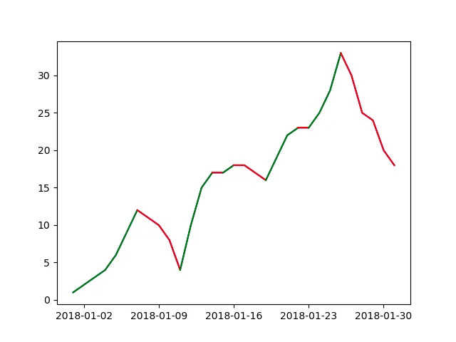
我将尝试绘制一条线,它的颜色应该以表示图表趋势的方式进行着色。例如,如果增加应该是绿色,而如果减少则应该是红色。
我可以使用移动后的数据框来简单地表示这种趋势绘制点图形:
dates = ['2018-01-{}'.format(d) for d in range(1, 32)]
vals = [1, 2, 3, 4, 6, 9, 12, 11, 10, 8, 4, 10, 15, 17, 17, 18, 18, 17, 16, 19, 22, 23, 23, 25, 28, 33, 30, 25, 24,
        20, 18]

df = pd.DataFrame(data=vals, columns=['Value'])
df.set_index(pd.to_datetime(dates), inplace=True)

df_shifted = df.shift()
df_shifted.iloc[0] = df_shifted.iloc[1]
mask_inc = df >= df_shifted
df['Increase'] = mask_inc['Value']

fig, ax = plt.subplots()
ax.plot(df['Value'], color='#ededed')

color = {True: 'green', False: 'red'}
for index, row in df.iterrows():
    ax.plot(index, row['Value'], 'o', color=color[row['Increase']])

在此输入图片描述

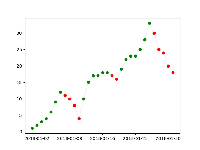
我知道在matplotlib中无法在同一条线图中使用不同的颜色,但有没有什么解决方法可以使它不那么复杂?

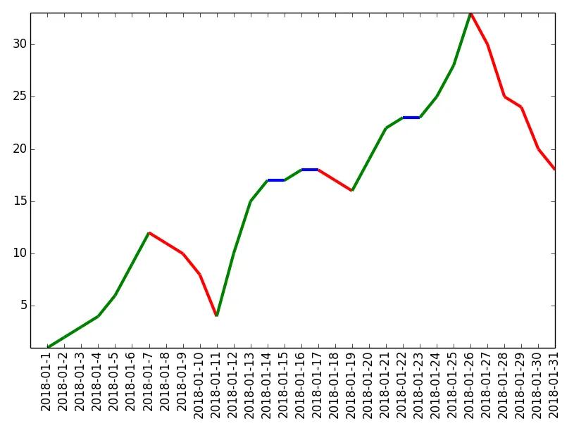
我考虑过使用增量掩码绘制两个不同的数据框,但问题是该线将被连续绘制,因此所有点都将连接在一起,而我需要将其分成由线段组成的不同部分。

2个回答

1

看看 DataFrame.diff。不要认为它会变得更简单。

找到了 这个答案,我认为使用它,你应该能够获得所需的片段,就像这样:

dates = ['2018-01-{}'.format(d) for d in range(1, 32)]
vals = [1, 2, 3, 4, 6, 9, 12, 11, 10, 8, 4, 10, 15, 17, 17, 18, 18, 17, 16, 19, 22, 23, 23, 25, 28, 33, 30, 25, 24,
        20, 18]

df = pd.DataFrame(data=vals, columns=['Value'])
df.set_index(pd.to_datetime(dates), inplace=True)
df['difference'] = df.diff()
df['condition'] = (df.difference > 0).astype(int)
df['group'] = df.condition.diff().abs().cumsum().fillna(0).astype(int) + 1

fig, ax = plt.subplots()
# fail safe only
ax.plot(df.Value, color='blue')

# decides if starts in descend
# (first difference is NaN therefore first condition 0 no matter what)
red = df.condition.iloc[1] == 1
last = pd.DataFrame()
for i in range(df.group.max() + 1):
    group = pd.concat([last, df.Value[df.group == i]])
    last = group.iloc[-1:]
    red = not red

    ax.plot(group, color='red' if red else 'green')

它应该result你一直在寻找的,没有任何空白。


你有安装jinja2吗? - axx
不太确定,但我可以直接使用pip安装它,为什么呢? - dabadaba

1

你可以按照本教程的步骤来实现你想要的内容。

然后你可以使用以下代码:

import numpy as np
import matplotlib.pyplot as plt
from matplotlib.collections import LineCollection
from matplotlib.colors import ListedColormap, BoundaryNorm
import datetime

max_range = 32
dates = ['2018-01-{}'.format(d) for d in range(1, max_range)]
x = np.asarray(range(1,max_range))
y = [1, 2, 3, 4, 6, 9, 12, 11, 10, 8, 4, 10, 15, 17, 17, 18, 18, 17, 16, 19, 22, 23, 23, 25, 28, 33, 30, 25, 24,
        20, 18]
y = np.asarray(y)
z = [i - j for i, j in zip(y[:-1], y[1:])]
z = np.asarray(z)

# Create a colormap for red, green and blue and a norm to color
# f' < -0.5 red, f' > 0.5 blue, and the rest green
cmap = ListedColormap(['g', 'b', 'r'])
norm = BoundaryNorm([-100, -0.5, 0.5, 100], cmap.N)

# Create a set of line segments so that we can color them individually
# This creates the points as a N x 1 x 2 array so that we can stack points
# together easily to get the segments. The segments array for line collection
# needs to be numlines x points per line x 2 (x and y)
points = np.array([x, y]).T.reshape(-1, 1, 2)
segments = np.concatenate([points[:-1], points[1:]], axis=1)

# Create the line collection object, setting the colormapping parameters.
# Have to set the actual values used for colormapping separately.
lc = LineCollection(segments, cmap=cmap, norm=norm)
lc.set_array(z)
lc.set_linewidth(3)

fig1 = plt.figure()
plt.gca().add_collection(lc)
plt.xlim(0,max_range-1)
plt.ylim(min(y), max(y))
plt.xticks(x,dates, rotation='vertical')
plt.tight_layout()
plt.show()

以下是产生下面的图形: 斜率着色图

网页内容由stack overflow 提供, 点击上面的
可以查看英文原文,
原文链接