如何在ggplot2中添加第二个坐标轴标签?

8

在我的之前的问题上继续,我想在图的另一侧添加第二个轴标签。

数据框如下:

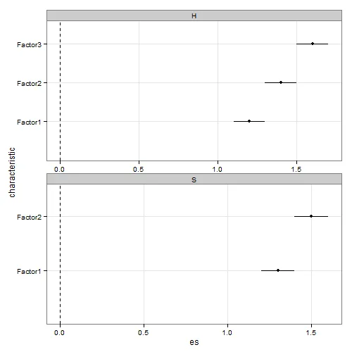
test <- structure(list(characteristic = structure(c(1L, 2L, 3L, 1L, 2L
), .Label = c("Factor1", "Factor2", "Factor3"), class = "factor"), 
    es = c(1.2, 1.4, 1.6, 1.3, 1.5), ci_low = c(1.1, 1.3, 1.5, 
    1.2, 1.4), ci_upp = c(1.3, 1.5, 1.7, 1.4, 1.6), label = structure(c(1L, 
    3L, 5L, 2L, 4L), .Label = c("1.2 (1.1, 1.3)", "1.3 (1.2, 1.4)", 
    "1.4 (1.3, 1.5)", "1.5 (1.4, 1.6)", "1.6 (1.5, 1.7)"), class = "factor"), 
    set = structure(c(1L, 1L, 1L, 2L, 2L), .Label = c("H", "S"
    ), class = "factor")), .Names = c("characteristic", "es", 
"ci_low", "ci_upp", "label", "set"), class = "data.frame", row.names = c(NA, 
-5L))

使用Tyler的解决方案,目前的图形如下所示:

enter image description here

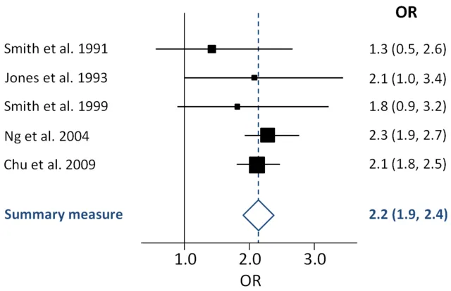
类似于森林图,我想在面板右侧添加第二组标签(我的数据框中的label变量)来表示绘制的值。所有这些都与下面的示例类似,以模仿森林图:

enter image description here

我知道第二轴似乎不太受欢迎。 然而,这只是另一组标签..它似乎是森林图中的一种自定义。

我该如何在ggplot中实现呢?


1
这里的答案可能会给你一个起点:https://dev59.com/v1PTa4cB1Zd3GeqPnu5g#4868130 - Chase
@Chase:谢谢你。确实使用
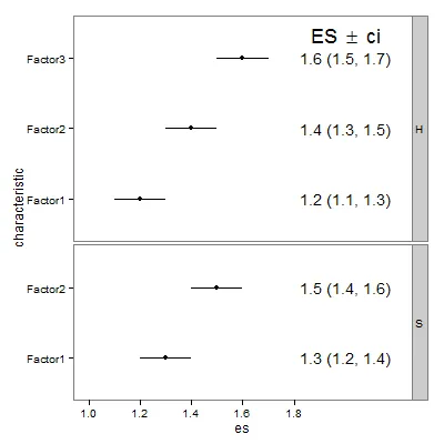
plot更容易被黑客攻击。不过我还在想能否在ggplot2中做到这一点? - radek
1
当第二个轴是一个完全不同的变量时(例如温度和沉积物浓度),它通常会受到反对。但如果第二个轴是第一个轴的转换版本,那是完全可以接受的(例如摄氏度、开尔文或华氏度表示的温度)。 - Paul Hiemstra
2个回答

7

编辑 更新为 ggplot2 0.9.3

将测试数据框中的标签集添加到分面图中很简单。使用 geom_text,与标签的审美、标签的 x 和 y 位置一起使用。在下面的代码中,xlim 为标签创建了更多的空间。以下是代码:

library(gridExtra)
library(ggplot2)

p <- ggplot(test, aes(y = characteristic, x = es, xmin = ci_low, xmax = ci_upp)) + 
  geom_point() +   
  geom_errorbarh(height = 0) +
  geom_text(aes(label = label, x = 2, y = characteristic)) + 
  scale_x_continuous(limits = c(1, 2.2), breaks = c(1, 1.2, 1.4, 1.6, 1.8),
    labels=c("1.0", "1.2", "1.4", "1.6", "1.8")) +
  facet_grid(set ~ ., scales = "free", space = "free") +
  theme_bw() + 
  theme(strip.text.y = element_text(angle = 0),
    panel.grid.major = element_blank(),
    panel.grid.minor = element_blank())
p

grid.text(expression(paste("ES " %+-% " ci")), x = 0.78,   y = .92,
   gp = gpar(fontsize = 18))

产生的结果:

在这里输入图片描述


(注:本文涉及IT技术)

1
这是我的回答: (我重新阅读了帖子,因为没有找到完整的答案。我仍在寻找添加“钻石”摘要的方法。)
这很大程度上是“自动化”的。
  • lgOR = Data with Estimates and CI 95%.

  • ci_lower = 95% CI lower

  • ci_upper = 95% CI upper

  • author = Authors / dates

  • Model_pars <- paste( orH2, ort2, orI2, orModel, orModel_sig, sep=" | ") # These are the Heterogeneity stats - as subtitle.

     min_v     <- floor(min(lgOR$ci_lower))
     max_v     <- ceiling(max(lgOR$ci_upper))
     OR_v      <- as.matrix( round(lgOR$OR,2) )
     ORci      <- paste("(", round(lgOR$ci_lower,2), "|", round(lgOR$ci_upper,2), ")" )
    
     ggplot(data=lgOR, aes(y=1:nrow(lgOR), x=OR, xmin=ci_lower, xmax=ci_upper)) +
       geom_point() + 
       geom_errorbarh(height=.3) +
       scale_y_continuous(name = "", breaks=1:nrow(lgOR), labels=lgOR$author ) +
       scale_x_continuous(limits = c( min_v, max_v + 3 ), 
                          breaks = c( min_v:max_v, max_v + 3 ),
                          expand = c(0,0) )+
       labs(title='Effect Size by Study', x=Model_pars, y = 'Study') +
       geom_vline(xintercept=0, color='black', linetype='dashed', alpha=.5) +
       theme( axis.title.x = element_text(size = 8),
              axis.text.x = element_text(size = 7),
              axis.title.y = element_text(size = 1)) +
       geom_text(aes(x=9, label= paste(OR_v, ORci ))) 
    

网页内容由stack overflow 提供, 点击上面的
可以查看英文原文,
原文链接