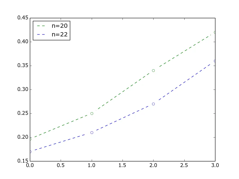
我有如下代码用于在matplotlib中绘制线条。我试图使用透明的圆圈来显示点,而不是标准的实心填充圆圈。
- How can I make the circles be the same color as the lines?
- How can I remove the circles from the ends of the dashed lines in the legend? Currently you can hardly see the dashed lines.
How can I make a little gap before and after each circle in the graph so the dashed lines don't touch them. I think this would look better here as I only have data at the points so the lines in between don't represent real data.
import matplotlib.pyplot as plt
import numpy as np
t = np.array([0.19641715476064042,
0.25,
0.34,
0.42])

c  = np.array([0.17,
0.21,
0.27,
0.36])

plt.plot(t, '-go', markerfacecolor='w', linestyle= 'dashed', label='n=20')
plt.plot(c, '-bo',  markerfacecolor='w', linestyle= 'dashed', label='n=22')
plt.show()
这是目前matplotlib代码给我的结果。
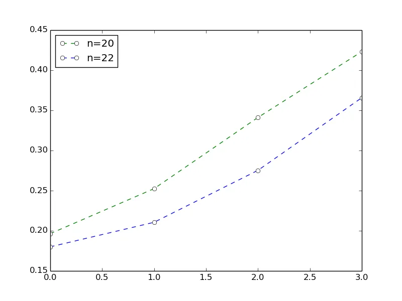
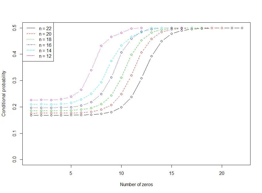
这是我希望最终看起来像的样子(当然,数据不同)。