我在使用ggplot2制作水平点图时,想尝试创建一个水平条形图。但是,我发现有一些限制。
这是我的数据:
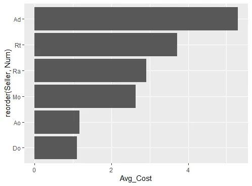
df <- data.frame(Seller=c("Ad","Rt","Ra","Mo","Ao","Do"),
                Avg_Cost=c(5.30,3.72,2.91,2.64,1.17,1.10), Num=c(6:1))
df
str(df)
起初,我使用以下代码生成了一个点图:
require(ggplot2)
ggplot(df, aes(x=Avg_Cost, y=reorder(Seller,Num))) +
    geom_point(colour="black",fill="lightgreen") +
    opts(title="Avg Cost") +
    ylab("Region") + xlab("") + ylab("") + xlim(c(0,7)) +
    opts(plot.title = theme_text(face = "bold", size=15)) +
    opts(axis.text.y = theme_text(family = "sans", face = "bold", size = 12)) +
    opts(axis.text.x = theme_text(family = "sans", face = "bold", size = 12))
但是,我现在尝试创建一个水平条形图,发现无法做到。我尝试过coord_flip()也没有帮助。
ggplot(df, aes(x=Avg_Cost, y=reorder(Seller,Num))) +
    geom_bar(colour="black",fill="lightgreen") +
    opts(title="Avg Cost") +
    ylab("Region") + xlab("") + ylab("") + xlim(c(0,7)) +
    opts(plot.title = theme_text(face = "bold", size=15)) +
    opts(axis.text.y = theme_text(family = "sans", face = "bold", size = 12)) +
    opts(axis.text.x = theme_text(family = "sans", face = "bold", size = 12))
有人可以提供一些关于如何在ggplot2中生成一个水平条形图的帮助吗?
geom都有一个默认的stat。对于geom_bar,默认的stat是bin,因此必须像Justin展示的那样将其更改为identity。另外两个默认为bin的geoms是freqpoly和当然是histogram。 - Pete