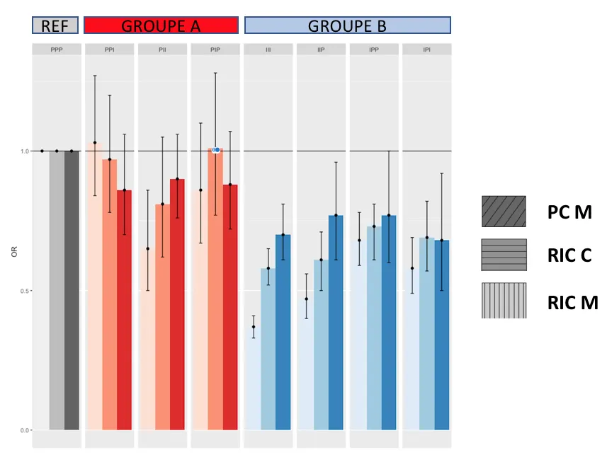
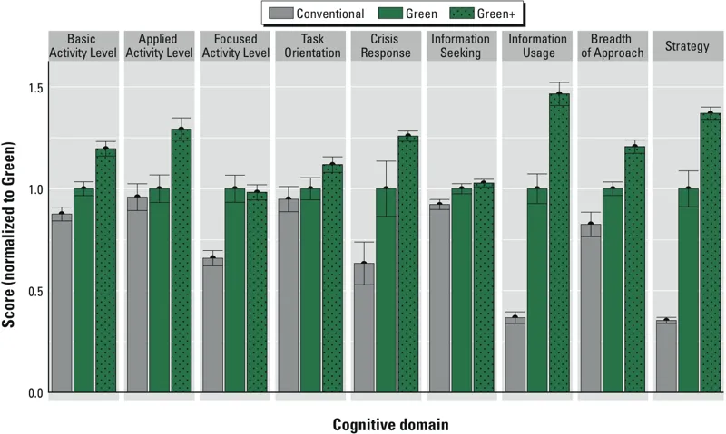
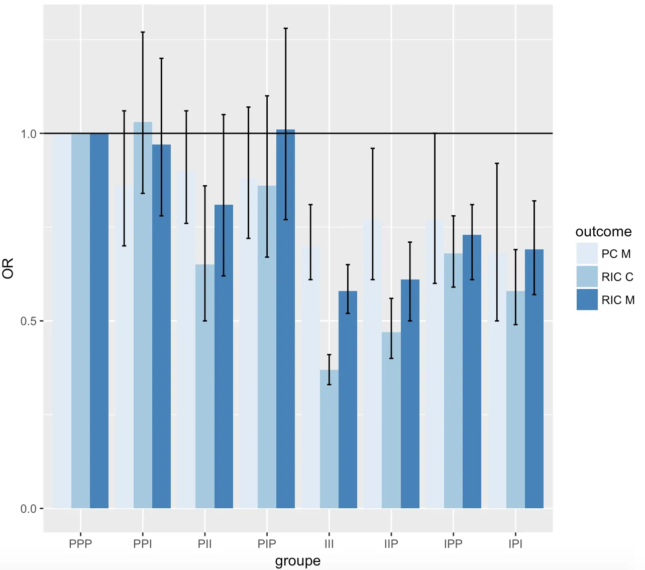
我希望能够绘制出与以下图A类似的图形:
我使用了以下代码,但需要一些帮助来自定义我的图形。
欢迎提供任何帮助。
先行谢过。
groupe2<-rep(c(rep("P",4),rep("I",4)),3)
groupe<-rep(c("PPP","PPI","PII","PIP","III","IIP","IPP","IPI"),3)
OR_A<-c(1.00,0.86,0.90,0.88,0.70,0.77,0.77,0.68)
ICinf_A<-c(NA,0.70,0.76,0.72,0.61,0.61,0.60,0.50)
ICsup_A<-c(NA,1.06,1.06,1.07,0.81,0.96,1.00,0.92)
OR_B<-c(1.00,0.97,0.81,1.01,0.58,0.61,0.73,0.69)
ICinf_B<-c(NA,0.78,0.62,0.77,0.52,0.50,0.61,0.57)
ICsup_B<-c(NA,1.20,1.05,1.28,0.65,0.71,0.81,0.82)
OR_C<-c(1.00,1.03,0.65,0.86,0.37,0.47,0.68,0.58)
ICinf_C<-c(NA,0.84,0.50,0.67,0.33,0.40,0.59,0.49)
ICsup_C<-c(NA,1.27,0.86,1.10,0.41,0.56,0.78,0.69)
outcome<-c(rep("PC M",8), rep("RIC M",8), rep("RIC C",8))
OR<-c(OR_A,OR_B,OR_C)
ICinf<-c(ICinf_A,ICinf_B,ICinf_C)
ICsup<-c(ICsup_A,ICsup_B,ICsup_C)
dataOR<-data.frame(OR,groupe,outcome,groupe2,ICinf,ICsup)
#pour mettre l'ordre qu'on veut pour la légende (par défaut : ordre alphabétique)
dataOR[, "groupe"] <- factor(dataOR[, "groupe"] ,
levels = c("PPP","PPI","PII","PIP","III","IIP","IPP","IPI"))
##########
##########
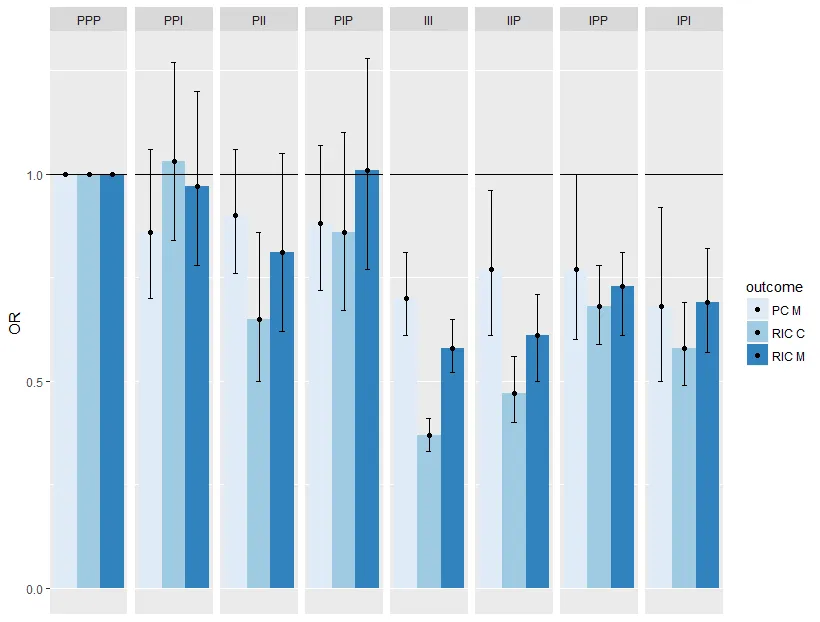
ggplot(dataOR, aes(fill=outcome, y=OR, x=groupe)) +
geom_bar(position="dodge", stat="identity") +
scale_fill_brewer(palette="Blues")+
geom_errorbar(aes(ymin=ICinf, ymax=ICsup), width=.2,position=position_dodge(.9))+
#theme(panel.background = element_rect(fill="lightgreen"))+
geom_hline(yintercept=1)
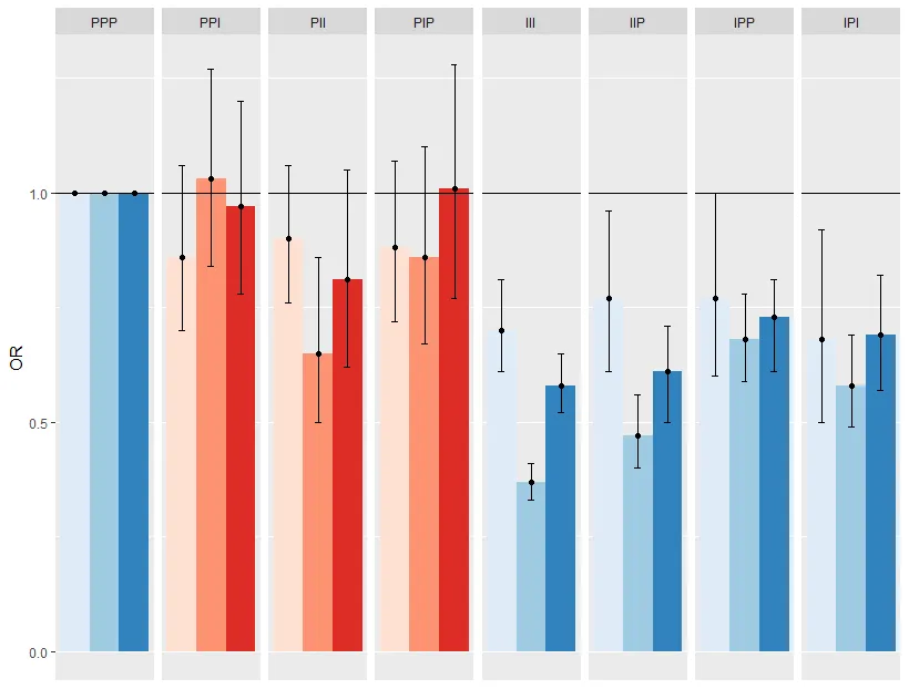
关于图 A 的标签:
例如:
PPP,等等...
应该放在
基本活动水平,等等...