我有一组数据,其中一个因子嵌套在另一个因子中。
我想展示一个父级水平条形图,然后是子级垂直条形图。我找到了一篇Hadley的论文,介绍了如何做到这一点http://vita.had.co.nz/papers/prodplots.pdf。他在GitHub上进行了初始工作https://github.com/hadley/productplots,但由于缺乏兴趣,开发已经停止。我可以使用此存储库几乎制作出我想要的东西,但还不完全。我想知道是否有人能帮助我完成剩余部分。我知道还有其他绘图方法,但这种方法特别好,因为它使用比较层次结构两个层次上计数的公共零的预先关注属性。
我也复制了两个单独的图表,如果有用的话:
    Family  Member Count
1  family1 Brother     3
2  family2 Brother     1
3  family3 Brother     1
4  family1     Dad     1
5  family2     Dad     1
6  family3     Dad     1
7  family1     Mom     1
8  family2     Mom     1
9  family3     Mom     0
10 family1     Pet     2
11 family2     Pet     0
12 family3     Pet     3
13 family1  Sister     3
14 family2  Sister     5
15 family3  Sister     3
我想展示一个父级水平条形图,然后是子级垂直条形图。我找到了一篇Hadley的论文,介绍了如何做到这一点http://vita.had.co.nz/papers/prodplots.pdf。他在GitHub上进行了初始工作https://github.com/hadley/productplots,但由于缺乏兴趣,开发已经停止。我可以使用此存储库几乎制作出我想要的东西,但还不完全。我想知道是否有人能帮助我完成剩余部分。我知道还有其他绘图方法,但这种方法特别好,因为它使用比较层次结构两个层次上计数的公共零的预先关注属性。
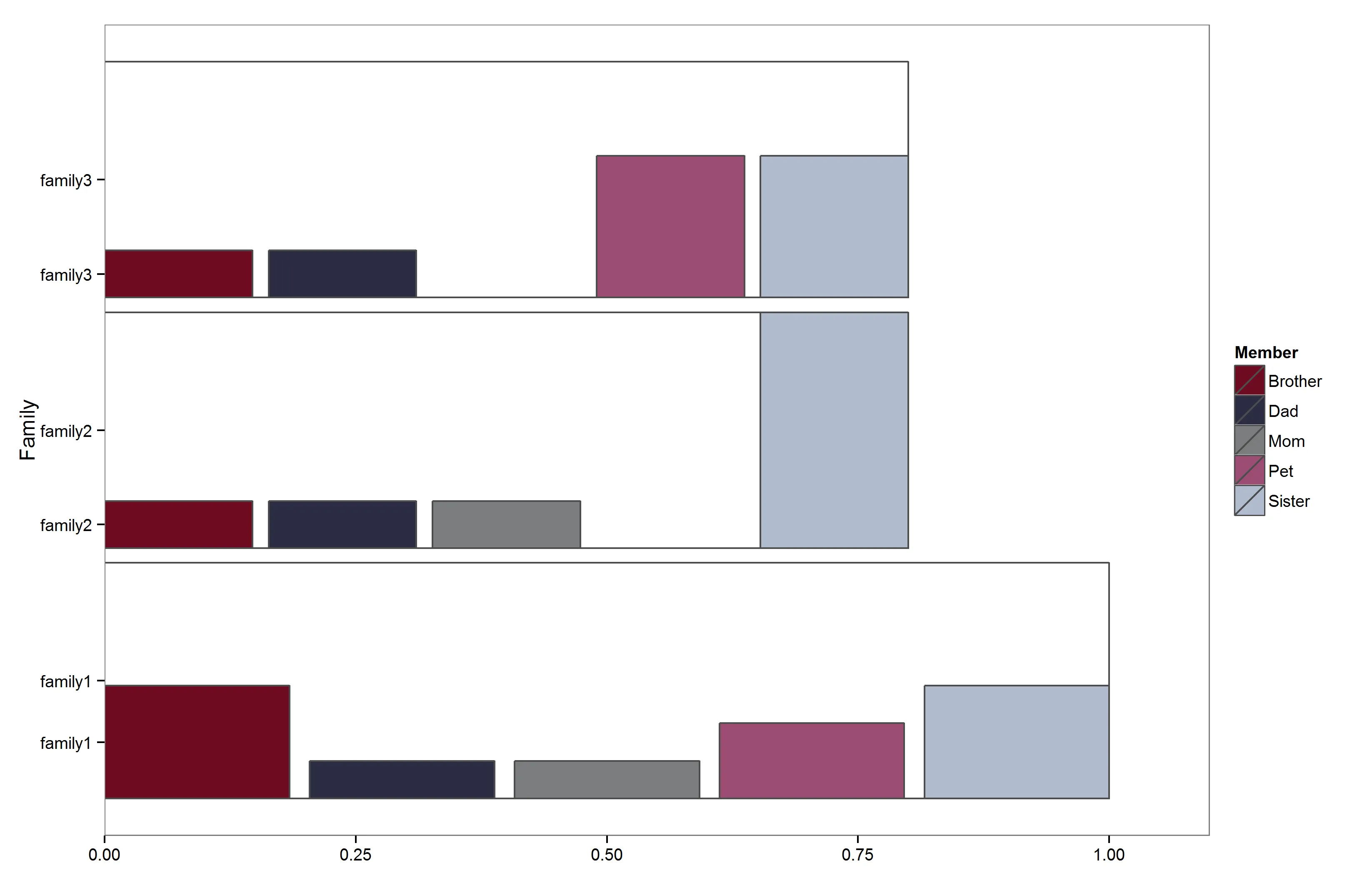
我想要:
- 去掉多余的父级标签
- 用浅色填充父级条形图
- 将 x 轴刻度改为原始计数
这是生成原始图形的代码:
devtools::install_github("hadley/productplots")
library(productplots)
library(ggplot2)

dat <- structure(list(Family = c("family1", "family2", "family3", "family1",
    "family2", "family3", "family1", "family2", "family3", "family1",
    "family2", "family3", "family1", "family2", "family3"), Member = structure(c(1L,
    1L, 1L, 2L, 2L, 2L, 3L, 3L, 3L, 4L, 4L, 4L, 5L, 5L, 5L), .Label = c("Brother",
    "Dad", "Mom", "Pet", "Sister"), class = "factor"), Count = c(3L,
    1L, 1L, 1L, 1L, 1L, 1L, 1L, 0L, 2L, 0L, 3L, 3L, 5L, 3L)), row.names = c(NA,
    -15L), .Names = c("Family", "Member", "Count"), class = "data.frame")

dat2 <- dat[rep(1:nrow(dat), dat[["Count"]]), ]


fill <- list(
  aes(fill = Member),
  theme(legend.position = "none"),
  scale_fill_manual(values = c(
    "Dad" = "#2B2D42",
    "Mom" = "#7A7D7F",
    "Sister" = "#B1BBCF",
    "Brother" = "#6E0B21",
    "Pet" = "#9B4D73",
    "NA" = "grey50")))

m <- prodplot(dat2, ~ Member + Family, c("hbar", "vbar"), na.rm = TRUE,
         levels = NA) + fill + theme_bw()
m + scale_x_continuous(expand = c(0,0), limits = c(0, 1.1)) +
    theme(panel.grid=element_blank())
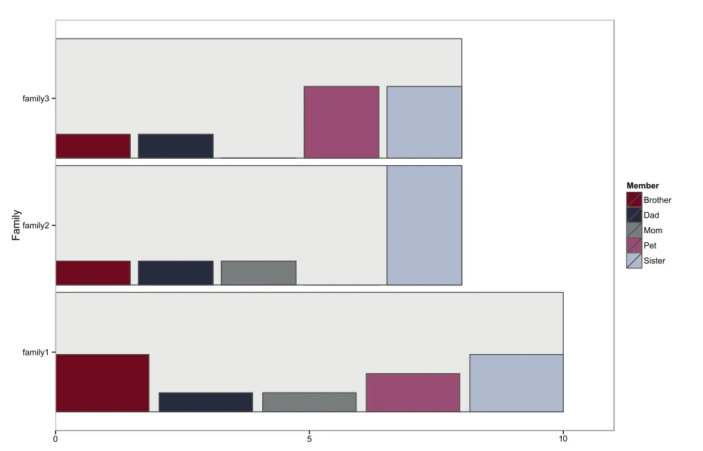
我也复制了两个单独的图表,如果有用的话:
library(ggplot2)
ggplot(dat, aes(Family, weight=Count)) +
geom_bar(fill="grey80") +
coord_flip() +
scale_y_continuous(expand = c(0,0), limits = c(0, 11)) +
theme_bw()
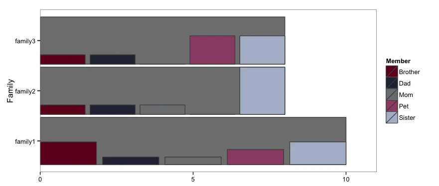
ggplot(dat, aes(Family, weight=Count)) +
geom_bar(aes(fill = Member), position = "dodge") +
scale_y_continuous(expand = c(0,0), limits = c(0, 6)) +
theme_bw() +
facet_wrap(~Family, ncol=1, scales="free_x") +
theme(text=element_blank(), panel.grid=element_blank())
希望其他图形系统解决方案也可以。
编辑 尝试填充,但使所有条变为灰色,而不仅仅是父条。
lvls <- unique(dat[["Family"]])

fill2 <- list(
  aes(fill = Family),
  theme(legend.position = "none"),
  scale_fill_manual(values = setNames(rep("grey90", length(lvls)), lvls)))

m <- prodplot(dat2, ~ Member + Family, c("hbar", "vbar"), na.rm = TRUE,
         levels = NA) + fill + fill2 + theme_bw()
m + scale_x_continuous(expand = c(0,0), limits = c(0, 1.1)) +
    theme(panel.grid=element_blank())
gridExtra:1)取出第二个独立的图,将其拆分(提取每个面板和图例);2)使用预定义的宽度进行grid.arrange。不过我会等待 @baptiste 的意见,他可能会提出更好的方法。 - tonytonov