
6个回答
24
随着CartoPy 0.15中geodesic module的添加,我们现在可以相对容易地计算地图上的精确长度。找到一个直线上距离合适的两点,在球面上它们之间的距离有些棘手。一旦确定了地图上的方向,我就会执行指数搜索来找到足够远的点,然后再执行二分搜索来找到距所需距离足够近的点。
额外的关键字参数(例如
我已经包含了我认为是常见用例的示例。
scale_bar函数非常简单,但是有很多选项。基本签名是scale_bar(ax, location, length)。ax是任何CartoPy轴,location是栏左侧在轴坐标系中的位置(因此每个坐标都在0到1之间),length是栏的长度(以公里为单位)。支持其他长度,例如metres_per_unit和unit_name关键字参数。额外的关键字参数(例如
color)只是传递给text和plot。但是,特定于text或plot的关键字参数(例如family或path_effects)必须通过text_kwargs和plot_kwargs作为字典传递。我已经包含了我认为是常见用例的示例。
请分享任何问题、评论或批评。
scalebar.py
import numpy as np
import cartopy.crs as ccrs
import cartopy.geodesic as cgeo


def _axes_to_lonlat(ax, coords):
    """(lon, lat) from axes coordinates."""
    display = ax.transAxes.transform(coords)
    data = ax.transData.inverted().transform(display)
    lonlat = ccrs.PlateCarree().transform_point(*data, ax.projection)

    return lonlat


def _upper_bound(start, direction, distance, dist_func):
    """A point farther than distance from start, in the given direction.

    It doesn't matter which coordinate system start is given in, as long
    as dist_func takes points in that coordinate system.

    Args:
        start:     Starting point for the line.
        direction  Nonzero (2, 1)-shaped array, a direction vector.
        distance:  Positive distance to go past.
        dist_func: A two-argument function which returns distance.

    Returns:
        Coordinates of a point (a (2, 1)-shaped NumPy array).
    """
    if distance <= 0:
        raise ValueError(f"Minimum distance is not positive: {distance}")

    if np.linalg.norm(direction) == 0:
        raise ValueError("Direction vector must not be zero.")

    # Exponential search until the distance between start and end is
    # greater than the given limit.
    length = 0.1
    end = start + length * direction

    while dist_func(start, end) < distance:
        length *= 2
        end = start + length * direction

    return end


def _distance_along_line(start, end, distance, dist_func, tol):
    """Point at a distance from start on the segment  from start to end.

    It doesn't matter which coordinate system start is given in, as long
    as dist_func takes points in that coordinate system.

    Args:
        start:     Starting point for the line.
        end:       Outer bound on point's location.
        distance:  Positive distance to travel.
        dist_func: Two-argument function which returns distance.
        tol:       Relative error in distance to allow.

    Returns:
        Coordinates of a point (a (2, 1)-shaped NumPy array).
    """
    initial_distance = dist_func(start, end)
    if initial_distance < distance:
        raise ValueError(f"End is closer to start ({initial_distance}) than "
                         f"given distance ({distance}).")

    if tol <= 0:
        raise ValueError(f"Tolerance is not positive: {tol}")

    # Binary search for a point at the given distance.
    left = start
    right = end

    while not np.isclose(dist_func(start, right), distance, rtol=tol):
        midpoint = (left + right) / 2

        # If midpoint is too close, search in second half.
        if dist_func(start, midpoint) < distance:
            left = midpoint
        # Otherwise the midpoint is too far, so search in first half.
        else:
            right = midpoint

    return right


def _point_along_line(ax, start, distance, angle=0, tol=0.01):
    """Point at a given distance from start at a given angle.

    Args:
        ax:       CartoPy axes.
        start:    Starting point for the line in axes coordinates.
        distance: Positive physical distance to travel.
        angle:    Anti-clockwise angle for the bar, in radians. Default: 0
        tol:      Relative error in distance to allow. Default: 0.01

    Returns:
        Coordinates of a point (a (2, 1)-shaped NumPy array).
    """
    # Direction vector of the line in axes coordinates.
    direction = np.array([np.cos(angle), np.sin(angle)])

    geodesic = cgeo.Geodesic()

    # Physical distance between points.
    def dist_func(a_axes, b_axes):
        a_phys = _axes_to_lonlat(ax, a_axes)
        b_phys = _axes_to_lonlat(ax, b_axes)

        # Geodesic().inverse returns a NumPy MemoryView like [[distance,
        # start azimuth, end azimuth]].
        return geodesic.inverse(a_phys, b_phys).base[0, 0]

    end = _upper_bound(start, direction, distance, dist_func)

    return _distance_along_line(start, end, distance, dist_func, tol)


def scale_bar(ax, location, length, metres_per_unit=1000, unit_name='km',
              tol=0.01, angle=0, color='black', linewidth=3, text_offset=0.005,
              ha='center', va='bottom', plot_kwargs=None, text_kwargs=None,
              **kwargs):
    """Add a scale bar to CartoPy axes.

    For angles between 0 and 90 the text and line may be plotted at
    slightly different angles for unknown reasons. To work around this,
    override the 'rotation' keyword argument with text_kwargs.

    Args:
        ax:              CartoPy axes.
        location:        Position of left-side of bar in axes coordinates.
        length:          Geodesic length of the scale bar.
        metres_per_unit: Number of metres in the given unit. Default: 1000
        unit_name:       Name of the given unit. Default: 'km'
        tol:             Allowed relative error in length of bar. Default: 0.01
        angle:           Anti-clockwise rotation of the bar.
        color:           Color of the bar and text. Default: 'black'
        linewidth:       Same argument as for plot.
        text_offset:     Perpendicular offset for text in axes coordinates.
                         Default: 0.005
        ha:              Horizontal alignment. Default: 'center'
        va:              Vertical alignment. Default: 'bottom'
        **plot_kwargs:   Keyword arguments for plot, overridden by **kwargs.
        **text_kwargs:   Keyword arguments for text, overridden by **kwargs.
        **kwargs:        Keyword arguments for both plot and text.
    """
    # Setup kwargs, update plot_kwargs and text_kwargs.
    if plot_kwargs is None:
        plot_kwargs = {}
    if text_kwargs is None:
        text_kwargs = {}

    plot_kwargs = {'linewidth': linewidth, 'color': color, **plot_kwargs,
                   **kwargs}
    text_kwargs = {'ha': ha, 'va': va, 'rotation': angle, 'color': color,
                   **text_kwargs, **kwargs}

    # Convert all units and types.
    location = np.asarray(location)  # For vector addition.
    length_metres = length * metres_per_unit
    angle_rad = angle * np.pi / 180

    # End-point of bar.
    end = _point_along_line(ax, location, length_metres, angle=angle_rad,
                            tol=tol)

    # Coordinates are currently in axes coordinates, so use transAxes to
    # put into data coordinates. *zip(a, b) produces a list of x-coords,
    # then a list of y-coords.
    ax.plot(*zip(location, end), transform=ax.transAxes, **plot_kwargs)

    # Push text away from bar in the perpendicular direction.
    midpoint = (location + end) / 2
    offset = text_offset * np.array([-np.sin(angle_rad), np.cos(angle_rad)])
    text_location = midpoint + offset

    # 'rotation' keyword argument is in text_kwargs.
    ax.text(*text_location, f"{length} {unit_name}", rotation_mode='anchor',
            transform=ax.transAxes, **text_kwargs)
demo.py
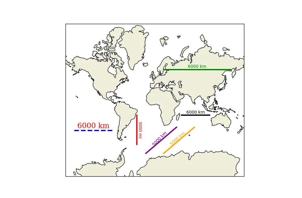
import cartopy.crs as ccrs
import cartopy.feature as cfeature
import matplotlib.pyplot as plt
from scalebar import scale_bar

fig = plt.figure(1, figsize=(10, 10))
ax = fig.add_subplot(111, projection=ccrs.Mercator())
ax.set_extent([-180, 180, -85, 85])
ax.coastlines(facecolor='black')
ax.add_feature(cfeature.LAND)

# Standard 6,000 km scale bar.
scale_bar(ax, (0.65, 0.4), 6_000)

# Length of the bar reflects its position on the map.
scale_bar(ax, (0.55, 0.7), 6_000, color='green')

# Bar can be placed at any angle. Any units can be used.
scale_bar(ax, (0.4, 0.4), 3_000, metres_per_unit=1609, angle=-90,
          unit_name='mi', color='red')
# Text and line can be styled separately. Keywords are simply passed to
# text or plot.
text_kwargs = dict(family='serif', size='xx-large', color='red')
plot_kwargs = dict(linestyle='dashed', color='blue')
scale_bar(ax, (0.05, 0.3), 6_000, text_kwargs=text_kwargs,
          plot_kwargs=plot_kwargs)

# Angles between 0 and 90 may result in the text and line plotted at
# slightly different angles for an unknown reason.
scale_bar(ax, (0.45, 0.15), 5_000, color='purple', angle=45, text_offset=0)

# To get around this override the text's angle and fiddle manually.
scale_bar(ax, (0.55, 0.15), 5_000, color='orange', angle=45, text_offset=0,
          text_kwargs={'rotation': 41})

plt.show()
- mephistolotl
8
我认为这看起来非常有前途。在某些时候,绘制一个标尺类型的比例尺会很好,但这是一个不错的开始。是
location参数决定比例尺的大小吗(因为距离取决于地图上的位置和投影)? - gauteh@PhilipeRiskallaLeal 这段时间我没有看过这个或者接触过cartopy,但是我相信我测试过多种投影方式。你可以试一下并告诉我结果如何。 - mephistolotl
类型错误:'NoneType'对象不可订阅。
114 return geodesic.inverse(a_phys, b_phys).base[0, 0] - Khalil Al Hooti1@KhalilAlHooti 我回答中的代码已经三年多了。我怀疑自那以后CartoPy发生了很多变化。我不会重新审查这个代码,但如果你有改进,欢迎发布。 - mephistolotl
1@KhalilAlHooti:尝试进入比例尺条形码,在“dist_func”函数下(第114行),并从行“return geodesic.inverse(a_phys, b_phys).base[0, 0]”中删除“.base”部分。然后得到的行是“return geodesic.inverse(a_phys, b_phys)[0, 0]”。我在更新cartopy后遇到了你提到的错误,改变了这一行和比例尺函数运行。我不确定这个小改变是否会导致任何错误或额外的错误,但它似乎至少让函数运行起来了。感谢mephistolotl提供的这个函数。它对我的工作很有用。 - mariandob
显示剩余3条评论
21
这是我为自己编写的Cartopy比例尺函数,使用了pp-mo答案的简化版本: 编辑:修改代码以创建新的投影,使得比例尺与许多坐标系(包括一些正交和更大的地图)的轴平行,并消除了指定utm系统的需要。 还添加了计算比例尺长度的代码,如果没有指定的话。
import cartopy.crs as ccrs
import numpy as np

def scale_bar(ax, length=None, location=(0.5, 0.05), linewidth=3):
    """
    ax is the axes to draw the scalebar on.
    length is the length of the scalebar in km.
    location is center of the scalebar in axis coordinates.
    (ie. 0.5 is the middle of the plot)
    linewidth is the thickness of the scalebar.
    """
    #Get the limits of the axis in lat long
    llx0, llx1, lly0, lly1 = ax.get_extent(ccrs.PlateCarree())
    #Make tmc horizontally centred on the middle of the map,
    #vertically at scale bar location
    sbllx = (llx1 + llx0) / 2
    sblly = lly0 + (lly1 - lly0) * location[1]
    tmc = ccrs.TransverseMercator(sbllx, sblly)
    #Get the extent of the plotted area in coordinates in metres
    x0, x1, y0, y1 = ax.get_extent(tmc)
    #Turn the specified scalebar location into coordinates in metres
    sbx = x0 + (x1 - x0) * location[0]
    sby = y0 + (y1 - y0) * location[1]

    #Calculate a scale bar length if none has been given
    #(Theres probably a more pythonic way of rounding the number but this works)
    if not length:
        length = (x1 - x0) / 5000 #in km
        ndim = int(np.floor(np.log10(length))) #number of digits in number
        length = round(length, -ndim) #round to 1sf
        #Returns numbers starting with the list
        def scale_number(x):
            if str(x)[0] in ['1', '2', '5']: return int(x)
            else: return scale_number(x - 10 ** ndim)
        length = scale_number(length)

    #Generate the x coordinate for the ends of the scalebar
    bar_xs = [sbx - length * 500, sbx + length * 500]
    #Plot the scalebar
    ax.plot(bar_xs, [sby, sby], transform=tmc, color='k', linewidth=linewidth)
    #Plot the scalebar label
    ax.text(sbx, sby, str(length) + ' km', transform=tmc,
            horizontalalignment='center', verticalalignment='bottom')
它有一些限制,但相对简单,如果你希望得到不同的东西,我希望你能看到如何改变它。
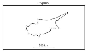
示例用法:
import matplotlib.pyplot as plt
ax = plt.axes(projection=ccrs.Mercator())
plt.title('Cyprus')
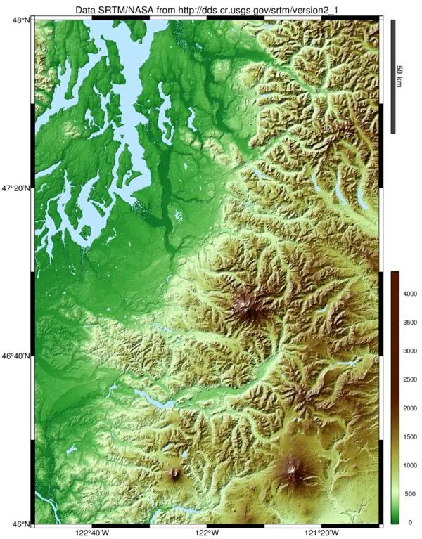
ax.set_extent([31, 35.5, 34, 36], ccrs.Geodetic())
ax.coastlines(resolution='10m')
scale_bar(ax, 100)
plt.show()
- Siyh
9
以下是@Siyh回答的精简版,它添加了以下功能:
- 自动UTM区域选择
- 文本/条形图后面的缓冲区,以便在背景上显示
- 一个北箭头
- 如果你的坐标轴不使用UTM,则条形图将绘制歪斜。
- 北箭头默认指向上方。
import os
import cartopy.crs as ccrs
from math import floor
import matplotlib.pyplot as plt
from matplotlib import patheffects
import matplotlib
if os.name == 'nt':
matplotlib.rc('font', family='Arial')
else: # might need tweaking, must support black triangle for N arrow
matplotlib.rc('font', family='DejaVu Sans')
def utm_from_lon(lon):
"""
utm_from_lon - UTM zone for a longitude
Not right for some polar regions (Norway, Svalbard, Antartica)
:param float lon: longitude
:return: UTM zone number
:rtype: int
"""
return floor( ( lon + 180 ) / 6) + 1
def scale_bar(ax, proj, length, location=(0.5, 0.05), linewidth=3,
units='km', m_per_unit=1000):
"""
https://dev59.com/bVwY5IYBdhLWcg3wq5fl#35705477
ax is the axes to draw the scalebar on.
proj is the projection the axes are in
location is center of the scalebar in axis coordinates ie. 0.5 is the middle of the plot
length is the length of the scalebar in km.
linewidth is the thickness of the scalebar.
units is the name of the unit
m_per_unit is the number of meters in a unit
"""
# find lat/lon center to find best UTM zone
x0, x1, y0, y1 = ax.get_extent(proj.as_geodetic())
# Projection in metres
utm = ccrs.UTM(utm_from_lon((x0+x1)/2))
# Get the extent of the plotted area in coordinates in metres
x0, x1, y0, y1 = ax.get_extent(utm)
# Turn the specified scalebar location into coordinates in metres
sbcx, sbcy = x0 + (x1 - x0) * location[0], y0 + (y1 - y0) * location[1]
# Generate the x coordinate for the ends of the scalebar
bar_xs = [sbcx - length * m_per_unit/2, sbcx + length * m_per_unit/2]
# buffer for scalebar
buffer = [patheffects.withStroke(linewidth=5, foreground="w")]
# Plot the scalebar with buffer
ax.plot(bar_xs, [sbcy, sbcy], transform=utm, color='k',
linewidth=linewidth, path_effects=buffer)
# buffer for text
buffer = [patheffects.withStroke(linewidth=3, foreground="w")]
# Plot the scalebar label
t0 = ax.text(sbcx, sbcy, str(length) + ' ' + units, transform=utm,
horizontalalignment='center', verticalalignment='bottom',
path_effects=buffer, zorder=2)
left = x0+(x1-x0)*0.05
# Plot the N arrow
t1 = ax.text(left, sbcy, u'\u25B2\nN', transform=utm,
horizontalalignment='center', verticalalignment='bottom',
path_effects=buffer, zorder=2)
# Plot the scalebar without buffer, in case covered by text buffer
ax.plot(bar_xs, [sbcy, sbcy], transform=utm, color='k',
linewidth=linewidth, zorder=3)
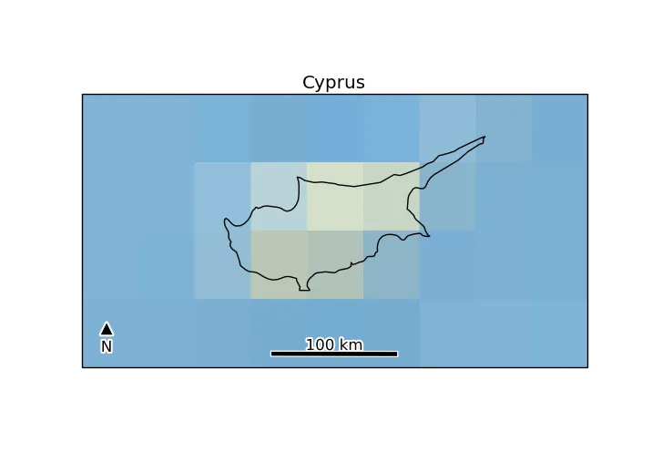
if __name__ == '__main__':
ax = plt.axes(projection=ccrs.Mercator())
plt.title('Cyprus')
ax.set_extent([31, 35.5, 34, 36], ccrs.Geodetic())
ax.stock_img()
ax.coastlines(resolution='10m')
scale_bar(ax, ccrs.Mercator(), 100) # 100 km scale bar
# or to use m instead of km
# scale_bar(ax, ccrs.Mercator(), 100000, m_per_unit=1, units='m')
# or to use miles instead of km
# scale_bar(ax, ccrs.Mercator(), 60, m_per_unit=1609.34, units='miles')
plt.show()
- Terry Brown
3
1看起来不错,代码中的数字
500是做什么用的?它能推广到其他领域吗?我特别在处理UPS相关的工作。 - gauteh@gauteh - 很好的问题,感谢。代码是硬编码为以千米为单位绘制条形图的,因此500代表1公里/2,用于居中对齐。但基于您的评论,我将其设为参数,现在支持其他单位 :-) - Terry Brown
proj参数是不必要的,你可以直接使用ax.projection.as_geodetic()来读取轴投影。 - Martin7
自从 cartopy 中的比例尺更新不多,我决定自己创建一个...(它是 EOmaps 的一部分... 我正在开发基于 matplotlib/cartopy 的交互地图库)
它的一些特点包括:
- 完全可定制(可以更改比例尺、颜色、字体、框架等) - 投影感知(可以处理任何 cartopy 投影) - 交互式 - 使用鼠标和键盘拖动、旋转和调整框架!
它的一些特点包括:
- 完全可定制(可以更改比例尺、颜色、字体、框架等) - 投影感知(可以处理任何 cartopy 投影) - 交互式 - 使用鼠标和键盘拖动、旋转和调整框架!

- raphael
3
基于上述提供的先前示例和这里的内容,我已经开发出一种使用cartopy绘制比例尺的替代方法。
该方法已在cartopy.crs.PlateCarree()投影中进行了验证。然而,该算法对其他投影不起作用。
下面是一个示例:
# importing main libraries

import cartopy
import cartopy.crs as ccrs
from cartopy.mpl.gridliner import LONGITUDE_FORMATTER, LATITUDE_FORMATTER
import matplotlib.pyplot as plt
import numpy as np

from matplotlib import font_manager as mfonts
import matplotlib.ticker as mticker
import matplotlib.patches as patches
import geopandas as gpd

import pandas as pd


def get_standard_gdf():
    """ basic function for getting some geographical data in geopandas GeoDataFrame python's instance:
        An example data can be downloaded from Brazilian IBGE:
        ref: ftp://geoftp.ibge.gov.br/organizacao_do_territorio/malhas_territoriais/malhas_municipais/municipio_2017/Brasil/BR/br_municipios.zip
    """
    gdf_path = r'C:\path_to_shp\shapefile.shp'

    return gpd.read_file(gdf_path)


----------
# defining functions for scalebar


def _crs_coord_project(crs_target, xcoords, ycoords, crs_source):
    """ metric coordinates (x, y) from cartopy.crs_source"""

    axes_coords = crs_target.transform_points(crs_source, xcoords, ycoords)

    return axes_coords


def _add_bbox(ax, list_of_patches, paddings={}, bbox_kwargs={}):

    '''
    Description:
        This helper function adds a box behind the scalebar:
            Code inspired by: https://dev59.com/-WQn5IYBdhLWcg3wIUBn


    '''

    zorder = list_of_patches[0].get_zorder() - 1

    xmin = min([t.get_window_extent().xmin for t in list_of_patches])
    xmax = max([t.get_window_extent().xmax for t in list_of_patches])
    ymin = min([t.get_window_extent().ymin for t in list_of_patches])
    ymax = max([t.get_window_extent().ymax for t in list_of_patches])


    xmin, ymin = ax.transData.inverted().transform((xmin, ymin))
    xmax, ymax = ax.transData.inverted().transform((xmax, ymax))


    xmin = xmin - ( (xmax-xmin) * paddings['xmin'])
    ymin = ymin - ( (ymax-ymin) * paddings['ymin'])

    xmax = xmax + ( (xmax-xmin) * paddings['xmax'])
    ymax = ymax + ( (ymax-ymin) * paddings['ymax'])

    width = (xmax-xmin)
    height = (ymax-ymin)

    # Setting xmin according to height


    rect = patches.Rectangle((xmin,ymin),
                              width,
                              height,
                              facecolor=bbox_kwargs['facecolor'],
                              edgecolor =bbox_kwargs['edgecolor'],
                              alpha=bbox_kwargs['alpha'],
                              transform=ax.projection,
                              fill=True,
                              clip_on=False,
                              zorder=zorder)

    ax.add_patch(rect)
    return ax


def add_scalebar(ax, metric_distance=100,
                 at_x=(0.1, 0.4),
                 at_y=(0.05, 0.075),
                 max_stripes=5,
                 ytick_label_margins = 0.25,
                 fontsize= 8,
                 font_weight='bold',
                 rotation = 45,
                 zorder=999,
                 paddings = {'xmin':0.3,
                             'xmax':0.3,
                             'ymin':0.3,
                             'ymax':0.3},

                 bbox_kwargs = {'facecolor':'w',
                                'edgecolor':'k',
                                'alpha':0.7}
                ):
    """
    Add a scalebar to a GeoAxes of type cartopy.crs.OSGB (only).

    Args:
    * at_x : (float, float)
        target axes X coordinates (0..1) of box (= left, right)
    * at_y : (float, float)
        axes Y coordinates (0..1) of box (= lower, upper)
    * max_stripes
        typical/maximum number of black+white regions
    """
    old_proj = ax.projection
    ax.projection = ccrs.PlateCarree()
    # Set a planar (metric) projection for the centroid of a given axes projection:
    # First get centroid lon and lat coordinates:

    lon_0, lon_1, lat_0, lat_1 = ax.get_extent(ax.projection.as_geodetic())

    central_lon = np.mean([lon_0, lon_1])
    central_lat = np.mean([lat_0, lat_1])

    # Second: set the planar (metric) projection centered in the centroid of the axes;
        # Centroid coordinates must be in lon/lat.
    proj=ccrs.EquidistantConic(central_longitude=central_lon, central_latitude=central_lat)

    # fetch axes coordinates in meters
    x0, x1, y0, y1 = ax.get_extent(proj)
    ymean = np.mean([y0, y1])

    # set target rectangle in-visible-area (aka 'Axes') coordinates
    axfrac_ini, axfrac_final = at_x
    ayfrac_ini, ayfrac_final = at_y

    # choose exact X points as sensible grid ticks with Axis 'ticker' helper
    xcoords = []
    ycoords = []
    xlabels = []
    for i in range(0 , 1+ max_stripes):
        dx = (metric_distance * i) + x0
        xlabels.append(dx - x0)

        xcoords.append(dx)
        ycoords.append(ymean)

    # Convertin to arrays:

    xcoords = np.asanyarray(xcoords)
    ycoords = np.asanyarray(ycoords)

    # Ensuring that the coordinate projection is in degrees:

    x_targets, y_targets, z_targets = _crs_coord_project(ax.projection, xcoords, ycoords, proj).T
    x_targets = [x + (axfrac_ini * (lon_1 - lon_0)) for x in  x_targets]


    # Checking x_ticks in axes projection coordinates
    #print('x_targets', x_targets)


    #Setting transform for plotting


    transform = ax.projection


    # grab min+max for limits
    xl0, xl1 = x_targets[0], x_targets[-1]


    # calculate Axes Y coordinates of box top+bottom
    yl0, yl1 = [lat_0 + ay_frac * (lat_1 - lat_0) for ay_frac in [ayfrac_ini, ayfrac_final]]


    # calculate Axes Y distance of ticks + label margins
    y_margin = (yl1-yl0)*ytick_label_margins


    # fill black/white 'stripes' and draw their boundaries
    fill_colors = ['black', 'white']
    i_color = 0

    filled_boxs = []
    for xi0, xi1 in zip(x_targets[:-1],x_targets[1:]):
        # fill region
        filled_box = plt.fill(
                              (xi0, xi1, xi1, xi0, xi0),
                              (yl0, yl0, yl1, yl1, yl0),

                              fill_colors[i_color],
                              transform=transform,
                              clip_on=False,
                              zorder=zorder
                            )

        filled_boxs.append(filled_box[0])

        # draw boundary
        plt.plot((xi0, xi1, xi1, xi0, xi0),
                 (yl0, yl0, yl1, yl1, yl0),
                 'black',
                 clip_on=False,
                transform=transform,
                zorder=zorder)

        i_color = 1 - i_color

    # adding boxes


    _add_bbox(ax,
             filled_boxs,
             bbox_kwargs = bbox_kwargs ,
             paddings =paddings)


    # add short tick lines
    for x in x_targets:
        plt.plot((x, x), (yl0, yl0-y_margin), 'black',
                 transform=transform,
                 zorder=zorder,
                 clip_on=False)


    # add a scale legend 'Km'
    font_props = mfonts.FontProperties(size=fontsize,
                                       weight=font_weight)

    plt.text(
        0.5 * (xl0 + xl1),
        yl1 + y_margin,
        'Km',
        color='k',
        verticalalignment='bottom',
        horizontalalignment='center',
        fontproperties=font_props,
        transform=transform,
        clip_on=False,
        zorder=zorder)

    # add numeric labels
    for x, xlabel in zip(x_targets, xlabels):
        print('Label set in: ', x, yl0 - 2 * y_margin)
        plt.text(x,
                 yl0 - 2 * y_margin,
                 '{:g}'.format((xlabel) * 0.001),
                 verticalalignment='top',
                 horizontalalignment='center',
                 fontproperties=font_props,
                 transform=transform,
                 rotation=rotation,
                 clip_on=False,
                 zorder=zorder+1,
                #bbox=dict(facecolor='red', alpha=0.5) # this would add a box only around the xticks
                )


    # Adjusting figure borders to ensure that the scalebar is within its limits
    ax.projection = old_proj
    ax.get_figure().canvas.draw()
    fig.tight_layout()


----------
为绘制轴定义一些辅助函数 #绘图
def format_ax(ax, projection):

    xlim = ax.get_xlim()
    ylim = ax.get_ylim()
    ax.set_global()
    ax.coastlines()

    ax.set_xlim(xlim)
    ax.set_ylim(ylim)


def add_grider(ax, nticks=5):


    if isinstance(ax.projection, ccrs.PlateCarree):


        Grider = ax.gridlines(draw_labels=True)
        Grider.xformatter = LONGITUDE_FORMATTER
        Grider.yformatter = LATITUDE_FORMATTER
        Grider.xlabels_top  = False
        Grider.ylabels_right  = False

        Grider.xlocator = mticker.MaxNLocator(nticks)
        Grider.ylocator = mticker.MaxNLocator(nticks)


    else:
        xmin, xmax, ymin, ymax = ax.get_extent()

        ax.set_xticks(np.arange(xmin, xmax, nticks))

        ax.set_yticks(np.arange(ymin, ymax, nticks))
        ax.grid(True)

----------
# Defining a main helper function for plotting:


def main(projection = ccrs.PlateCarree(central_longitude=0),
        nticks=4):


    fig, ax1 = plt.subplots( figsize=(8, 10), subplot_kw={'projection':projection})

    # Label axes of a Plate Carree projection with a central longitude of 180:

    #for enum, proj in enumerate(['Mercator, PlateCarree']):

    gdf = get_standard_gdf()


    if gdf.crs.is_projected:
        epsg = gdf.crs.to_epsg()

        crs_epsg = ccrs.epsg(epsg)

    else:
        crs_epsg = ccrs.PlateCarree()


    gdf.plot(ax=ax1, transform=projection)


    format_ax(ax1, projection)


    add_grider(ax1, nticks)


    ax1.set_title('Projection {0}'.format(ax1.projection.__class__.__name__))
    plt.draw()
    return fig, fig.get_axes()


----------
# Example of the case


length = 1000

fig, axes = main(ccrs.PlateCarree())

for ax in axes:

    add_scalebar(ax,
                 metric_distance=200_000  ,
                 at_x=(1.1, 1.3),
                 at_y=(0.08, 0.11),
                 max_stripes=4,
                 paddings = {'xmin':0.1,
                            'xmax':0.1,
                            'ymin':2.8,
                            'ymax':0.5},
                 fontsize=9,
                 font_weight='bold',
                 bbox_kwargs = {'facecolor':'w',
                                'edgecolor':'k',
                               'alpha':0.7})

fig.show()
以下是相同区域(巴西帕拉州)的两个图像,使用"add_scalebar"函数不同的设置。图1正好使用上述的设置,而图2则使用了变体:
add_scalebar(ax,
                 metric_distance=200_000  ,
                 at_x=(0.55, 0.3),
                 at_y=(0.08, 0.11),
                 max_stripes=4,
                 paddings = {'xmin':0.05,
                            'xmax':0.05,
                            'ymin':2.2,
                            'ymax':0.5},
                 fontsize=7,
                 font_weight='bold',
                 bbox_kwargs = {'facecolor':'w',
                                'edgecolor':'k',
                               'alpha':0.7})
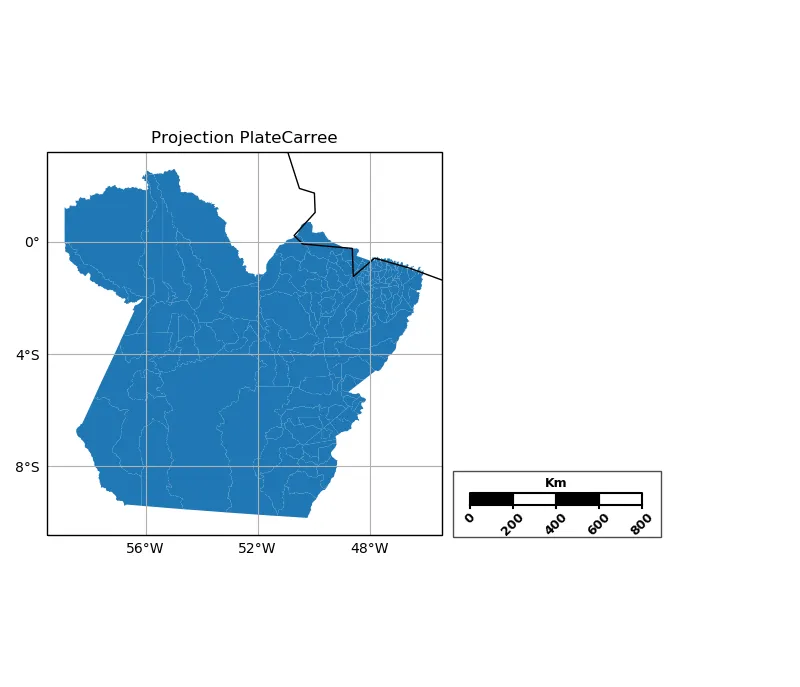
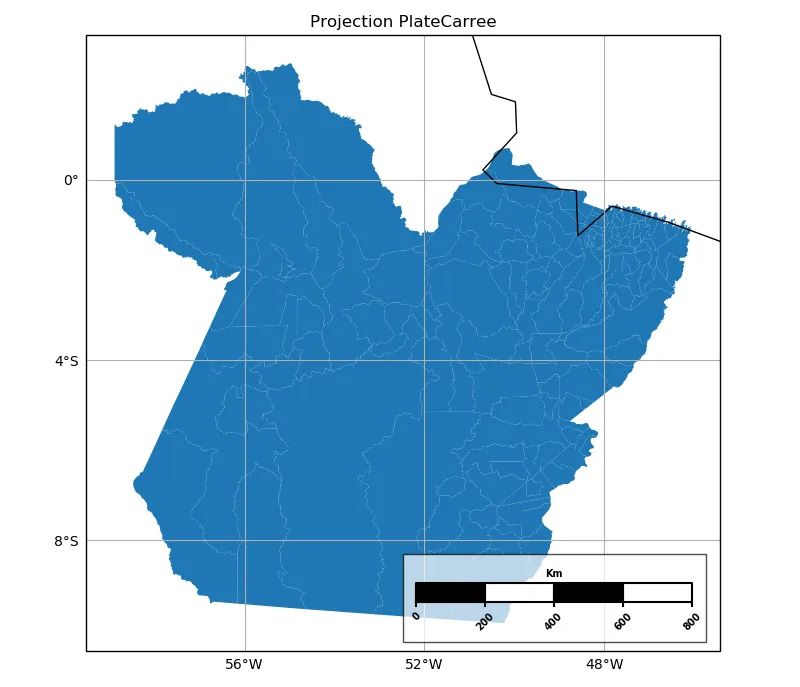
唯一的问题是,这个提议的解决方案仍需要扩展到其他的cartopy投影(除了PlateCarree)。
- Philipe Riskalla Leal
1
1你的代码运行得很好。然而,我注意到实际距离和比例尺中呈现的距离之间存在差异。我建议使用
pyproj 替代函数 _crs_coord_project。 - Romero_912
我认为这个问题没有简单的解决方案:您必须使用图形元素自己绘制出来。
很久以前,我写了一些自适应代码,将比例尺添加到任意比例尺的 OS 地图中。
我认为这不是你想要的,但它展示了必要的技术:
def add_osgb_scalebar(ax, at_x=(0.1, 0.4), at_y=(0.05, 0.075), max_stripes=5):
    """
    Add a scalebar to a GeoAxes of type cartopy.crs.OSGB (only).

    Args:
    * at_x : (float, float)
        target axes X coordinates (0..1) of box (= left, right)
    * at_y : (float, float)
        axes Y coordinates (0..1) of box (= lower, upper)
    * max_stripes
        typical/maximum number of black+white regions
    """
    # ensure axis is an OSGB map (meaning coords are just metres)
    assert isinstance(ax.projection, ccrs.OSGB)
    # fetch axes coordinate mins+maxes
    x0, x1 = ax.get_xlim()
    y0, y1 = ax.get_ylim()
    # set target rectangle in-visible-area (aka 'Axes') coordinates
    ax0, ax1 = at_x
    ay0, ay1 = at_y
    # choose exact X points as sensible grid ticks with Axis 'ticker' helper
    x_targets = [x0 + ax * (x1 - x0) for ax in (ax0, ax1)]
    ll = mpl.ticker.MaxNLocator(nbins=max_stripes, steps=[1,2,4,5,10])
    x_vals = ll.tick_values(*x_targets)
    # grab min+max for limits
    xl0, xl1 = x_vals[0], x_vals[-1]
    # calculate Axes Y coordinates of box top+bottom
    yl0, yl1 = [y0 + ay * (y1 - y0) for ay in [ay0, ay1]]
    # calculate Axes Y distance of ticks + label margins
    y_margin = (yl1-yl0)*0.25

    # fill black/white 'stripes' and draw their boundaries
    fill_colors = ['black', 'white']
    i_color = 0
    for xi0, xi1 in zip(x_vals[:-1],x_vals[1:]):
        # fill region
        plt.fill((xi0, xi1, xi1, xi0, xi0), (yl0, yl0, yl1, yl1, yl0),
                 fill_colors[i_color])
        # draw boundary
        plt.plot((xi0, xi1, xi1, xi0, xi0), (yl0, yl0, yl1, yl1, yl0),
                 'black')
        i_color = 1 - i_color

    # add short tick lines
    for x in x_vals:
        plt.plot((x, x), (yl0, yl0-y_margin), 'black')

    # add a scale legend 'Km'
    font_props = mfonts.FontProperties(size='medium', weight='bold')
    plt.text(
        0.5 * (xl0 + xl1),
        yl1 + y_margin,
        'Km',
        verticalalignment='bottom',
        horizontalalignment='center',
        fontproperties=font_props)

    # add numeric labels
    for x in x_vals:
        plt.text(x,
                 yl0 - 2 * y_margin,
                 '{:g}'.format((x - xl0) * 0.001),
                 verticalalignment='top',
                 horizontalalignment='center',
                 fontproperties=font_props)
有点乱,不是吗?
你可能认为可以添加某种“浮动轴对象”来自动调整图形大小,但我无法想出一种方法来实现这一点(我猜我仍然无法做到)。
希望对你有所帮助。
- pp-mo
1
这很有用,但不完全是我要找的。也许可以用它作为灵感来源。 - gauteh
网页内容由stack overflow 提供, 点击上面的可以查看英文原文,
原文链接
原文链接
pyproj.Geod.inv来绘制所需长度和坐标系的大地线,然后可以使用 Cartopy 进行绘制,或者用于构建更复杂的多边形进行绘制。对于大多数基本用途来说,这可能已经足够了,尽管示例比普通的线条或矩形要高级得多。 - shadowtalker