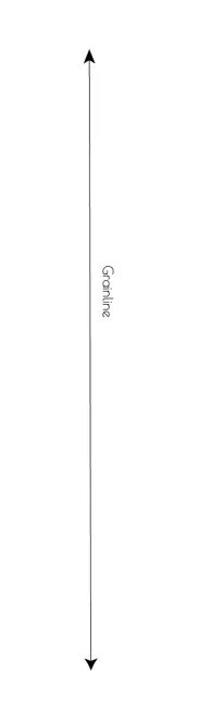
单元素解决方案
您可以使用伪元素、CSS三角形和一些定位来实现:伪元素,CSS三角形和定位。
.arrow {
width: 2px;
height: 200px; /* <- adjust your height as you need it */
background: black;
margin: 10px;
position: relative;
}
.arrow::before,
.arrow::after {
content: '';
position: absolute;
left: -9px;
width: 0;
height: 0;
border-left: 10px solid transparent;
border-right: 10px solid transparent;
}
.arrow::before {
top: 0;
border-bottom: 15px solid black;
}
.arrow::after {
bottom: 0;
border-top: 15px solid black;
}
<div class="arrow"></div>
多元素解决方案
要实现实际的箭头形状,您需要使用多个元素。在这里,伪元素用于创建白色三角形,以切出黑色箭头头部:
.arrow {
width: 2px;
height: 200px; /* <- adjust your height as you need it */
background: black;
margin: 10px;
position: relative;
}
.up, .down, .arrow::before, .arrow::after {
position: absolute;
left: -9px;
width: 0;
height: 0;
border-left: 10px solid transparent;
border-right: 10px solid transparent;
}
.up {
top: 0;
border-bottom: 15px solid black;
}
.down {
bottom: 0;
border-top: 15px solid black;
}
.arrow::before, .arrow::after {
content: '';
z-index: 2;
}
.arrow::before {
top: 11px;
border-bottom: 4px solid white;
}
.arrow::after {
bottom: 11px;
border-top: 4px solid white;
}
<div class="arrow">
<div class="up"></div>
<div class="line"></div>
<div class="down"></div>
</div>
或者另一种连续线的变体:
.line {
position: relative;
margin: -15px 0 -15px 9px;
width: 2px;
height: 180px;
background-color: black;
z-index: 5;
}
.up,
.down {
position: relative;
z-index: 3;
width: 0;
height: 0;
border-left: 10px solid transparent;
border-right: 10px solid transparent;
}
.up {
border-bottom: 15px solid black;
}
.down {
border-top: 15px solid black;
}
.down::before, .up::after {
position: absolute;
left: -10px;
width: 0;
height: 0;
border-left: 10px solid transparent;
border-right: 10px solid transparent;
content: '';
z-index: 4;
}
.down::before {
bottom: 11px;
border-top: 4px solid white;
}
.up::after {
top: 11px;
border-bottom: 4px solid white;
}
<div class="arrow">
<div class="up"></div>
<div class="line"></div>
<div class="down"></div>
</div>
.wrap{
position:relative;
height:70vh;
border-left:1px solid #000;
margin:10vh 50px;
padding:5vh 20px;
}
.arrow {
position:absolute;
left:-5px;
width: 9px;
height: auto;
}
.up{top:-9px;}
.down{bottom:-9px;}
<div class="wrap">
<svg class="arrow up" viewbox="0 0 7 10">
<path d="M3.5 0 L7 10 Q3.5 7 0 10z"/>
</svg>
<svg class="arrow down" viewbox="0 0 7 10">
<path d="M3.5 10 L7 0 Q3.5 3 0 0z"/>
</svg>
Whatever content you need here
</div>
内联SVG箭头是使用路径元素制作的,并使用一个二次曲线(在向上箭头中使用Q3.5 7 0 10
)。
箭头之间的线是通过容器
两个箭头都采用绝对定位。
.arrow
元素的宽度。并调整left
属性使它们居中。 - web-tikifill
属性,就像这样:https://jsfiddle.net/2w5v6zL3/ 除此之外,在内联 SVG 中没有什么特别的。 - web-tiki这里有另一种使用箭头字符代码\027A4
作为::before
和::after
内容的解决方案。
这些字符的大小已绑定到根字体大小rem
,它们的修改rotate
,top
和left
基于内容字体大小。
.arrow {
position: relative;
width: 3px;
height: 150px;
margin: 20px;
background: tomato;
}
.arrow::before,
.arrow::after {
content: '\027A4';
position: absolute;
font-size: 1.5rem;
color: tomato;
}
.arrow::before {
top: -.9em;
left: -.5em;
transform: rotate(-90deg);
}
.arrow::after {
bottom: -.9em;
left: -.32em;
transform: rotate(90deg);
}
<div class="arrow"></div>
.up {
width: 0px;
height: 0px;
border-bottom: 10px solid black;
border-left: 8px solid transparent;
border-right: 8px solid transparent;
border-top: none;
}
.mid {
margin-left:7px;
width: 2px;
height: 180px;
background-color:black;
}
.down{
width: 0px;
height: 0px;
border-top: 10px solid black;
border-left: 8px solid transparent;
border-right: 8px solid transparent;
border-bottom: none;
}
<div class='up'></div>
<div class='mid'></div>
<div class='down'></div>