如何制作虚线箭头动画?

7
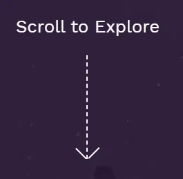
作为标题所描述的,我正在尝试制作一个虚线箭头动画。我希望它看起来尽可能接近此网站上的样子。

enter image description here

我能够制作箭头,但我不确定这是否是制作箭头的正确方法。我假设我需要使用SVG来绘制它...
此外,动画看起来很奇怪,我不知道如何使它更流畅...
希望大家能提供一些帮助 :) 这是我制作的JsFiddle 以下是代码:

body {
  margin: 0;
  font-size: 16px;
  line-height: 1.528571429;
  padding: 0;
  height: 100%;
}
body #contact {
  height: calc(100vh - 40px);
  background-color: #ffffff;
}
body #contact .to-top-btn-wrapper {
  position: absolute;
  z-index: 999;
  left: 7%;
  bottom: 15%;
}
body #contact .to-top-btn-wrapper .btn-text-wrapper {
  margin: -35px auto;
}
body #contact .to-top-btn-wrapper .btn-text-wrapper .btn-text {
  font-size: 14px;
  letter-spacing: 0.25em;
  text-align: center;
  color: #676565;
  text-transform: uppercase;
}
body #contact .to-top-btn-wrapper .to-top-btn {
  position: absolute;
  top: 0;
  left: 35px;
  bottom: 25px;
  cursor: pointer;
}
body #contact .to-top-btn-wrapper .to-top-btn .line {
  border-right: 0.1rem dashed #676565;
  display: inline-block;
  animation: show 1000ms linear forwards infinite;
}
body #contact .to-top-btn-wrapper .to-top-btn .arrow {
  position: absolute;
  top: -0.3rem;
  bottom: 0;
  height: 1rem;
  border-right: 0.1rem solid #676565;
  display: inline-block;
}
body #contact .to-top-btn-wrapper .to-top-btn .right {
  left: 0.3rem;
  transform: rotate(-45deg);
}
body #contact .to-top-btn-wrapper .to-top-btn .left {
  right: 0.3rem;
  transform: rotate(45deg);
}
@keyframes show {
  0% {
    height: 5rem;
  }
  100% {
    height: 0rem;
  }
}
<section id="contact" class="container-fluid">
  <div class="to-top-btn-wrapper">
    <div class="btn-text-wrapper">
      <span class="btn-text">Scroll to top</span>
    </div>
    <div class="to-top-btn">
      <span class="arrow left"></span>
      <span class="line"></span>
      <span class="arrow right"></span>
    </div>
  </div>
</section>


1
检查您提供的页面上的代码,就能得到答案。为什么不跟随他们的做法呢?这并不复杂。他们使用关键帧来动画化“transform”,值为matrix3d - Marius
1
好的,不只是matrix3d。看看容器中的每个元素。他们使用了相当多的技巧,但大多数是使用动画完成的。您可以使用关键帧。似乎他们正在使用JS,因为它在元素样式中。 - Marius
2个回答

6
使用一些背景颜色的clip-path动画可以实现这个效果。

.arrow {
  width: 20px;
  margin:10px;
  height: 150px; 
  display:inline-block;
  position: relative;
  padding-bottom:4px;
  color: #fff;
  background: linear-gradient(currentColor 50%, transparent 50%) top/2px 15px content-box repeat-y;
  clip-path:polygon(0 0,100% 0,100% 100%,0 100%);
  animation:hide infinite 2s linear;
}

.arrow:after {
  content: "";
  position: absolute;
  border-left: 2px solid;
  border-bottom: 2px solid;
  width: 80%;
  padding-top: 80%;
  bottom: 4px;
  left: 1px;
  transform: rotate(-45deg);
}

@keyframes hide {
  50% {
    clip-path:polygon(0 100%,100% 100%,100% 100%,0 100%);
  }
  50.1% {
    clip-path:polygon(0 0   ,100% 0   ,100% 0   ,0 0);
  }
}

body {
  background: red;
}
<div class="arrow"></div>

<div class="arrow" style="transform:scaleY(-1)"></div>

使用 mask 的类似想法。

.arrow {
  width: 20px;
  margin:10px;
  height: 150px;
  padding-bottom:4px;
  display:inline-block;  
  position: relative;
  color: #fff;
  background: linear-gradient(currentColor 50%, transparent 50%) top/2px 15px content-box repeat-y;
  -webkit-mask:linear-gradient(#fff,#fff);
  -webkit-mask-size:100% 0%;
  -webkit-mask-repeat:no-repeat;
  mask:linear-gradient(#fff,#fff);
  mask-size:100% 0%;
  mask-repeat:no-repeat;
  animation:hide infinite 2s linear;
}

.arrow:after {
  content: "";
  position: absolute;
  border-left: 2px solid;
  border-bottom: 2px solid;
  width: 80%;
  padding-top: 80%;
  bottom: 4px;
  left: 1px;
  transform: rotate(-45deg);
}

@keyframes hide {
  50% {
     -webkit-mask-size:100% 100%; 
     -webkit-mask-position:top;  
     mask-size:100% 100%; 
     mask-position:top;      
  }
  50.1% {
     -webkit-mask-size:100% 100%; 
     -webkit-mask-position:bottom;
     mask-size:100% 100%; 
     mask-position:bottom;   
  }
  100% {
     -webkit-mask-position:bottom;
     mask-position:bottom;  
  }
}

body {
  background: red;
}
<div class="arrow"></div>

<div class="arrow" style="transform:scaleY(-1)"></div>

这是一个无需剪辑路径的纯背景解决方案:

.arrow {
  width: 20px;
  margin:10px;
  height: 150px; 
  display:inline-block;
  color: #fff;
  background: 
   linear-gradient(to bottom left, 
     transparent    calc(50% - 1px), 
     currentColor 0 calc(50% + 1px),
     transparent  0) 
   bottom left/10px 10px,
    
   linear-gradient(to bottom right, 
     transparent    calc(50% - 1px), 
     currentColor 0 calc(50% + 1px),
     transparent  0) 
   bottom right/10px 10px,
    
   repeating-linear-gradient(currentColor 0 7px, transparent 7px 15px) 
   bottom/2px 100%;
  background-repeat:no-repeat;
  background-clip:content-box;
  box-sizing:border-box;
  animation:hide infinite 2s linear;
}

@keyframes hide {
  50% {
    padding:150px 0 0;
  }
  50.1% {
    padding:0 0 150px;
  }
}

body {
  background: red;
}
<div class="arrow"></div>

<div class="arrow" style="transform:scaleY(-1)"></div>

另一种较少渐变的版本:

.arrow {
  width: 20px;
  margin:10px;
  height: 150px; 
  display:inline-flex;
}
.arrow:before,
.arrow:after{
  content:"";
  width:50%;
  background: 
   linear-gradient(to bottom left, 
     transparent    calc(50% - 1px), 
     white        0 calc(50% + 1px),
     transparent  0) 
   bottom/100% 10px,
    
   repeating-linear-gradient(white 0 7px, transparent 0 15px) 
   right/1px 100%;
  background-repeat:no-repeat;
  background-clip:content-box;
  box-sizing:border-box;
  animation:hide infinite 2s linear;
}
.arrow:after {
  transform:scaleX(-1);
}
@keyframes hide {
  50% {
    padding:150px 0 0;
  }
  50.1% {
    padding:0 0 150px;
  }
}

body {
  background: red;
}
<div class="arrow"></div>

<div class="arrow" style="transform:scaleY(-1)"></div>

结合CSS变量轻松控制一切:

.arrow {
  --h:150px;   /* height */
  --w:20px;    /* width */
  --b:7px;     /* width of the dash*/
  --g:8px;     /* gap between dashes*/
  width: var(--w);
  margin:10px;
  height: var(--h); 
  display:inline-flex;
}
.arrow:before,
.arrow:after{
  content:"";
  width:50%;
  background: 
   linear-gradient(to bottom left, 
     transparent    calc(50% - 1px), 
     white        0 calc(50% + 1px),
     transparent  0) 
   bottom/100% calc(var(--w)/2),
    
   repeating-linear-gradient(white 0 var(--b), transparent 0 calc(var(--b) + var(--g))) 
   right/1px 100%;
  background-repeat:no-repeat;
  background-clip:content-box;
  box-sizing:border-box;
  animation:hide infinite 2s linear;
}
.arrow:after {
  transform:scaleX(-1);
}
@keyframes hide {
  50% {
    padding:var(--h) 0 0;
  }
  50.1% {
    padding:0 0 var(--h);
  }
}

body {
  background: red;
}
<div class="arrow"></div>
<div class="arrow" style="transform:scaleY(-1);--h:100px;--g:3px;"></div>
<div class="arrow" style="--h:120px;--b:3px;--w:30px"></div>
<div class="arrow" style="transform:scaleY(-1);--h:150px;--b:5px;--g:10px;--w:40px"></div>


兄弟,非常感谢你:D 我请你喝一杯虚拟网络啤酒!:D - weinde
@weinde提供了另外一个想法,以防您需要比clip-path更好的支持。 - Temani Afif
兄弟,干得好!说实话,我没想到会有这样的东西:D你让我对这个地方恢复了信心。 - weinde

3

采用不同的方法来实现箭头动画。

可以使用SVG而不是文本。

POC:

body {
  margin: 0;
}

.arrow-container {
  padding: 0 50px;
  animation: scrolling 2s infinite linear;
  overflow: hidden;
  height: 150px;
}

.arrow {
  animation: scrolling-a 2s infinite linear;
}

.arrow-point {
  font-size: 50px;
  display: block;
  margin: 0 0 -50px -10px;
}

@keyframes scrolling {
  0% {
    margin-top: 150px;
    height: 0;
  }
  50% {
    margin-top: 0;
    height: 150px;
  }
  100% {
    margin-top: 0;
    height: 0;
  }
}

@keyframes scrolling-a {
  0% {
    margin-top: -150px;
  }
  50%,
  100% {
    margin-top: 0;
  }
}
<div class="arrow-container">
  <div class="arrow">
    <span class="arrow-point">^</span><br> |
    <br> |
    <br> |
    <br> |
    <br> |
    <br> |
    <br> |
  </div>
</div>


网页内容由stack overflow 提供, 点击上面的
可以查看英文原文,
原文链接