我正在构建一个基于AngularJS数据的产品网格,其中包括图片和产品详细信息(文本)。
文本有时会延伸到第二行,引起混乱。
以下是我的代码:
这是它的样子: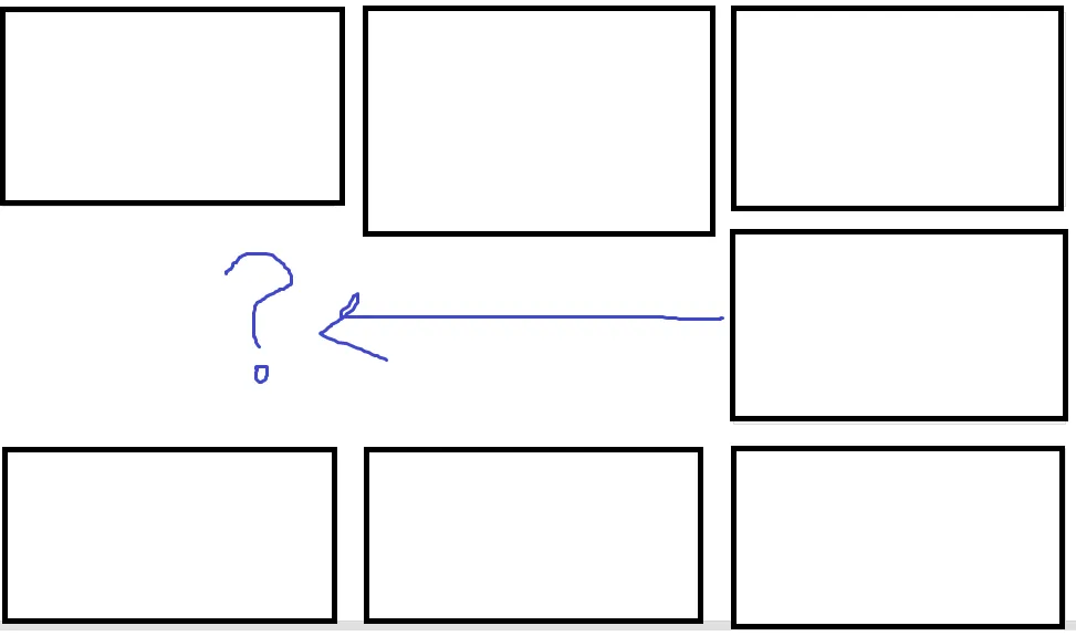 如何解决使所有
以下是我的代码:
<div class="row">
    <div data-ng-repeat="s in Results">
        <div class="col-xs-4">
            <a href="#" class="thumbnail">
                <div>
                    <img ng-src="{{s.ProductImage}}" class="img-responsive">
                </div>
                <div>
                    {{s.Store}} {{s.Category}} {{s.ProductName}}
                </div>
            </a>
        </div>
        <div class="clearfix visible-xs-block"></div>
    </div>
</div>
这是它的样子:
如何解决使所有的高度相同?
我尝试在线寻找解决方案,但我认为我只有50%的进展。请帮忙。
注意:我不想隐藏内容。
注意:我不想隐藏内容。
(col-xs-4),并在每个列内部进行重复,并根据计数将每个项目拆分到适当的列中。我不知道如何在Angular中实现这一点,所以我只是点了赞该问题。我在我的首选语言中遇到过这个问题多次。 - Kaizen Programmerjquery。在加载完所有项目后,您需要循环遍历它们并将最小高度设置为与最大产品div相同。 - Kaizen Programmer