我从互联网上加载了多个图片到我的网站上。是否有可能在响应式网格中为所有这些图片赋予一个六边形形状?
<div>
    <img src="link" class="Image">
</div>

<div>
    <img src="link" class="Image">
</div>
...
我找到了多种方法来做到这一点,但你需要在CSS代码中填写图像的src。但对于我来说这不可能,因为该网站使用jQuery从互联网随机加载图像,所以我不能使用背景图像。
我从互联网上加载了多个图片到我的网站上。是否有可能在响应式网格中为所有这些图片赋予一个六边形形状?
<div>
<img src="link" class="Image">
</div>
<div>
<img src="link" class="Image">
</div>
...
我找到了多种方法来做到这一点,但你需要在CSS代码中填写图像的src。但对于我来说这不可能,因为该网站使用jQuery从互联网随机加载图像,所以我不能使用背景图像。
这里是演示和六边形响应式网格的仓库。 这里的代码没有得到维护。它已经被移动到 GitHub 并进行了改进,因此评论、问题报告和贡献应该在那里进行。
<img> tag<li> tag and an <a> tagoverflow:hidden;nth-child() to space the hexagons in a regular patternAnd more to create the hexagon grid with the <img> tag.
以下代码片段不是最新版本的网格。GitHub repo是维护和更新的。问题和贡献可以在那里进行。
* {
    margin: 0;
    padding: 0;
}

body {
    font-family: 'Open Sans', arial, sans-serif;
    background: rgb(123, 158, 158);
}

#hexGrid {
    overflow: hidden;
    width: 90%;
    margin: 0 auto;
    padding:0.707% 0;
}

#hexGrid:after {
    content: "";
    display: block;
    clear: both;
}

.hex {
    position: relative;
    list-style-type: none;
    float: left;
    overflow: hidden;
    visibility: hidden;
    -webkit-transform: rotate(-60deg) skewY(30deg);
        -ms-transform: rotate(-60deg) skewY(30deg);
            transform: rotate(-60deg) skewY(30deg);
}

.hex * {
    position: absolute;
    visibility: visible;
}

.hexIn {
    display:block;
    width: 100%;
    height: 100%;
    text-align: center;
    color: #fff;
    overflow: hidden;
    -webkit-transform: skewY(-30deg) rotate(60deg);
        -ms-transform: skewY(-30deg) rotate(60deg);
            transform: skewY(-30deg) rotate(60deg);
    -webkit-backface-visibility: hidden;
            backface-visibility: hidden;
}


/* HEX CONTENT */

.hex img {
    left: -100%;
    right: -100%;
    width: auto;
    height: 100%;
    margin: 0 auto;
}

.hex h1, .hex p {
    width: 90%;
    padding: 0 5%;
    background-color: #008080;
    background-color: rgba(0, 128, 128, 0.8);
    font-family: 'Raleway', sans-serif;
    -webkit-transition: top .2s ease-out, bottom .2s ease-out, .2s padding .2s ease-out;
            transition: top .2s ease-out, bottom .2s ease-out, .2s padding .2s ease-out;
}

.hex h1 {
    bottom: 110%;
    font-style: italic;
    font-weight: normal;
    font-size: 1.5em;
    padding-top: 100%;
    padding-bottom: 100%;
}

.hex h1:after {
    content: '';
    display: block;
    position: absolute;
    bottom: -1px;
    left: 45%;
    width: 10%;
    text-align: center;
    z-index: 1;
    border-bottom: 2px solid #fff;
}

.hex p {
    padding-top: 50%;
    top: 110%;
    padding-bottom: 50%;
}


/* HOVER EFFECT  */

.hexIn:hover h1 {
    bottom: 50%;
    padding-bottom: 10%;
}

.hexIn:hover p {
    top: 50%;
    padding-top: 10%;
}

/* SPACING AND SIZING */

@media (min-width:1201px) {
    .hex {
        width: 19.2%; /* = (100-4) / 5 */
        padding-bottom: 22.170%; /* =  width / sin(60deg) */
    }
    .hex:nth-child(9n+6),
    .hex:nth-child(9n+7),
    .hex:nth-child(9n+8),
    .hex:nth-child(9n+9) {
        margin-top: -4.676%;
        margin-bottom: -4.676%;
        -webkit-transform: translateX(50%) rotate(-60deg) skewY(30deg);
            -ms-transform: translateX(50%) rotate(-60deg) skewY(30deg);
                transform: translateX(50%) rotate(-60deg) skewY(30deg);
    }
    .hex:nth-child(9n+6):last-child,
    .hex:nth-child(9n+7):last-child,
    .hex:nth-child(9n+8):last-child,
    .hex:nth-child(9n+9):last-child {
        margin-bottom: 0;
    }
    .hex:nth-child(9n+6) {
        margin-left: 0.5%;
        clear: left;
    }
    .hex:nth-child(9n+10) {
        clear: left;
    }
    .hex:nth-child(9n+2),
    .hex:nth-child(9n+ 7) {
        margin-left: 1%;
        margin-right: 1%;
    }
    .hex:nth-child(9n+3),
    .hex:nth-child(9n+4),
    .hex:nth-child(9n+8) {
        margin-right: 1%;
    }
}

@media (max-width: 1200px) and (min-width:901px) {
    .hex {
        width: 24.25%; /* = (100-3) / 4 */
        padding-bottom: 28.001%; /* =  width / sin(60deg) */
    }
    .hex:nth-child(7n+5),
    .hex:nth-child(7n+6),
    .hex:nth-child(7n+7) {
        margin-top: -6.134%;
        margin-bottom: -6.134%;
        -webkit-transform: translateX(50%) rotate(-60deg) skewY(30deg);
            -ms-transform: translateX(50%) rotate(-60deg) skewY(30deg);
                transform: translateX(50%) rotate(-60deg) skewY(30deg);
    }
    .hex:nth-child(7n+5):last-child,
    .hex:nth-child(7n+6):last-child,
    .hex:nth-child(7n+7):last-child {
        margin-bottom: 0;
    }
    .hex:nth-child(7n+2),
    .hex:nth-child(7n+6) {
        margin-left: 1%;
        margin-right: 1%;
    }
    .hex:nth-child(7n+3) {
        margin-right: 1%;
    }
    .hex:nth-child(7n+8) {
        clear: left;
    }
    .hex:nth-child(7n+5) {
        clear: left;
        margin-left: 0.5%;
    }
}

@media (max-width: 900px) and (min-width:601px) {
    .hex {
        width: 32.666%; /* = (100-2) / 3 */
        padding-bottom: 37.720%; /* =  width / sin(60) */
    }
    .hex:nth-child(5n+4),
    .hex:nth-child(5n+5) {
        margin-top: -8.564%;
        margin-bottom: -8.564%;
        -webkit-transform: translateX(50%) rotate(-60deg) skewY(30deg);
            -ms-transform: translateX(50%) rotate(-60deg) skewY(30deg);
                transform: translateX(50%) rotate(-60deg) skewY(30deg);
    }
    .hex:nth-child(5n+4):last-child,
    .hex:nth-child(5n+5):last-child {
        margin-bottom: 0;
    }
    .hex:nth-child(5n+4) {
        margin-right: 1%;
        margin-left: 0.5%;
    }
    .hex:nth-child(5n+2) {
        margin-left: 1%;
        margin-right: 1%;
    }
    .hex:nth-child(5n+6) {
        clear: left;
    }
}

@media (max-width: 600px) {
    .hex {
        width: 49.5%; /* = (100-1) / 2 */
        padding-bottom: 57.158%; /* =  width / sin(60) */
    }
    .hex:nth-child(3n+3) {
        margin-top: -13.423%;
        margin-bottom: -13.423%;
        -webkit-transform: translateX(50%) rotate(-60deg) skewY(30deg);
            -ms-transform: translateX(50%) rotate(-60deg) skewY(30deg);
                transform: translateX(50%) rotate(-60deg) skewY(30deg);
    }
    .hex:nth-child(3n+3):last-child {
        margin-bottom: 0;
    }
    .hex:nth-child(3n+3) {
        margin-left: 0.5%;
    }
    .hex:nth-child(3n+2) {
        margin-left: 1%;
    }
    .hex:nth-child(3n+4) {
        clear: left;
    }
}<link href='http://fonts.googleapis.com/css?family=Open+Sans:400italic,700italic,800italic,400,700,800' rel='stylesheet' type='text/css'>
<link href='http://fonts.googleapis.com/css?family=Raleway:400,700,300,200,100,900' rel='stylesheet' type='text/css'>
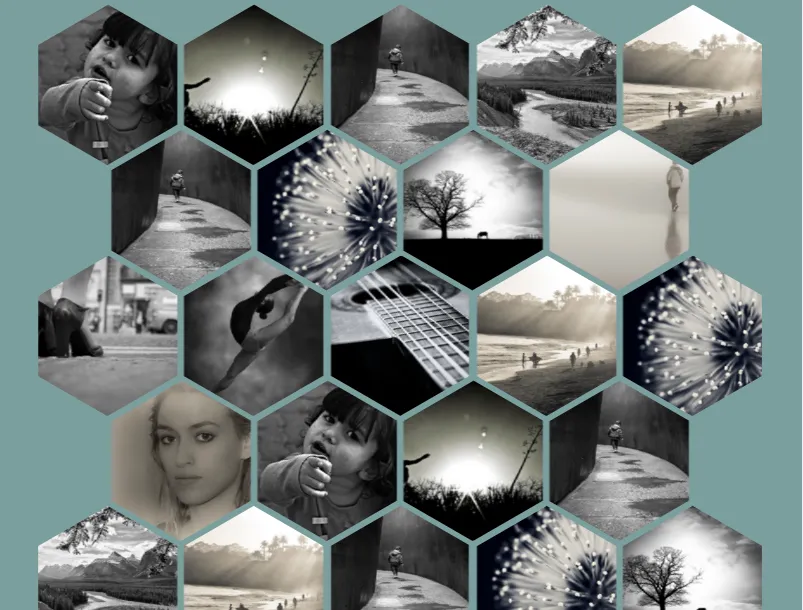
<ul id="hexGrid">
<li class="hex">
<a class="hexIn" href="#">
<img src="https://farm9.staticflickr.com/8461/8048823381_0fbc2d8efb.jpg" alt="" />
<h1>This is a title</h1>
<p>Some sample text about the article this hexagon leads to</p>
</a>
</li>
<li class="hex">
<a class="hexIn" href="#">
<img src="https://farm5.staticflickr.com/4144/5053682635_b348b24698.jpg" alt="" />
<h1>This is a title</h1>
<p>Some sample text about the article this hexagon leads to</p>
</a>
</li>
<li class="hex">
<a class="hexIn" href="#">
<img src="https://farm3.staticflickr.com/2827/10384422264_d9c7299146.jpg" alt="" />
<h1>This is a title</h1>
<p>Some sample text about the article this hexagon leads to</p>
</a>
</li>
<li class="hex">
<a class="hexIn" href="#">
<img src="https://farm7.staticflickr.com/6217/6216951796_e50778255c.jpg" alt="" />
<h1>This is a title</h1>
<p>Some sample text about the article this hexagon leads to</p>
</a>
</li>
<li class="hex">
<a class="hexIn" href="#">
<img src="https://farm7.staticflickr.com/6083/6055581292_d94c2d90e3.jpg" alt="" />
<h1>This is a title</h1>
<p>Some sample text about the article this hexagon leads to</p>
</a>
</li>
<li class="hex">
<a class="hexIn" href="#">
<img src="https://farm3.staticflickr.com/2827/10384422264_d9c7299146.jpg" alt="" />
<h1>This is a title</h1>
<p>Some sample text about the article this hexagon leads to</p>
</a>
</li>
<li class="hex">
<a class="hexIn" href="#">
<img src="https://farm8.staticflickr.com/7187/6895047173_d4b1a0d798.jpg" alt="" />
<h1>This is a title</h1>
<p>Some sample text about the article this hexagon leads to</p>
</a>
</li>
<li class="hex">
<a class="hexIn" href="#">
<img src="https://farm4.staticflickr.com/3766/12953056854_b8cdf14f21.jpg" alt="" />
<h1>This is a title</h1>
<p>Some sample text about the article this hexagon leads to</p>
</a>
</li>
<li class="hex">
<a class="hexIn" href="#">
<img src="https://farm7.staticflickr.com/6139/5986939269_10721b8017.jpg" alt="" />
<h1>This is a title</h1>
<p>Some sample text about the article this hexagon leads to</p>
</a>
</li>
<li class="hex">
<a class="hexIn" href="#">
<img src="https://farm4.staticflickr.com/3165/5733278274_2626612c70.jpg" alt="" />
<h1>This is a title</h1>
<p>Some sample text about the article this hexagon leads to</p>
</a>
</li>
<li class="hex">
<a class="hexIn" href="#">
<img src="https://farm8.staticflickr.com/7163/6822904141_50277565c3.jpg" alt="" />
<h1>This is a title</h1>
<p>Some sample text about the article this hexagon leads to</p>
</a>
</li>
<li class="hex">
<a class="hexIn" href="#">
<img src="https://farm4.staticflickr.com/3771/13199704015_72aa535bd7.jpg" alt="" />
<h1>This is a title</h1>
<p>Some sample text about the article this hexagon leads to</p>
</a>
</li>
<li class="hex">
<a class="hexIn" href="#">
<img src="https://farm7.staticflickr.com/6083/6055581292_d94c2d90e3.jpg" alt="" />
<h1>This is a title</h1>
<p>Some sample text about the article this hexagon leads to</p>
</a>
</li>
<li class="hex">
<a class="hexIn" href="#">
<img src="https://farm8.staticflickr.com/7187/6895047173_d4b1a0d798.jpg" alt="" />
<h1>This is a title</h1>
<p>Some sample text about the article this hexagon leads to</p>
</a>
</li>
<li class="hex">
<a class="hexIn" href="#">
<img src="https://farm3.staticflickr.com/2878/10944255073_973d2cd25c.jpg" alt="" />
<h1>This is a title</h1>
<p>Some sample text about the article this hexagon leads to</p>
</a>
</li>
<li class="hex">
<a class="hexIn" href="#">
<img src="https://farm9.staticflickr.com/8461/8048823381_0fbc2d8efb.jpg" alt="" />
<h1>This is a title</h1>
<p>Some sample text about the article this hexagon leads to</p>
</a>
</li>
<li class="hex">
<a class="hexIn" href="#">
<img src="https://farm5.staticflickr.com/4144/5053682635_b348b24698.jpg" alt="" />
<h1>This is a title</h1>
<p>Some sample text about the article this hexagon leads to</p>
</a>
</li>
<li class="hex">
<a class="hexIn" href="#">
<img src="https://farm3.staticflickr.com/2827/10384422264_d9c7299146.jpg" alt="" />
<h1>This is a title</h1>
<p>Some sample text about the article this hexagon leads to</p>
</a>
</li>
<li class="hex">
<a class="hexIn" href="#">
<img src="https://farm7.staticflickr.com/6217/6216951796_e50778255c.jpg" alt="" />
<h1>This is a title</h1>
<p>Some sample text about the article this hexagon leads to</p>
</a>
</li>
<li class="hex">
<a class="hexIn" href="#">
<img src="https://farm7.staticflickr.com/6083/6055581292_d94c2d90e3.jpg" alt="" />
<h1>This is a title</h1>
<p>Some sample text about the article this hexagon leads to</p>
</a>
</li>
<li class="hex">
<a class="hexIn" href="#">
<img src="https://farm3.staticflickr.com/2827/10384422264_d9c7299146.jpg" alt="" />
<h1>This is a title</h1>
<p>Some sample text about the article this hexagon leads to</p>
</a>
</li>
<li class="hex">
<a class="hexIn" href="#">
<img src="https://farm8.staticflickr.com/7187/6895047173_d4b1a0d798.jpg" alt="" />
<h1>This is a title</h1>
<p>Some sample text about the article this hexagon leads to</p>
</a>
</li>
<li class="hex">
<a class="hexIn" href="#">
<img src="https://farm4.staticflickr.com/3766/12953056854_b8cdf14f21.jpg" alt="" />
<h1>This is a title</h1>
<p>Some sample text about the article this hexagon leads to</p>
</a>
</li>
<li class="hex">
<a class="hexIn" href="#">
<img src="https://farm7.staticflickr.com/6139/5986939269_10721b8017.jpg" alt="" />
<h1>This is a title</h1>
<p>Some sample text about the article this hexagon leads to</p>
</a>
</li>
<li class="hex">
<a class="hexIn" href="#">
<img src="https://farm4.staticflickr.com/3165/5733278274_2626612c70.jpg" alt="" />
<h1>This is a title</h1>
<p>Some sample text about the article this hexagon leads to</p>
</a>
</li>
<li class="hex">
<a class="hexIn" href="#">
<img src="https://farm8.staticflickr.com/7163/6822904141_50277565c3.jpg" alt="" />
<h1>This is a title</h1>
<p>Some sample text about the article this hexagon leads to</p>
</a>
</li>
<li class="hex">
<a class="hexIn" href="#">
<img src="https://farm4.staticflickr.com/3771/13199704015_72aa535bd7.jpg" alt="" />
<h1>This is a title</h1>
<p>Some sample text about the article this hexagon leads to</p>
</a>
</li>
<li class="hex">
<a class="hexIn" href="#">
<img src="https://farm7.staticflickr.com/6083/6055581292_d94c2d90e3.jpg" alt="" />
<h1>This is a title</h1>
<p>Some sample text about the article this hexagon leads to</p>
</a>
</li>
<li class="hex">
<a class="hexIn" href="#">
<img src="https://farm8.staticflickr.com/7187/6895047173_d4b1a0d798.jpg" alt="" />
<h1>This is a title</h1>
<p>Some sample text about the article this hexagon leads to</p>
</a>
</li>
<li class="hex">
<a class="hexIn" href="#">
<img src="https://farm7.staticflickr.com/6139/5986939269_10721b8017.jpg" alt="" />
<h1>This is a title</h1>
<p>Some sample text about the article this hexagon leads to</p>
</a>
</li>
<li class="hex">
<a class="hexIn" href="#">
<img src="https://farm4.staticflickr.com/3165/5733278274_2626612c70.jpg" alt="" />
<h1>This is a title</h1>
<p>Some sample text about the article this hexagon leads to</p>
</a>
</li>
<li class="hex">
<a class="hexIn" href="#">
<img src="https://farm8.staticflickr.com/7163/6822904141_50277565c3.jpg" alt="" />
<h1>This is a title</h1>
<p>Some sample text about the article this hexagon leads to</p>
</a>
</li>
<li class="hex">
<a class="hexIn" href="#">
<img src="https://farm4.staticflickr.com/3771/13199704015_72aa535bd7.jpg" alt="" />
<h1>This is a title</h1>
<p>Some sample text about the article this hexagon leads to</p>
</a>
</li>
<li class="hex">
<a class="hexIn" href="#">
<img src="https://farm7.staticflickr.com/6083/6055581292_d94c2d90e3.jpg" alt="" />
<h1>This is a title</h1>
<p>Some sample text about the article this hexagon leads to</p>
</a>
</li>
<li class="hex">
<a class="hexIn" href="#">
<img src="https://farm8.staticflickr.com/7187/6895047173_d4b1a0d798.jpg" alt="" />
<h1>This is a title</h1>
<p>Some sample text about the article this hexagon leads to</p>
</a>
</li>
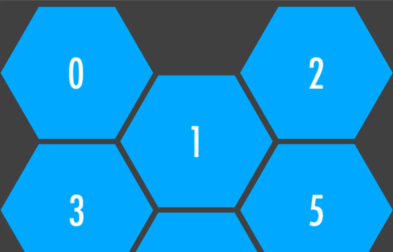
</ul>网格会根据视口宽度自适应调整每行六边形的数量,当屏幕宽度大于1200像素时为5个,小于600像素时为2个。
如果您不需要媒体查询,只想更改每行六边形的数量,可以保留相应媒体查询的CSS并删除不必要的内容。
如需进行更多自定义,请参见六边形的大小和间距。
有关所有演示的列表,请参见此Codepen集合:带有不同行中六边形数量,居中选项等的响应式六边形网格。
这是原始的 codepen演示,使用.pusher元素创建六边形的不规则网格。 .pusher元素用于在网格中创建空六边形的“洞口”。
.hex-wrapper { max-width: 600px; padding-right: 80px; margin-left: auto; margin-right: auto; } 我还需要它变小一点,但不是在移动设备上,因此最大宽度为600。有什么想法吗? - redfox05好的,这里有一个干净的、跨浏览器兼容的解决方案,甚至可以让您制作蜂窝状的六边形:
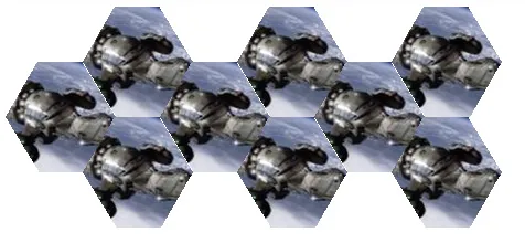
为了使其有效,您需要将每个图像包装在两个容器中,因为一个容器将用于左上/右下的截断,另一个容器将用于右上/左下的截断。
<div class="outerclip">
    <div class="innerclip">
        <img src="http://img1.wikia.nocookie.net/__cb20090714124528/firefly/images/thumb/1/11/Firefly_class_ship.jpg/100px-136,568,0,431-Firefly_class_ship.jpg" />
    </div>
</div>
skew来给图像添加角度:.outerclip {
-webkit-transform: skew(-30deg);
-ms-transform: skew(-30deg);
-transform: skew(-30deg);
overflow: hidden;
display: inline-block;
}
.innerclip {
-webkit-transform: skew(50deg);
-ms-transform: skew(50deg);
transform: skew(50deg);
overflow: hidden;
display: inline-block;
}
img {
-webkit-transform: skew(-30deg);
-ms-transform: skew(-30deg);
transform: skew(-30deg);
}
示例: http://jsfiddle.net/XkQtF/3/
注意:为了提高渲染质量,建议给.outerclip和.innerclip设置相同的固定高度。
要获得蜂窝状图案,您可以将多个图像放在一个row容器中,然后将每个奇数行偏移几个像素,如下所示:
如果涉及到蜂窝结构,这里有一个CSS的可能性。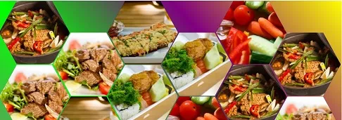 http://codepen.io/gc-nomade/pen/eyntg/
  <div><!-- even div gets a negative bottom margin. all of them gets a negative right margin -->
  <span><!-- skewed and rotated -->
    <img src="http://lorempixel.com/200/200/food/1"/><!-- rotated back, unskewed and rescaled -->
  </span>
</div>
垂直内边距加伪元素来绘制一个正方形。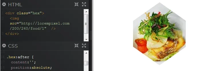 HTML
HTML <div class="hex">
<img src="image100x120">
</div>
CSS
<!--language:css-->

.hex  {
  position:relative;
  margin:auto;
  text-align:center;
  overflow:hidden;
  white-space:nowrap;
  display:table;
}
.hex:before {
  content:'';
  padding-top:120%;
  display:inline-block;
  vertical-align:middle;
}

.hex:after {
  content:'';
  position:absolute;
  top:0%;
  left:-10%;
  width:120%;
  padding-top:120%;
  transform: rotatex(45deg) rotate(45deg);
  text-align:center;
  box-shadow:0 0 0 200px white;;
}
.hex img {
  display:inline-block;
  vertical-align:middle;
  margin:0 -10px;
}
HTML:
<div class="hexagon">
  <div class="contents"></div>
</div>
SASS(搭配Compass):
$width: 400px;
$fillColor: #CCC;
$height: $width*sin(60deg);
.hexagon {
  display: inline-block;
  position: relative;
  width: $width;
}
.hexagon:before, .hexagon:after {
  content: '';
  display: block;
  width: 50%;
  border: 0 solid transparent;
}
.hexagon:before {
  border-bottom-color: $fillColor;
  border-width: 0 $width/4 $height/2;
}
.hexagon:after {
  border-top-color: $fillColor;
  border-width: $height/2 $width/4 0;
}
.hexagon > .contents {
  position: absolute;
  top: 0; bottom: 0;
  left: 25%; right: 25%;
}
.contents内使用以下方法。<img id="myimg" src="foo" />
#myimg {
  position: absolute;
  top: 0; bottom: 0;
  left: 0; right: 0;
  margin: auto;
  width: 50%;
}
position:absolute。我已经更新了答案以显示它。 - Oriol查看这个使用AngularJS实现的响应式六边形网格。
<div class="wrapper">

  <section class="hex-grid">

    <div
      ng-repeat="item in app.items"
      class="grid-item repeat-animation">

      <div class="inner">
        <div
          class="inner-inner"
          ng-style="{ 'background-image': 'url({{ item.imgSrc }})' }">

          <a
            href=""
            class="grid-info">

            <div class ="inner-text">
              <div class="inner-text-inner">

                <h2>{{ item.name }}</h2>
                <p>{{item.desc }}</p>

              </div><!-- /.inner-text-inner -->
            </div><!-- /.inner-text -->
          </a><!-- /.grid-info -->
        </div><!-- /.inner-inner -->
      </div><!-- /.inner -->
    </div><!-- /.grid-item -->
  </section><!-- /.hex-grid -->

</div><!-- /.wrapper -->
.hex-grid {
  position: relative;
  width: 80%;
  left: 10%;
  padding-top: 120px;
}
@media (max-width: 767px) {
  .hex-grid {
    width: 100%;
    left: 0;
  }
}
.hex-grid .grid-item {
  position: relative;
  display: inline-block;
  float: left;
  overflow: hidden;
  visibility: hidden;
  -webkit-transform: rotate(120deg);
  -ms-transform: rotate(120deg);
  transform: rotate(120deg);
  cursor: pointer;
}
@media (max-width: 633px) {
  .hex-grid .grid-item {
    width: 222%;
    margin: 0 -61%;
    margin-bottom: 10px;
  }
}
@media (min-width: 634px) and (max-width: 1022px) {
  .hex-grid .grid-item {
    width: 133%;
    margin: 0 -42%;
    margin-bottom: -25%;
  }
  .hex-grid .grid-item:nth-child(2),
  .hex-grid .grid-item:nth-child(4),
  .hex-grid .grid-item:nth-child(6),
  .hex-grid .grid-item:nth-child(8),
  .hex-grid .grid-item:nth-child(10),
  .hex-grid .grid-item:nth-child(12),
  .hex-grid .grid-item:nth-child(14),
  .hex-grid .grid-item:nth-child(16),
  .hex-grid .grid-item:nth-child(18),
  .hex-grid .grid-item:nth-child(20),
  .hex-grid .grid-item:nth-child(22),
  .hex-grid .grid-item:nth-child(24),
  .hex-grid .grid-item:nth-child(26),
  .hex-grid .grid-item:nth-child(28),
  .hex-grid .grid-item:nth-child(30) {
    margin-top: 28%;
  }
  .hex-grid .grid-item:nth-child(3),
  .hex-grid .grid-item:nth-child(5),
  .hex-grid .grid-item:nth-child(7),
  .hex-grid .grid-item:nth-child(9),
  .hex-grid .grid-item:nth-child(11),
  .hex-grid .grid-item:nth-child(13),
  .hex-grid .grid-item:nth-child(15),
  .hex-grid .grid-item:nth-child(17),
  .hex-grid .grid-item:nth-child(19),
  .hex-grid .grid-item:nth-child(21),
  .hex-grid .grid-item:nth-child(23),
  .hex-grid .grid-item:nth-child(25),
  .hex-grid .grid-item:nth-child(27),
  .hex-grid .grid-item:nth-child(29) {
    clear: left;
  }
}
@media (min-width: 1023px) and (max-width: 1599px) {
  .hex-grid .grid-item {
    width: 91.6%;
    margin: 0 -29.2%;
    margin-bottom: -17.5%;
  }
  .hex-grid .grid-item:nth-child(2),
  .hex-grid .grid-item:nth-child(5),
  .hex-grid .grid-item:nth-child(8),
  .hex-grid .grid-item:nth-child(11),
  .hex-grid .grid-item:nth-child(14),
  .hex-grid .grid-item:nth-child(17),
  .hex-grid .grid-item:nth-child(20),
  .hex-grid .grid-item:nth-child(23),
  .hex-grid .grid-item:nth-child(26),
  .hex-grid .grid-item:nth-child(29) {
    margin-top: 19%;
  }
  .hex-grid .grid-item:nth-child(4),
  .hex-grid .grid-item:nth-child(7),
  .hex-grid .grid-item:nth-child(10),
  .hex-grid .grid-item:nth-child(13),
  .hex-grid .grid-item:nth-child(16),
  .hex-grid .grid-item:nth-child(19),
  .hex-grid .grid-item:nth-child(22),
  .hex-grid .grid-item:nth-child(25),
  .hex-grid .grid-item:nth-child(28) {
    clear: left;
  }
}
@media (min-width: 1600px) {
  .hex-grid .grid-item {
    width: 66.7%;
    margin: 0 -20.9%;
    margin-bottom: -12.5%;
  }
  .hex-grid .grid-item:nth-child(2),
  .hex-grid .grid-item:nth-child(4),
  .hex-grid .grid-item:nth-child(6),
  .hex-grid .grid-item:nth-child(8),
  .hex-grid .grid-item:nth-child(10),
  .hex-grid .grid-item:nth-child(12),
  .hex-grid .grid-item:nth-child(14),
  .hex-grid .grid-item:nth-child(16),
  .hex-grid .grid-item:nth-child(18),
  .hex-grid .grid-item:nth-child(20),
  .hex-grid .grid-item:nth-child(22),
  .hex-grid .grid-item:nth-child(24),
  .hex-grid .grid-item:nth-child(26),
  .hex-grid .grid-item:nth-child(28),
  .hex-grid .grid-item:nth-child(30) {
    margin-top: 14%;
  }
  .hex-grid .grid-item:nth-child(5),
  .hex-grid .grid-item:nth-child(9),
  .hex-grid .grid-item:nth-child(13),
  .hex-grid .grid-item:nth-child(17),
  .hex-grid .grid-item:nth-child(21),
  .hex-grid .grid-item:nth-child(25),
  .hex-grid .grid-item:nth-child(29) {
    clear: left;
  }
}
.hex-grid .grid-item .inner {
  overflow: hidden;
  position: relative;
  width: 100%;
  height: 100%;
  -webkit-transform: rotate(-60deg);
  -ms-transform: rotate(-60deg);
  transform: rotate(-60deg);
}
.hex-grid .grid-item .inner .inner-inner {
  -webkit-transform-style: preserve-3d;
  /* Chrome, Safari, Opera */
  transform-style: preserve-3d;
  visibility: visible;
  overflow: hidden;
  width: 100%;
  padding-bottom: 40%;
  -webkit-transform: rotate(-60deg);
  -ms-transform: rotate(-60deg);
  transform: rotate(-60deg);
  background-repeat: no-repeat;
  background-size: 50%;
  -webkit-transition: all 0.35s ease-out;
  transition: all 0.35s ease-out;
  background-position: 50%;
}
@media (min-width: 1100px) {
  .hex-grid .grid-item .inner .inner-inner {
    padding-bottom: 40%;
  }
}
.hex-grid .grid-item .inner .inner-inner:hover {
  background-size: 60%;
}
.hex-grid .grid-item .inner .inner-inner .grid-info {
  position: absolute;
  top: 0;
  left: 0;
  display: block;
  width: 100%;
  height: 100%;
  padding: 10%;
  background: #ffffff;
  color: #000000;
  text-decoration: none;
  text-align: center;
  z-index: 2;
  opacity: 0;
  filter: alpha(opacity=0);
  -webkit-transition: all 0.35s;
  transition: all 0.35s;
}
.hex-grid .grid-item .inner .inner-inner .grid-info:hover {
  opacity: 1;
  filter: alpha(opacity=100);
}
.hex-grid .grid-item .inner .inner-inner .grid-info .inner-text {
  display: table;
  position: relative;
  height: 100%;
  width: 46%;
  left: 27%;
}
.hex-grid .grid-item .inner .inner-inner .grid-info .inner-text .inner-text-inner {
  display: table-cell;
  vertical-align: middle;
}
.hex-grid .grid-item .inner .inner-inner {
  -webkit-backface-visibility: hidden;
}
.repeat-animation.ng-enter-stagger,
.repeat-animation.ng-leave-stagger,
.repeat-animation.ng-move-stagger {
  /* 100ms will be applied between each sucessive enter operation */
     -moz-transition-delay: 0.1s !important;
  -webkit-transition-delay: 0.1s !important;
          transition-delay: 0.1s !important;

  /* this is here to avoid accidental CSS inheritance */
  -webkit-transition-duration: 0 !important;
          transition-duration: 0 !important;
}

.repeat-animation.ng-enter,
.repeat-animation.ng-leave,
.repeat-animation.ng-move {
     -moz-transition: 0.2s ease-in-out all;
  -webkit-transition: 0.2s ease-in-out all;
          transition: 0.2s ease-in-out all;
}

.repeat-animation.ng-leave.ng-leave-active,
.repeat-animation.ng-enter,
.repeat-animation.ng-move {
     -moz-transition: 0.2s ease-in-out all;
  -webkit-transition: 0.2s ease-in-out all;
          transition: 0.2s ease-in-out all;

  opacity:0;
}

.repeat-animation.ng-leave,
.repeat-animation.ng-move.ng-move-active,
.repeat-animation.ng-enter.ng-enter-active {
  opacity:1;
}
'use strict';
(function() {
  /**
   * Declares the app module.
   */
  angular
    .module( 'app', [ 'ngAnimate' ] );

//...
翻译: http://rachidmrad.com/ 原文链接。
所有的功劳都归给Rachid Mrad先生,他是一位非常出色的网页设计师。
<div class="hexagon">
    <!-- get the image -->
    <img src="injected.jpg" />

    <!-- apply hexagon shape to it -->
    <img src="transparentHex.png" />
</div>
CSS:
.hexagon {
    position: relative;
}

.hexagon > img {
    position: absolute;
}
一个纯CSS响应式六边形网格。它依赖于clip-path来创建主要形状和shape-outside来确保我们拥有正确的缩进:
.main {
  display:flex;
  --s: 100px;  /* size  */
  --m: 4px;    /* space */
}

.container {
  font-size: 0; /*disable white space between inline block element */
}

.container div {
  width: var(--s);
  margin: var(--m);
  height: calc(var(--s)*1.1547); /*  = 1/cos(30)  */
  display: inline-block;
  font-size:initial;
  clip-path: polygon(0% 25%, 0% 75%, 50% 100%, 100% 75%, 100% 25%, 50% 0%);
  background: red;
  margin-bottom: calc(var(--m) + var(--s)*-0.2885); /* = tan(30)/2 */
}
.container div:nth-child(odd) {
  background:green;
}
.container::before {
  content: "";
  width: calc(var(--s)/2 + var(--m));
  float: left;
  height: 100%;
  --r:calc(var(--s)*3*1.1547/2 + 4*var(--m)  - 2px);
  shape-outside:
   repeating-linear-gradient(
     transparent 0 calc(var(--r) - 3px),
     #fff        0 var(--r));
}<div class="main">
<div class="container">
<div></div>
<div></div>
<div></div>
<div></div>
<div></div>
<div></div>
<div></div>
<div></div>
<div></div>
<div></div>
<div></div>
<div></div>
<div></div>
<div></div>
<div></div>
<div></div>
<div></div>
<div></div>
<div></div>
<div></div>
<div></div>
<div></div>
<div></div>
<div></div>
<div></div>
<div></div>
<div></div>
</div>
</div>相关详情请查看:无需媒体查询的响应式六边形网格
试试这个JSFiddle
<div class="hex one">
       <div class="images1">
          <div class="images2"></div>
       </div>
    </div>

    <div class="hex two">
       <div class="images1">
          <div class="images2"></div>
       </div>
    </div>
CSS
BODY {
    background: url(http://placekitten.com/600/600);
}
.hex {
    overflow: hidden;
    visibility: hidden;
    -webkit-transform: rotate(120deg);
    -moz-transform: rotate(120deg);
    -ms-transform: rotate(120deg);
    -o-transform: rotate(120deg);
    transform: rotate(120deg);
    cursor: pointer;
    }
.images1{
    overflow: hidden;
    width: 100%;
    height: 100%;
    -webkit-transform: rotate(-60deg);
       -moz-transform: rotate(-60deg);
        -ms-transform: rotate(-60deg);
         -o-transform: rotate(-60deg);
            transform: rotate(-60deg);
    }
.images2{
    width: 100%;
    height: 100%;
    background-repeat: no-repeat;
    background-position: 50%;
    background-image: url(http://placekitten.com/238/240);
    visibility: visible;
    -webkit-transform: rotate(-60deg);
       -moz-transform: rotate(-60deg);
        -ms-transform: rotate(-60deg);
         -o-transform: rotate(-60deg);
            transform: rotate(-60deg);
    }
.images2:hover {
    background-image: url(http://placekitten.com/440/242);
    }

.one {
    width: 400px;
    height: 200px;
    margin: 0 0 0 -80px;
    }
.two {
    width: 200px;
    height: 400px;
    margin: -80px 0 0 20px;
    }
不要在img标签中使用class,而是在img容器中使用css,例如:
.container img{ your code}
它将为您节省很多在图像中添加类的麻烦。