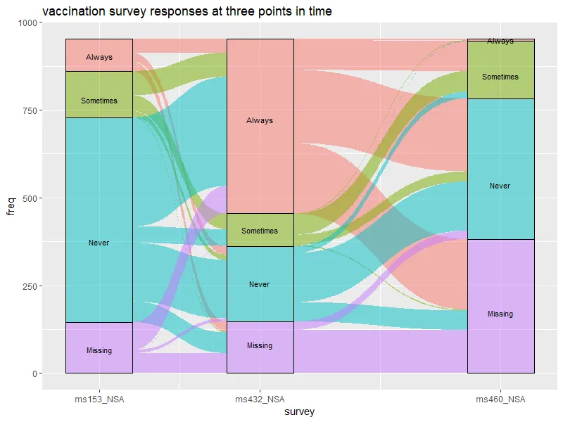
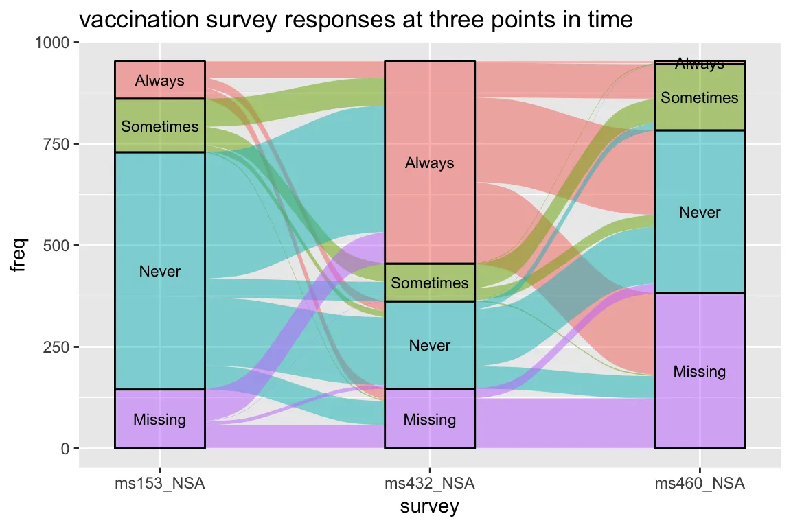
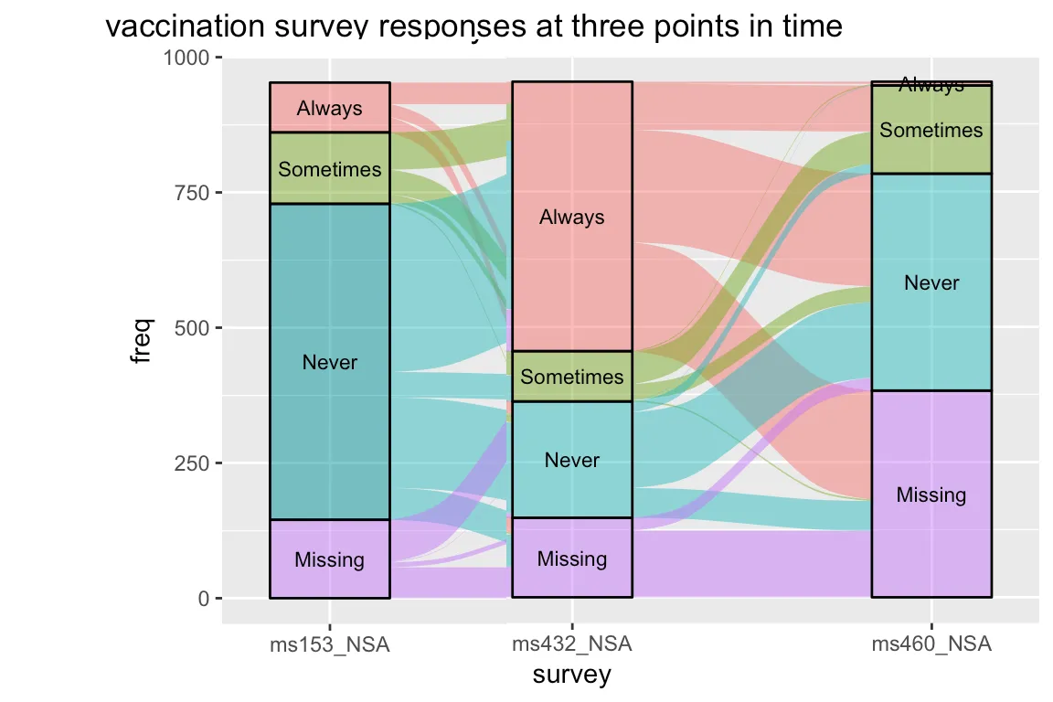
群组在冲积图中的不对称距离

7

我想使用 ggplot2ggalluvial 更改洪积图中组之间的距离。

我的示例来自 https://corybrunson.github.io/ggalluvial/articles/ggalluvial.html

data(vaccinations)
levels(vaccinations$response) <- rev(levels(vaccinations$response))
ggplot(vaccinations,
       aes(x = survey, stratum = response, alluvium = subject,
           y = freq,
           fill = response, label = response)) +
  scale_x_discrete(expand = c(.1, .1)) +
  geom_flow() +
  geom_stratum(alpha = .5) +
  geom_text(stat = "stratum", size = 3) +
  theme(legend.position = "none") +
  ggtitle("vaccination survey responses at three points in time")

给我:

enter image description here

现在,我想缩短ms153_NSA之间的距离,同时保持ms432_NSA和ms460_NSA之间相同的距离:

enter image description here

我尝试使用以下方法(但没有成功):

https://rdrr.io/cran/ggalluvial/man/stat_flow.html

如何在ggplot2中增加条形图中柱子之间的间距?

即使是谷歌也没有给我显示不对称的alluvial图::'-/


1
我成功地改变了条形间距,但每次这样做时,其中一个间隙就会变成没有流动带的空白。 - IRTFM
1个回答

5

以下是一种黑客的方法

数据操作:

# get layer data calculated by ggalluvial, & shift 2nd position x leftwards by desired amount

library(dplyr)

p <- ggplot(vaccinations,
            aes(x = survey, stratum = response, alluvium = subject,
                y = freq,
                fill = response, label = response)) +
  scale_x_discrete(expand = c(.1, .1)) +
  geom_flow() +
  theme(legend.position = "none") +
  ggtitle("vaccination survey responses at three points in time")

shift.amt = 0.2

new.df <- layer_data(p) %>%
  mutate(xmin = ifelse(x == 2, xmin - shift.amt, xmin),
         xmax = ifelse(x == 2, xmax - shift.amt, xmax),
         x = ifelse(x == 2, x - shift.amt, x))

剧情:

library(ggforce) # needed for geom_diagonal_wide

ggplot(new.df, aes(fill = fill)) +

  # recreate each geom layer using the modified data
  geom_diagonal_wide(data = . %>%
                       select(alluvium, fill, side, xmin, xmax, ymin, ymax) %>%
                       group_by(alluvium,) %>%
                       summarise(fill = fill[side == "start"],
                                 x = list(c(xmax[side == "start"], xmin[side == "end"], 
                                            xmin[side == "end"], xmax[side == "start"])),
                                 y = list(c(ymax[side == "start"], ymax[side == "end"], 
                                            ymin[side == "end"], ymin[side == "start"]))) %>%
                       tidyr::unnest(),
                     aes(x = x, y = y, group = alluvium),
                     alpha = 0.5) +
  geom_rect(data = . %>% group_by(x, stratum, fill) %>%
              summarise(xmin = min(xmin), xmax = max(xmax),
                        ymin = min(ymin), ymax = max(ymax)),
            aes(xmin = xmin, xmax = xmax, ymin = ymin, ymax = ymax),
            alpha = 0.5, colour = "black") +
  geom_text(data = . %>% group_by(x, stratum, label) %>%
              summarise(y = mean(range(y))),
            aes(x = x, y = y, label = label), 
            inherit.aes = FALSE, size = 3) +

  # recreate original x-axis breaks/labels, fill values, & axis titles
  scale_x_continuous(breaks = sort(unique(new.df$x)),
                     labels = layer_scales(p)$x$get_labels()) +
  scale_fill_identity() + # by default, this won't create a legend
  labs(title = "vaccination survey responses at three points in time",
       x = p$labels$x, y = p$labels$y)

plot


网页内容由stack overflow 提供, 点击上面的
可以查看英文原文,
原文链接