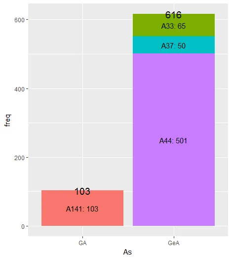
我需要使用一个组变量As和子组变量ADs绘制频率数据的图表。最好的可视化频率的方式是饼图还是马赛克图?在ggplot2中是否有相关函数?
df <- data.frame(As=c('GeA','GeA','GeA', 'GA'),
             ADs=c('A44','A33','A37','A141'),
             freq=c(501,65,50,103))

#    As  ADs freq
# 1 GeA  A44  501
# 2 GeA  A33   65
# 3 GeA  A37   50
# 4  GA A141  103
以下是一些想法:
然而,有没有一种方法可以在一个图表中区分组和子组?
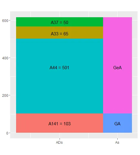
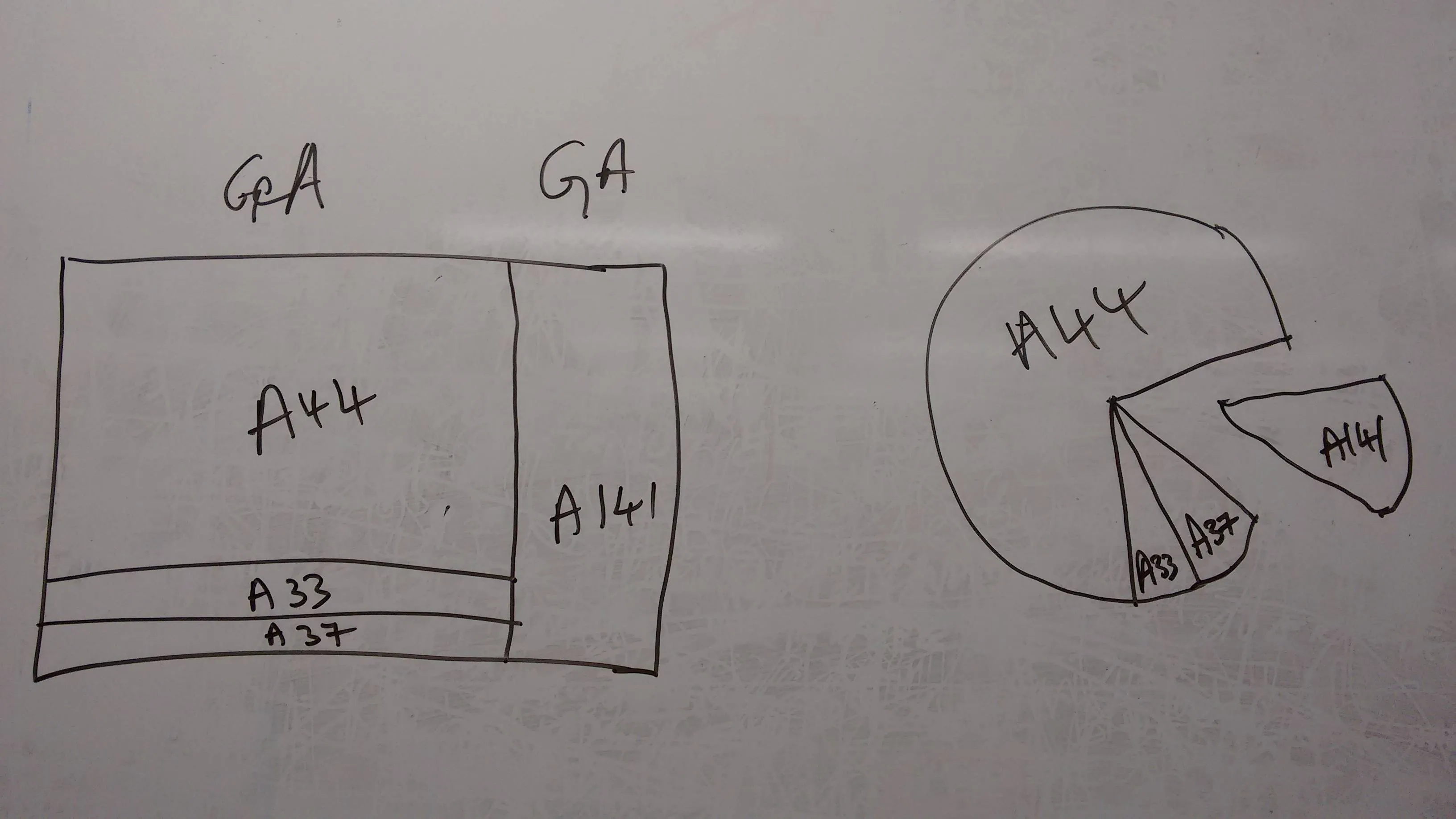
在提出的解决方案中,下面的两个图表看起来很有前途。
饼图&瓷砖图
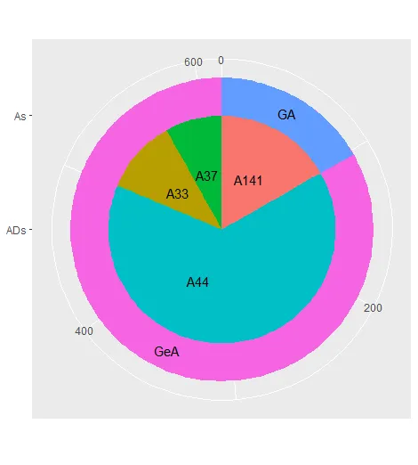

我已经使用了M--建议的以下代码。
df.2 <- df
df.2$ymax <- with(df.2, ave(freq, As, FUN=cumsum))
df.2$ymin <- lag(df.2$ymax, default = 0)
df.2$ymin <- ifelse(lag(as.character(df.2$As), default = 0) != df.2$As, 0, df.2$ymin)

df.legend <- df.2[with(df.2, order(As)), ]

library(ggplot2)
# Pie Chart
ggplot(df.2) +
  geom_rect(aes(fill=As, ymax=ymax, ymin=ymin, xmax=4, xmin=3)) +
  geom_rect(aes(fill=ADs, ymax=ymax, ymin=ymin, xmax=3, xmin=0)) +
  xlim(c(0, 4)) +
  theme(aspect.ratio=1) +
  coord_polar(theta="y") +
  scale_x_continuous(breaks=c(0,3), labels=c("ADs", "As")) +
  annotate("text", x=rep(1.5,4), y=c(50, 350,530,590),
           label= as.character(df.legend$ADs)) +
  annotate("text", x=rep(3.5,2), y=c(50, 350),
           label= as.character(unique(df.legend$As))) +
  theme(legend.position="none", axis.title.x=element_blank(),
        axis.title.y=element_blank())

# Tile Graph
ggplot(df.2) +
  geom_rect(aes(fill=As, ymax=ymax, ymin=ymin, xmax=4, xmin=3)) +
  geom_rect(aes(fill=ADs, ymax=ymax, ymin=ymin, xmax=3, xmin=0)) +
  xlim(c(0, 4)) + theme(aspect.ratio=1) +
  scale_x_continuous(breaks=c(1.5,3.5), labels=c("ADs", "As")) +
  annotate("text", x=rep(1.5,4), y=c(50, 350,530,590),
           label= paste(as.character(df.legend$ADs), df.legend$freq,sep= " = ")) +
  annotate("text", x=rep(3.5,2), y=c(50, 350),
           label= as.character(unique(df.legend$As))) +
  theme(legend.position="none", axis.title.x=element_blank(),
        axis.title.y=element_blank())
然而,我没有得到相同的输出结果。
饼图和瓦片图。
消息:'x'的比例已经存在。添加另一个比例尺'x',将替换现有比例尺。
请问可能出现什么问题?所使用的软件包版本有什么区别吗?